Working in Engage Components (51)

Lessons on how to work with the Engage components.

No Projects found

There are no projects in this collection.

Reordering elements on an Engage Component panel

When working on an Engage Component panel you can re-order the elements after you've added content.

This works for both vertical and horizontal order.

It's also great if you need to add a new element into the middle of a layout at a later time. Just add the new content below the existing conten then move (reorder) it to the position where it needs to be.
4554   0
  |  
0   0

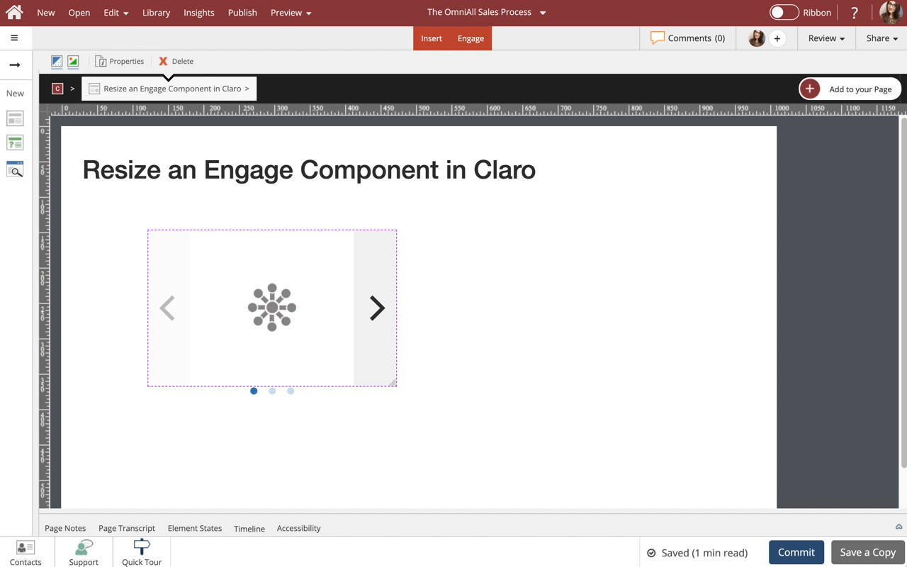
Customizing the layouts on Engage Components by manually adjusting element size (width)

The components on the Engage tab allow you to add several different layouts to any tab or component.

These default layouts offer up to three columns, since these are the most typically-required types of layouts.

Need more columns? You can customize the sizing of the elements in a layout to allow more elements in the same horizontal row.

An important concept to understand is that responsive design measures width in 12ths.

Something full-width is 12/12ths wide, something half-width is 6/12...
5066   0
  |  
0   0

Add an Icon to a Tab Set, Accordion, Steps, and Reveal Components

Steps to add an Icon to a Tab Set, Accordion, Steps, and Reveal Components.

Icons are one of many design options you can add to Components on the Engage tab.
5930   0
  |  
0   0

Add a Tab Set Component to a Page

Steps to add a Tab Set Component to a Page.

Tab Sets are one of many components available on the Engage Tab.

The learner can interact with the Tab Set by clicking each tab to change the content shown.
10514   0
  |  
0   0

Edit a Tab Set Component

Steps to edit a Tab Set component.

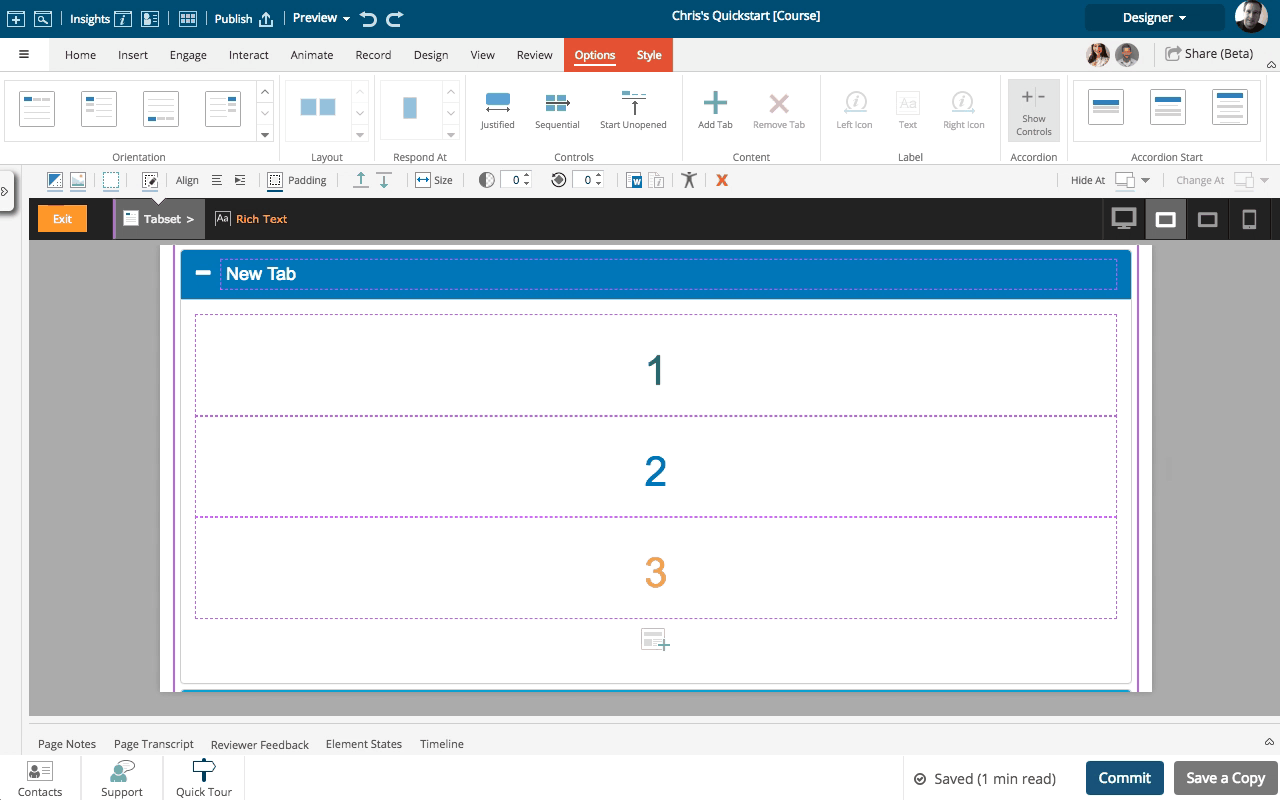
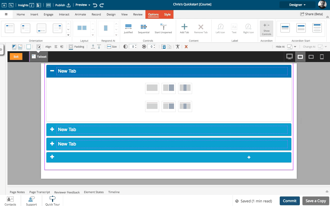
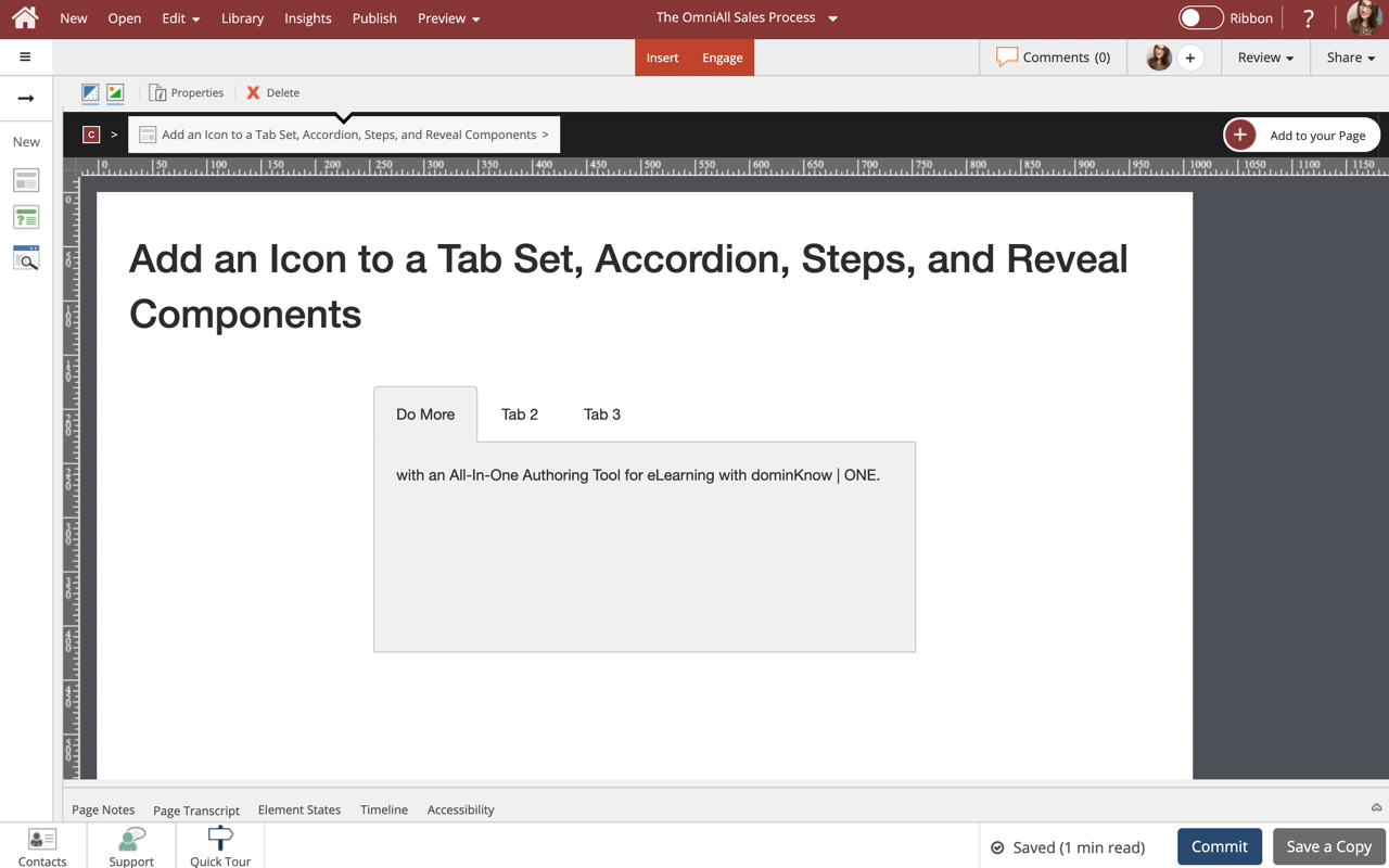
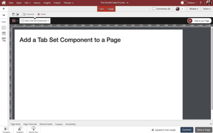
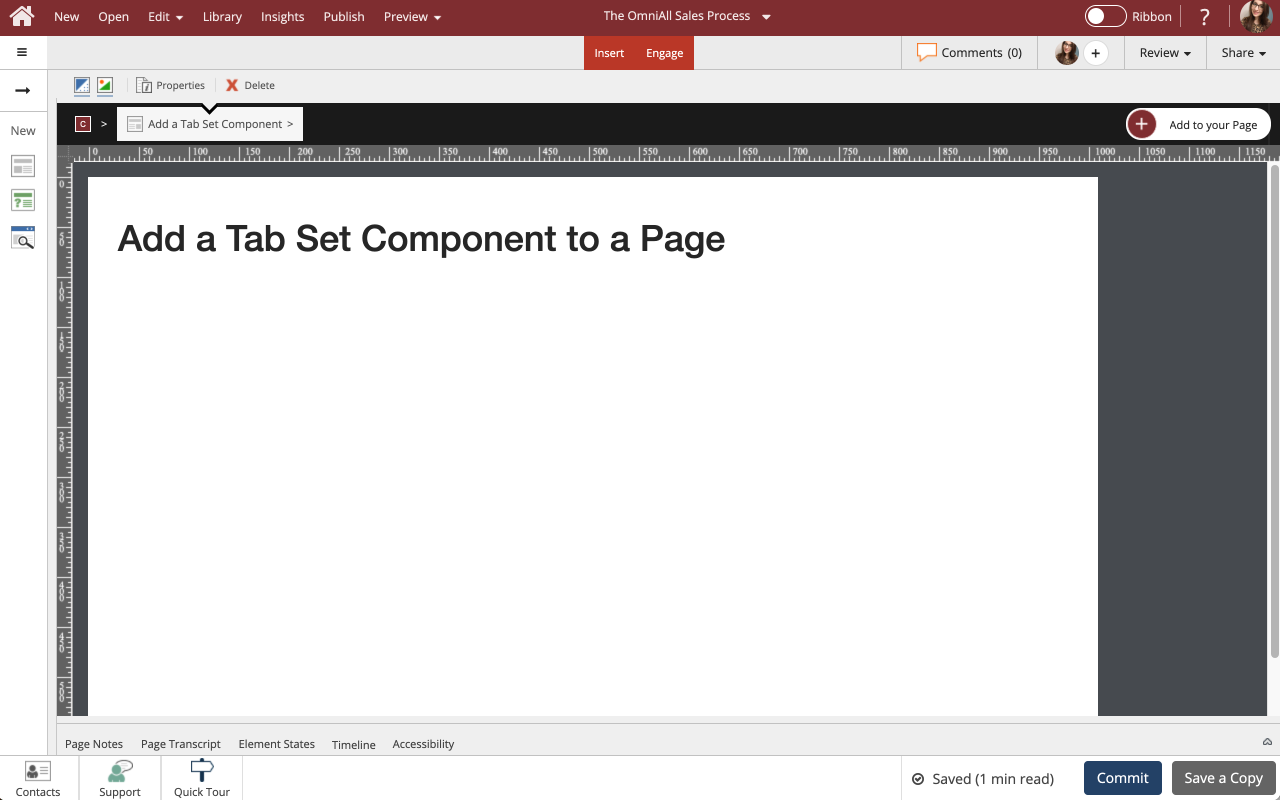
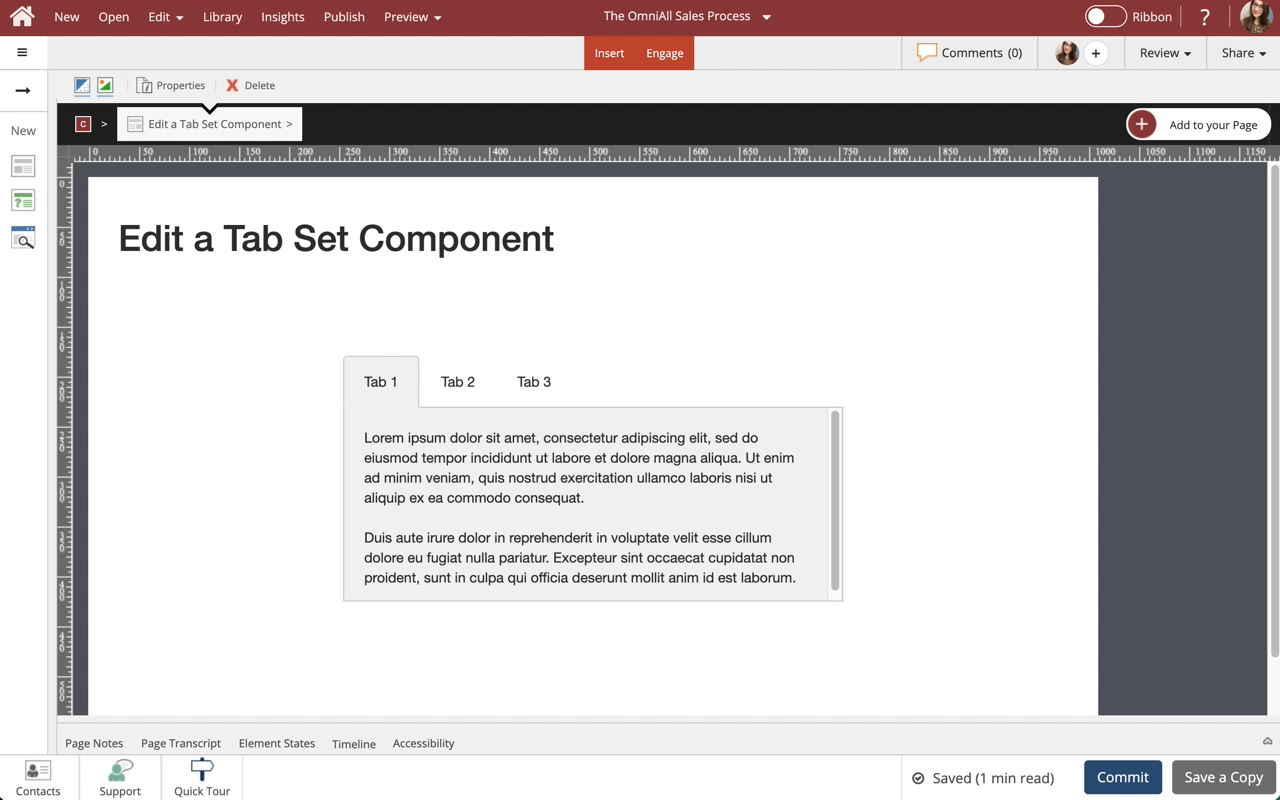
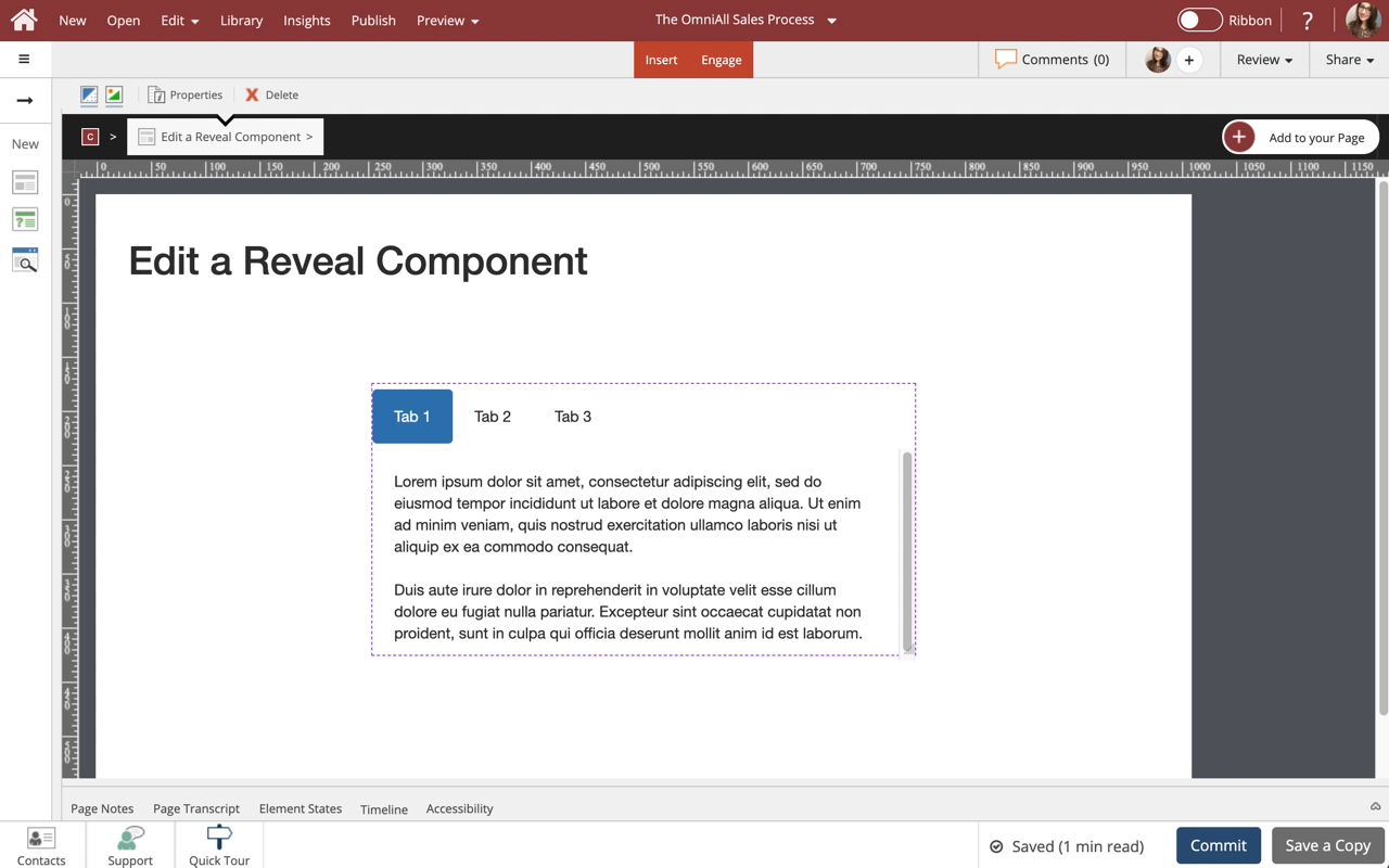
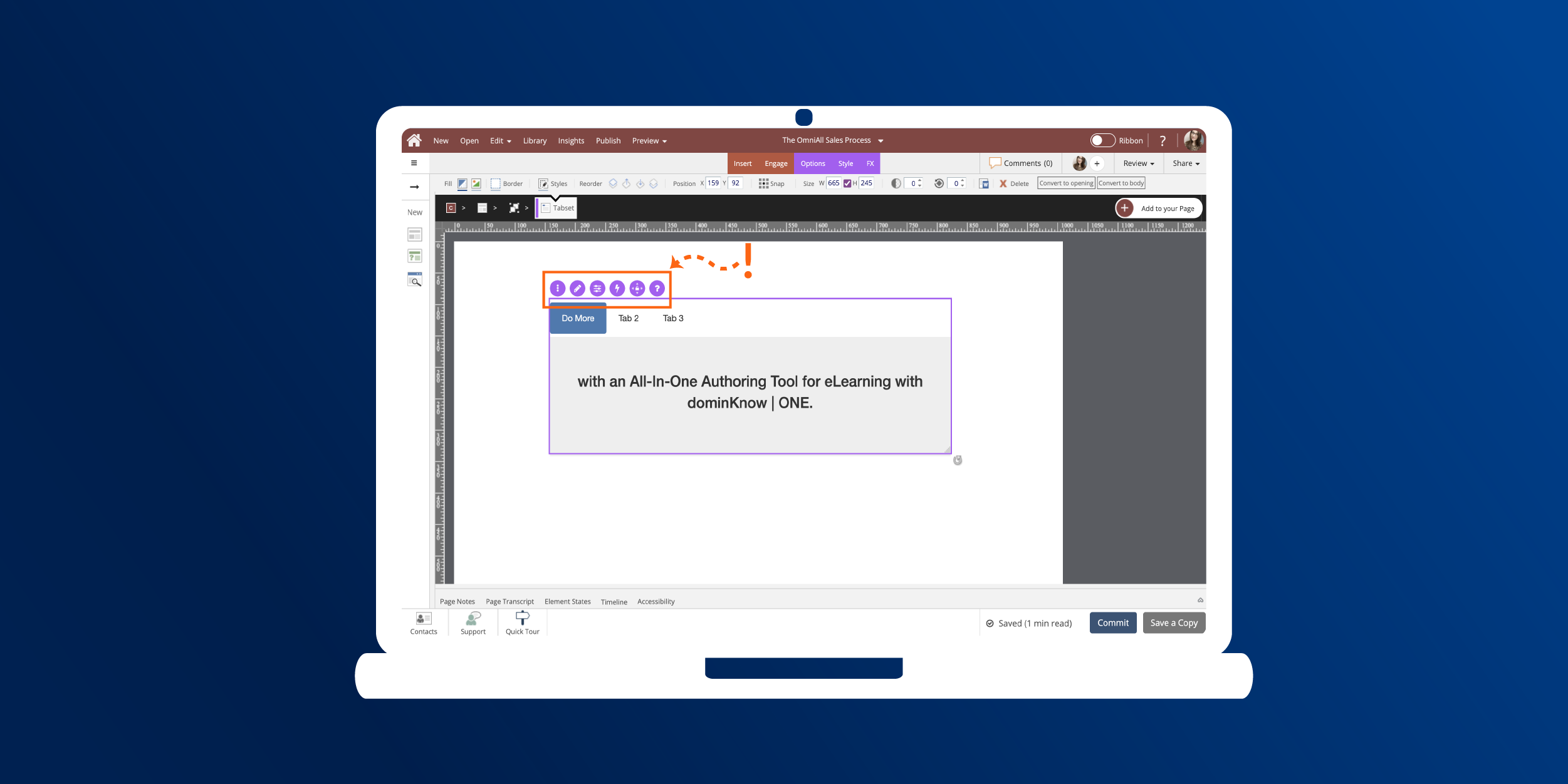
Use Tab Sets to display information in a tabbed layout. Tab Sets are available in a variety of orientations for you to choose from. All types can be formatted and styled for numerous appearances and behaviors.

Notes:
1. There is a publishing profile option that allows you to turn on or off completion checkmarks for tab sets and accordions. See the article: Publishing Profile Options for more information.
2. When in Essentials, only a limited amount of Opti...
9300   0
  |  
0   0

Add an Accordion Component to a Page

Steps to add an Accordion Component to a Page.

Accordions are one of many components available on the Engage Tab.

The learner can interact with the Accordion component by clicking each tab to open the content within.
4926   0
  |  
0   0

Edit an Accordion Component

Steps to edit an Accordion Component.

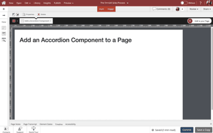
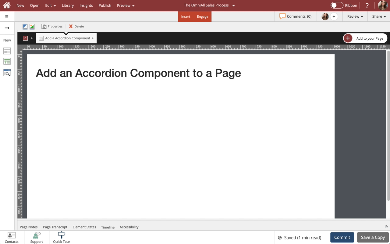
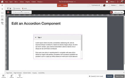
Use the Accordion Component to show information in a tabbed menu, users can open and close tabs to view content within the Component. This lesson covers editing of the Accordion and controlling the display properties of the component to suit your design needs.
5241   0
  |  
0   0

Add a Steps Component to a Page

Steps to add a Steps Component to a Page.

Steps are one of many components available on the Engage Tab.

The learner can interact with the Steps component by clicking each tab to open the content within.
5426   0
  |  
0   0

Edit a Steps Component

Steps to edit a Steps component.

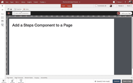
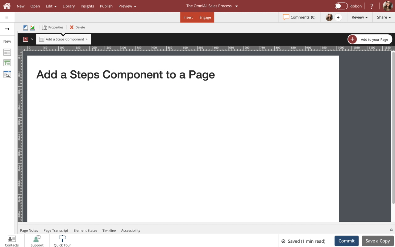
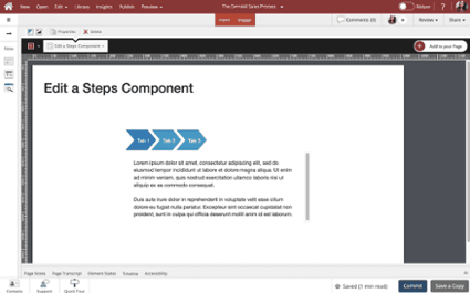
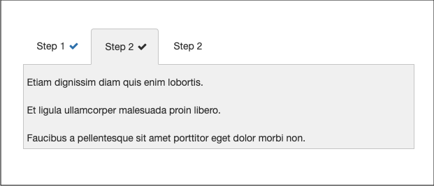
Use Steps to display information in a tabbed layout. Steps are available in a variety of orientations for you to choose from. All types can be formatted and styled for numerous appearances and behaviors.
4423   0
  |  
0   0

Add a Carousel Component to a Page

Steps to add a Carousel component to a Page.

Carousel is one of many components available on the Engage tab.

The learner can interact with the Carousel by clicking next/previous buttons to view the content on each slide.
5828   0
  |  
0   0

Edit a Carousel Component

Steps to edit a Carousel component.

You can add any content to each slide within the Carousel, as well as control many display and play options.
5603   0
  |  
0   0

Add a Flip Card component to a Page

Steps to add a Flip Card component to a Page.

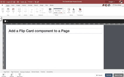
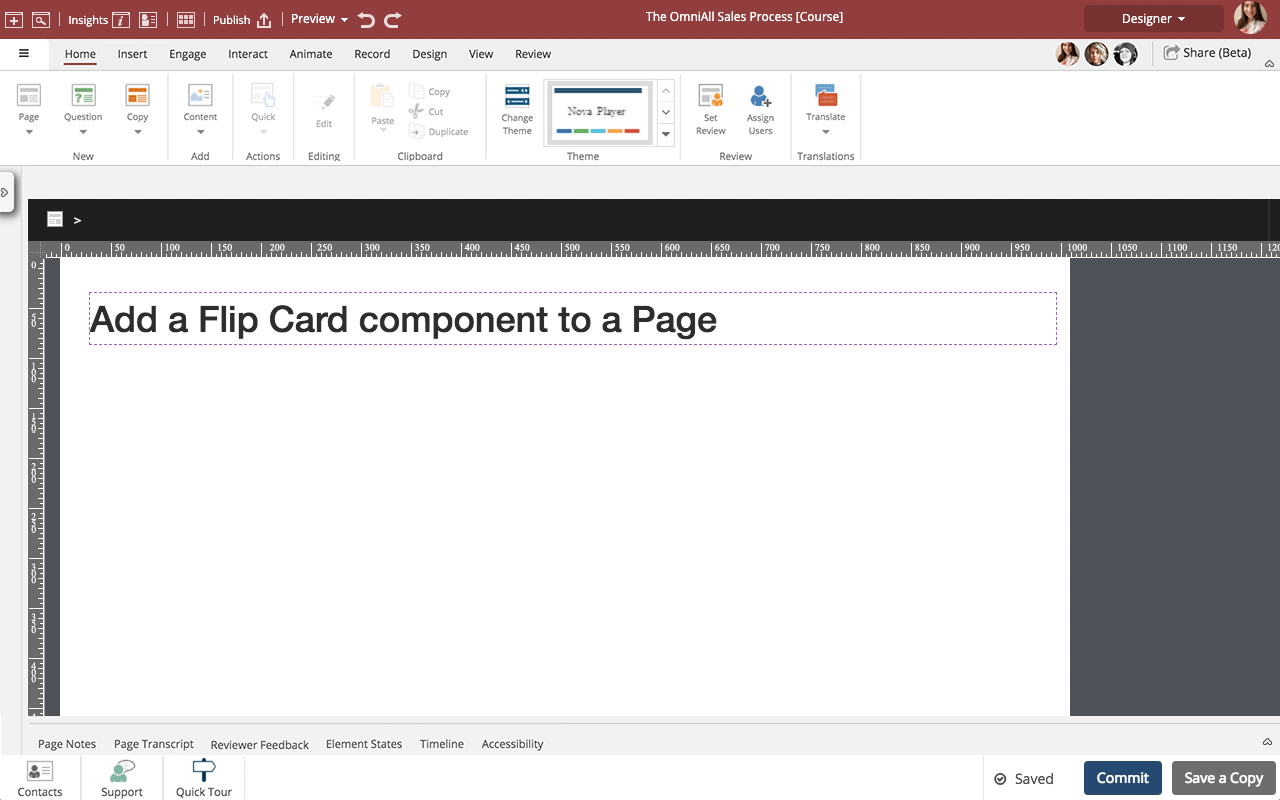
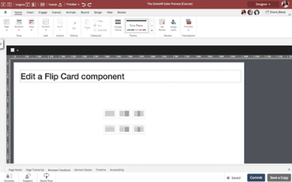
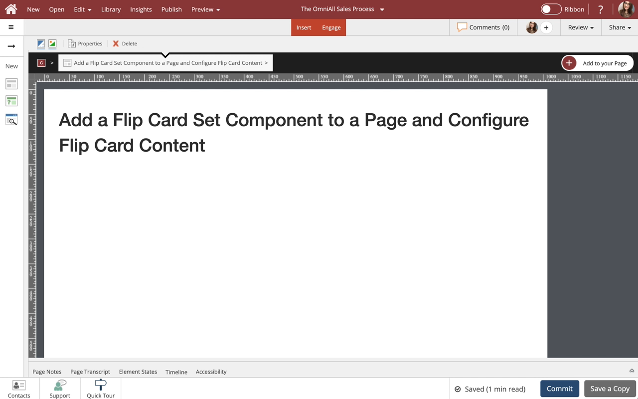
A Flip Card is one of many options available on the Engage tab's Interactive Components section. It allows you to add a single Flip Card to your page.

The learner can interact with the card to flip it from the front side to the back side.

There is also a Flip Set component in the Widgets area of the Engage tab which we recommend using if you want to have more than one flip card. The Flip Set offers better control over matching height than you ...
5819   0
  |  
0   0

Edit a Flip Card component

Steps to edit a Flip Card component.

You can add any content to the front and back of a Flip Card as well as control many display properties.
8646   0
  |  
0   0

Add a Reveal Component to a Page

Steps to add a Reveal component to a Page.

Reveal is one of many components available in the Engage tab.

The learning can interact with the Reveal component by clicking each tab to change the content shown.
4429   0
  |  
0   0

Edit a Reveal Component

Steps to edit a Reveal component.

You can add any content to the Reveal component, add multiple tabs, as well as control many display properties.
4506   0
  |  
0   0

Add a Tile Card Component to a Page

Steps to Add a Tile Card component to a Page.

Tile Cards are one of many components available on the Engage tab.

The learner can interact with the Tile Card when an action or trigger is applied to the card.
4224   0
  |  
0   0

Edit a Tile Card Component

Steps to edit a Tile Card component.

You can edit the text, change the icon on the Tile Card, as well as control the background display options.
4651   0
  |  
0   0

Add a Hover Animation to a Tile Card Component

Steps to add a Hover Animation to a Tile Card component.
5003   0
  |  
0   0

Add a Panel Component to a Page

Steps to add a Panel Component to a Page.

Panels are one of many components available on the Engage tab.

The learner can interact with a Panel by opening and closing it if allowed.
4291   0
  |  
0   0

Edit a Panel Component

Steps to edit a Panel component.

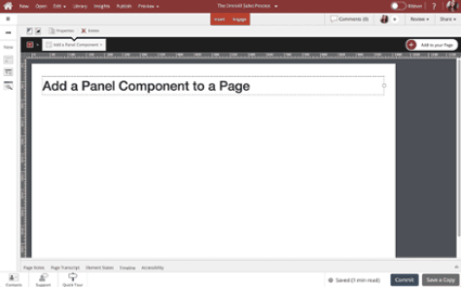
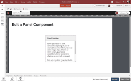
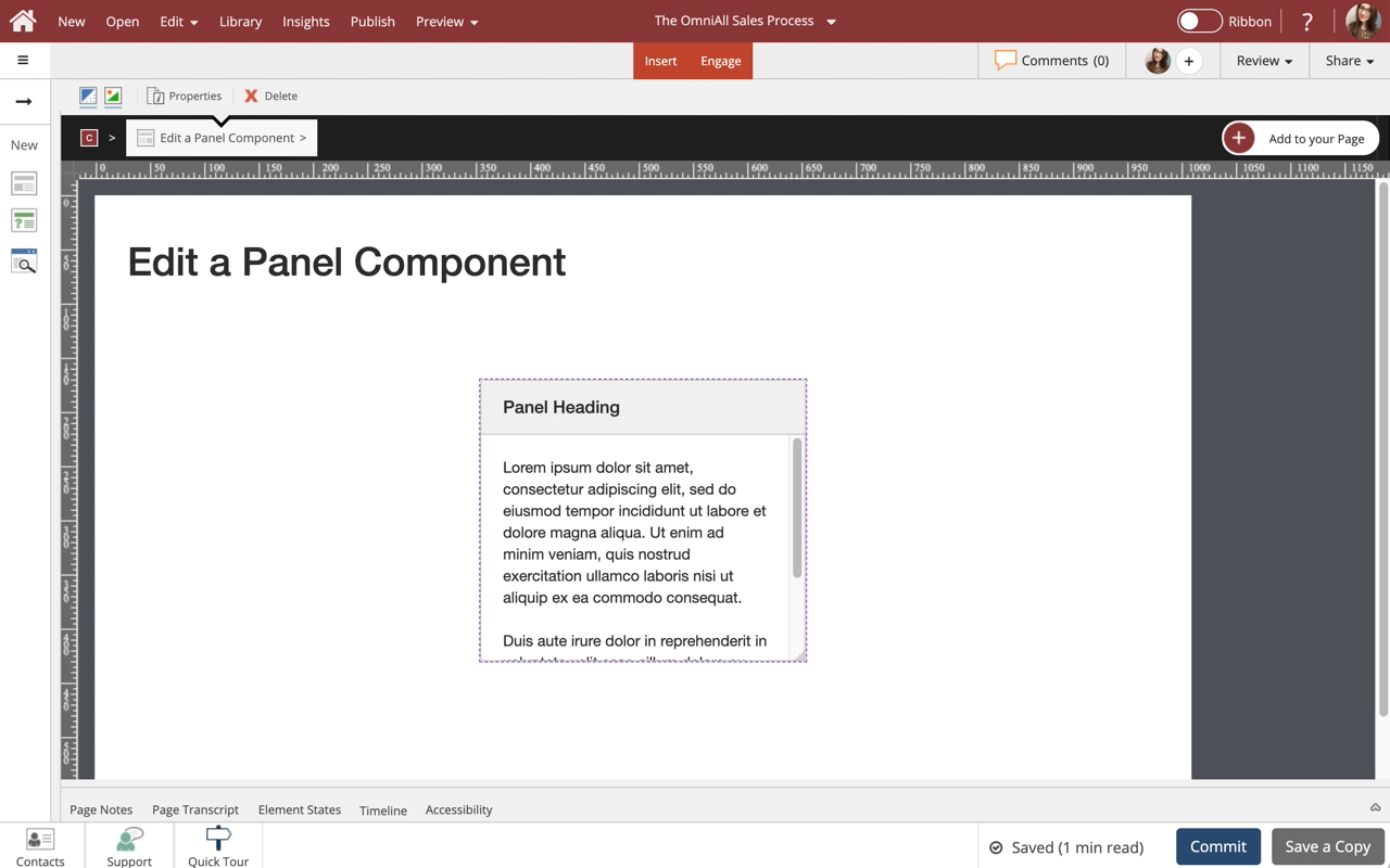
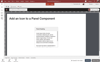
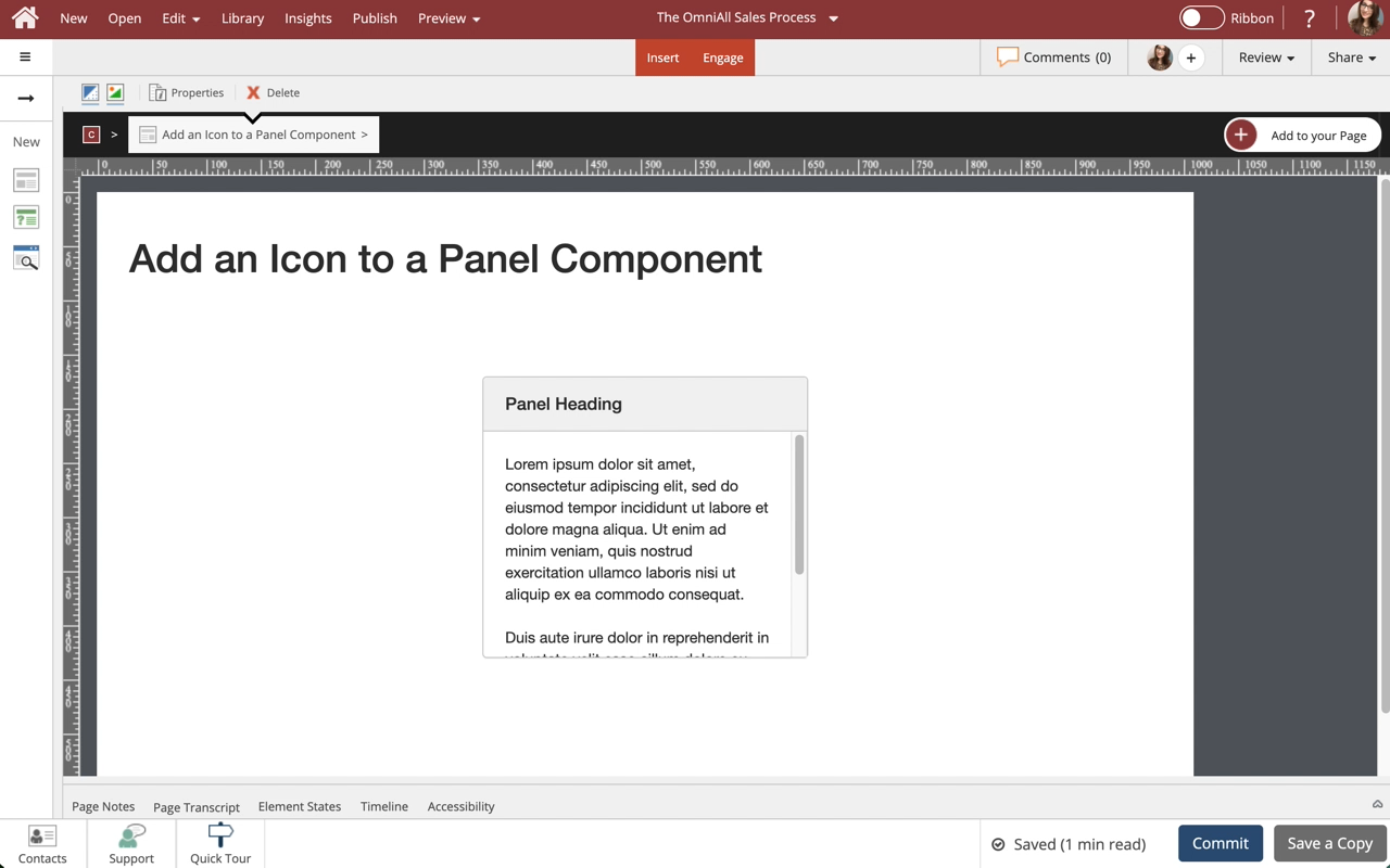
Use Panels to set apart certain information, and assign headers, footers, borders and styles as you see fit. This lesson covers controlling the display properties of the Panel component to suit your design needs.
5137   0
  |  
0   0

Add an Icon to a Panel Component

Steps to add an Icon to a Panel component.
4999   0
  |  
0   0

Add a Card Component to a Page

Steps to add a Card Component to a Page.

Cards are one of many components available in dominKnow.

The learner can interact with a Card by selecting the button within the card if applied.
4462   0
  |  
0   0

Edit a Card Component

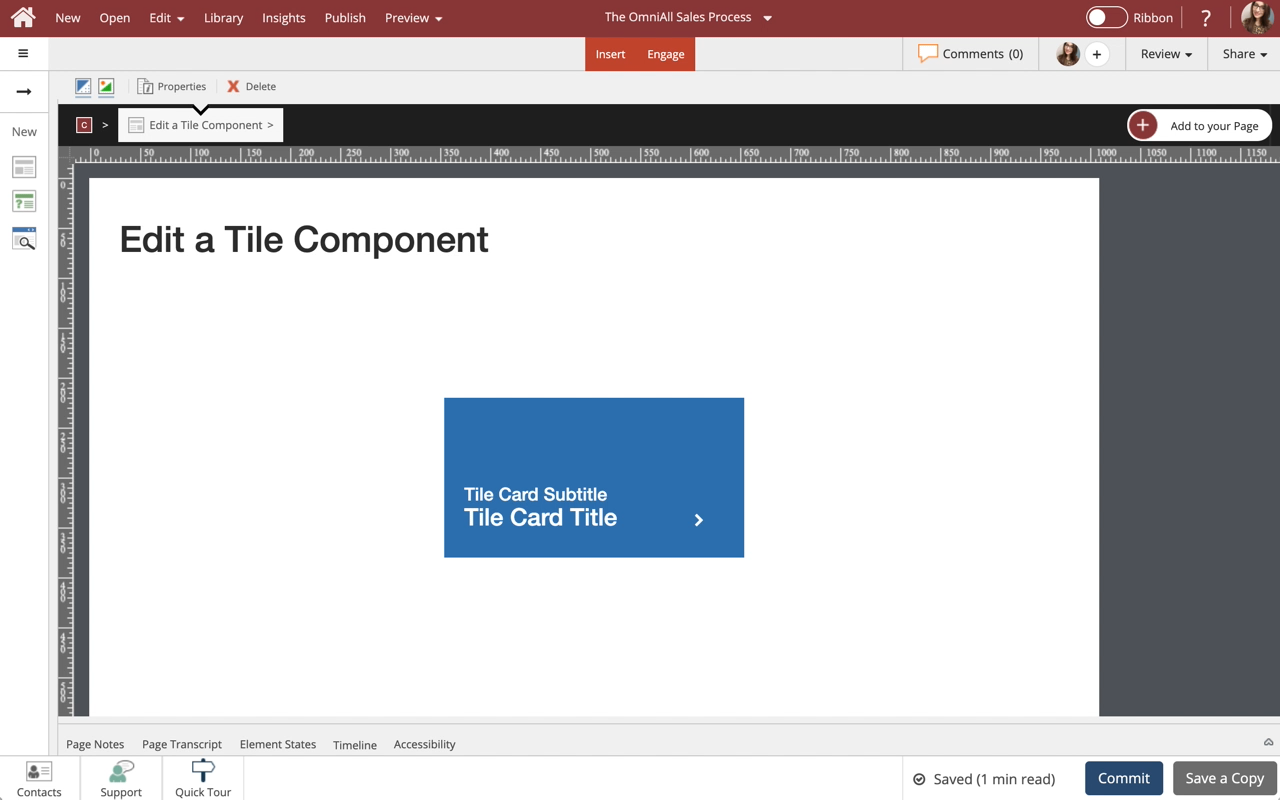
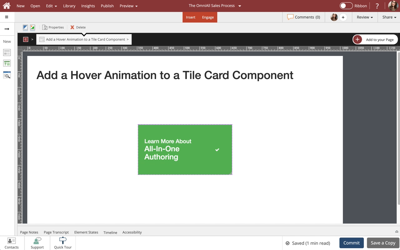
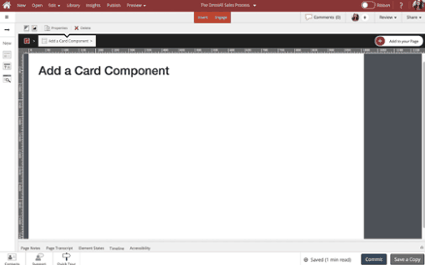
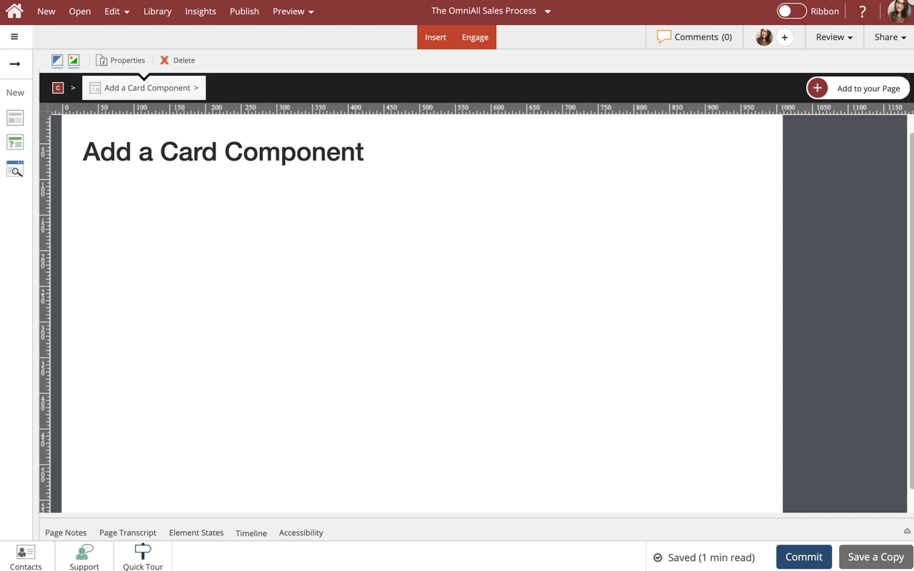
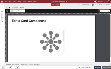
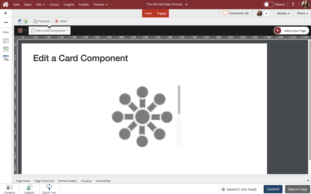
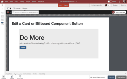
Use cards to set apart certain information, and assign headers, footers, borders and styles as you see fit. This lesson covers controlling the display properties of the Card component to suit your design needs.

Note: Cards are available in multiple styles with or without a Button. The buttons are easily set up just like any other button in dominKnow | One.
4654   0
  |  
0   0

Edit a Card or Billboard Component Button

Steps to edit a Card or Billboard component button.
4611   0
  |  
0   0

Add a Callout Component to a Page

Steps to add a Callout Component to a Page.

Callouts are one of many components available in dominKnow.
16726   0
  |  
0   0

Edit a Callout Component

Steps to edit a Callout component.

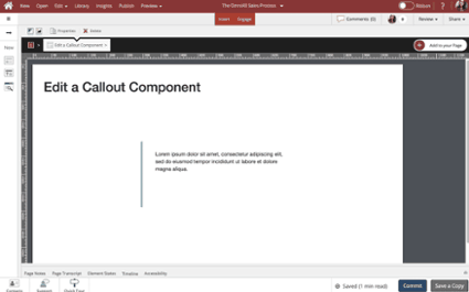
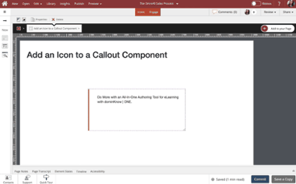
Use callouts to set apart certain information, and add various styles, borders and icons. This lesson covers controlling the display properties of the Callout component to suit your design needs.
8958   0
  |  
0   0

Add an Icon to a Callout Component

Steps to add an Icon to a Call Out component.
6111   0
  |  
0   0

Add a Billboard Component to a Page

Steps to Add a Billboard Component to a Page.

Billboards are one of many components available on the Engage tab.

Learners can interact with a Billboard by clicking the button if applied.
4683   0
  |  
0   0

Edit a Billboard Component

Steps to Edit a Billboard component.

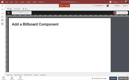
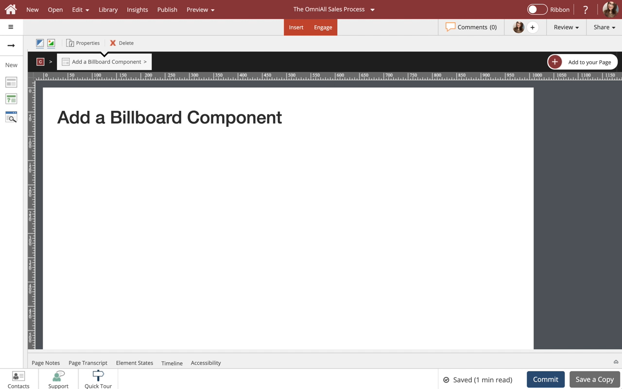
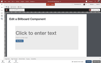
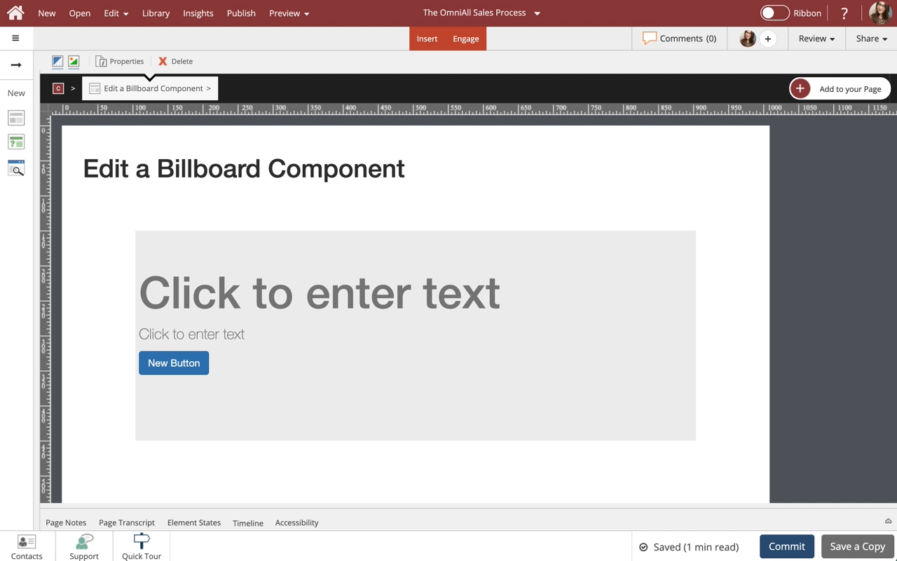
Use billboards as your big attention-grabbers. This lesson covers controlling the display properties of the Billboard component to suit your design needs.
Note: Billboards are available in multiple styles with or without a Button. The buttons are easily set up just like any other button in dominKnow | One.
4860   0
  |  
0   0

Add a Timeline Component to a Page in Flow

Steps to add a Timeline Component to a Page in Flow.

Timeline component is one of many components available on the Engage Tab in Flow.
5157   0
  |  
0   0

Edit a Timeline Component in Flow

Steps to Edit the Timeline Component in Flow.

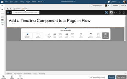
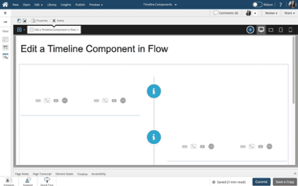
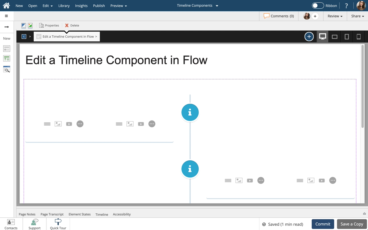
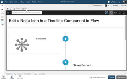
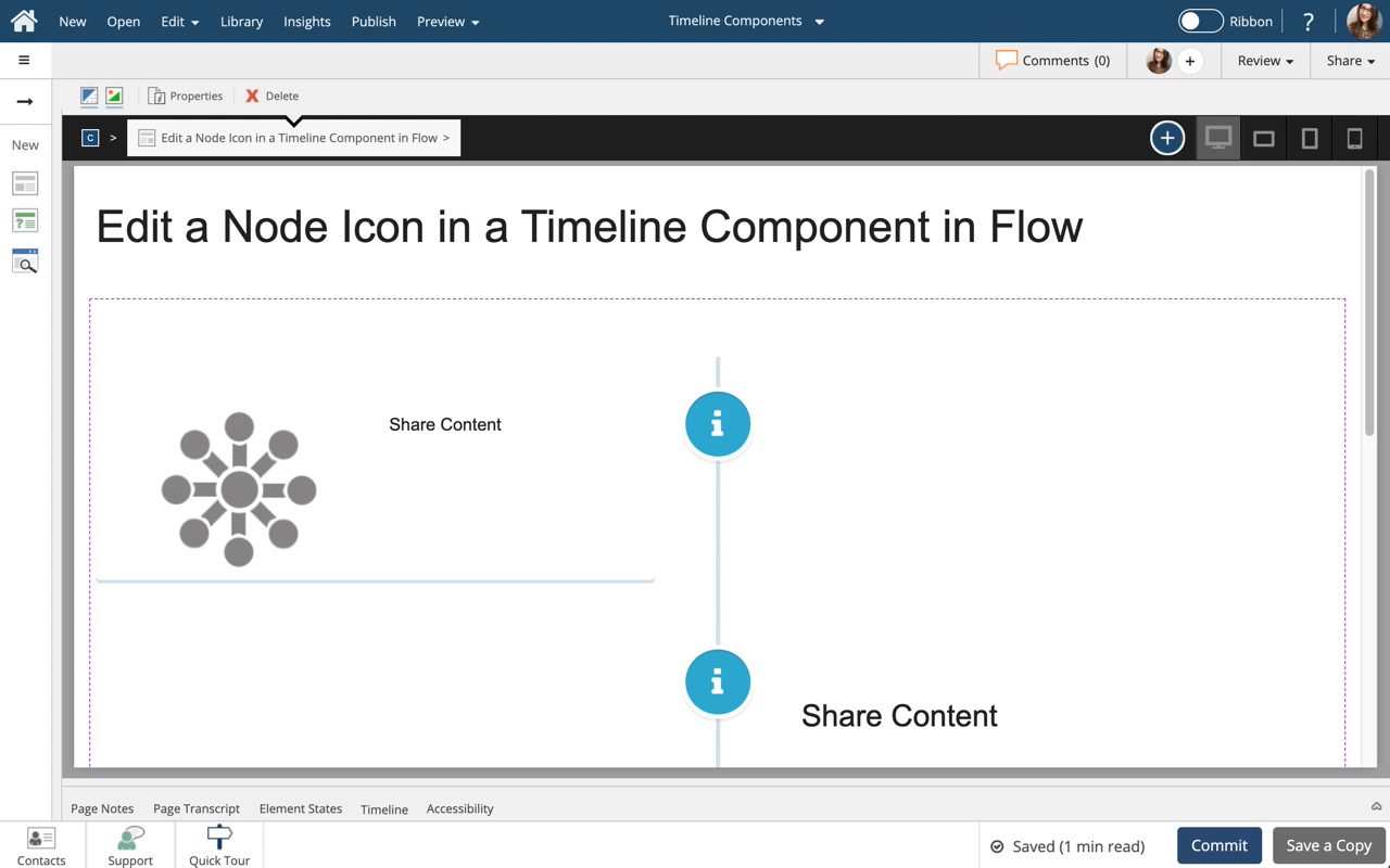
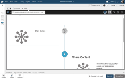
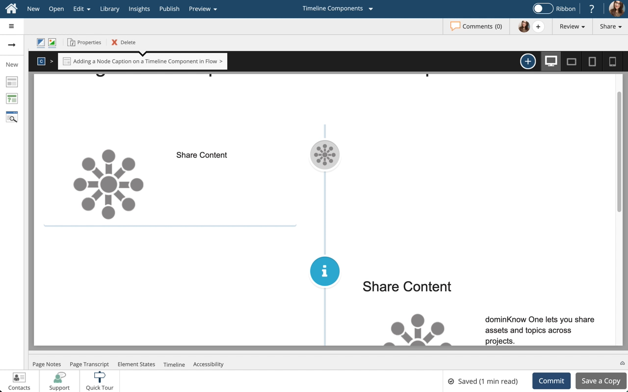
Use Timelines to create a graphical representation of information that is displayed sequentially along a vertical line. This lesson covers editing of the Timeline Component Content.

Note: Timelines are only available in Flow.
5050   0
  |  
0   0

Edit a Node in a Timeline Component in Flow

Steps to Edit the Node in a Timeline component in Flow.
5969   0
  |  
0   0

Adding a Node Caption on a Timeline Component in Flow

Steps to Add a Caption to a Node within a Timeline component in Flow.
5213   0
  |  
0   0

Resize an Engage Component in Claro

Steps on how to resize any Engage Component in Claro.

Resize a Tabset, Accordion, Steps, Carousel, Reveal, Tile Card, Flip Card, Scenario, Card Sets, Video Playlists, Panel, Card, Callouts, Billboard, and inline questions.
4848   0
  |  
0   0

Add a Flip Card Set Component to a Page and Configure Flip Card Content

Steps to add and a Flip Card Set component to a page and configure the Flip Cards within the set.

Flip Card Sets are one of many components available on the Engage tab.
5703   0
  |  
0   0

dominKnow | ONE - Scenario Builder

dominKnow | ONE’s scenario builder makes it easy to create branching activities.

There’s no programming so it's easy to use. Plus, it’s fully responsive so it will work great on any screen.
2568   0
  |  
0   0

Getting Started with the Scenario Builder

A walk-through of the basics of using the Scenario Builder widget available on the Engage Tab.
11135   0
  |  
0   0

Flash Card Sets - Overview

Flash Cards Sets are an interactive Engage component.
1727   0
  |  
0   0

Match Card Sets - Overview

Match Card Sets are an interactive Engage component that you can use in Flow or Claro content Projects.
1977   0
  |  
0   0

Adding a Video Playlist widget to your page

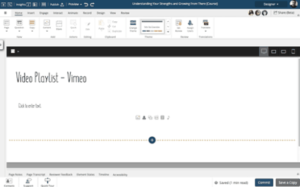
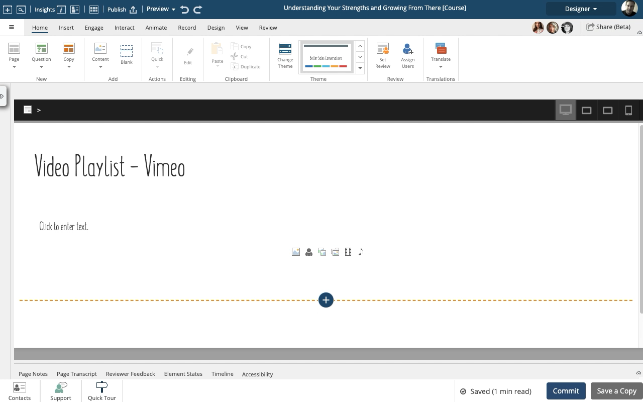
The Video Playlist widgets make it easy to add a collection of Vimeo or YouTube videos to any page.

Check out the drag and drop option for adding more videos, it's a great time saver.

When added to a Flow page, the Playlist is responsive. On wider screens the list of videos will display on the right side of the main video panel. On narrower screens the list of videos will be shown under the main video panel.

NOTE: You can't mix YouTube and Vimeo videos in the same Playlist.
5669   0
  |  
0   0

Setting Tabsets, Accordion Menus, Flip Cards and Carousels to show a completion checkmark

1 min read
A Publishing Profile setting lets you show learners what they've completed on these interactive Engage components
2159   0
  |  
0   0

Working with the Sorting Inline Quiz Element

Use inline quiz elements to quickly add questions to your existing content pages.
3200   0
  |  
0   0

Working with the True or False Inline Quiz Element

Use inline quiz elements to quickly add questions to your existing content pages.
2808   0
  |  
0   0

Working with the Multiple Pulldown Inline Quiz Element

Use inline quiz questions to quickly add questions to your existing content pages.
2962   0
  |  
0   0

Working with the Multiple Choice Inline Quiz Element

Use inline quiz elements to quickly add questions to your existing content pages.
2978   0
  |  
0   0

Working with the Fill in the Blanks Inline Quiz Element

Use inline quiz elements to quickly add questions to your existing content pages.
3430   0
  |  
0   0

Working with the Drag the Word Inline Quiz Element

Use inline quiz elements to quickly add questions to your existing content pages.
2908   0
  |  
0   0

Working with the Click the Word Inline Quiz Element

Use inline quiz elements to quickly add questions to your existing content pages.
2906   0
  |  
0   0

New Inline Quiz Elements

dominKnow | ONE’s Summer 2021 (7.4) Feature Release adds five new interactive quiz elements that can be used on any page in Claro or Flow projects.
939   0
  |  
0   0

Element Controls for Components in Flow

1 min read
Enjoy quick access to menu items, the container inspector options and more!
713   0
  |  
0   0

Element Controls for Components in Claro

1 min read
Enjoy quick access to menu items, the container inspector options and more!
754   0
  |  
0   0