https://uxdesign.cc/responsive-web-design-rwd-guide-to-responsive-typography-7c4836e9df0e
Responsive Typography Considerations

Product: dominKnow | ONE | Version: 7.4
Applies to: Flow | Edition: Solo, Team, Business, Enterprise
Applies to: Flow | Edition: Solo, Team, Business, Enterprise
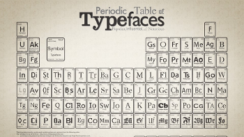
The UX Community has done all the Research
Special thanks to Amy Parent for sharing this article with me. Like many of you I've been simply going with my gut on typography decisions. And also know that the dominknow team has already built in defaults that are great.
For example, I've often wondered if there was a comfortable standard for the width of my text elements. When I use a single column they feel too wide on the desktop, but narrowing them down to something comfortable feels like I'm leaving a lot of unused space. According to the article:
The line length is very crucial to allow the user to move comfortably to the next line, therefore for any display, it is recommended to have the maximum line length to be around 75–80 characters and the minimum line length to be around 35–40 characters.
The article has a bunch of links to other articles on Responsive Typography as well. I highly suggest reading them all if you can.
REMEMBER: Responsive design is NOT new. It may be new to us as eLearning developers, but there is a massive community of internet, and app user experience designers that have already done all the hard work and research figuring out what designs work best. Let's follow their lead.
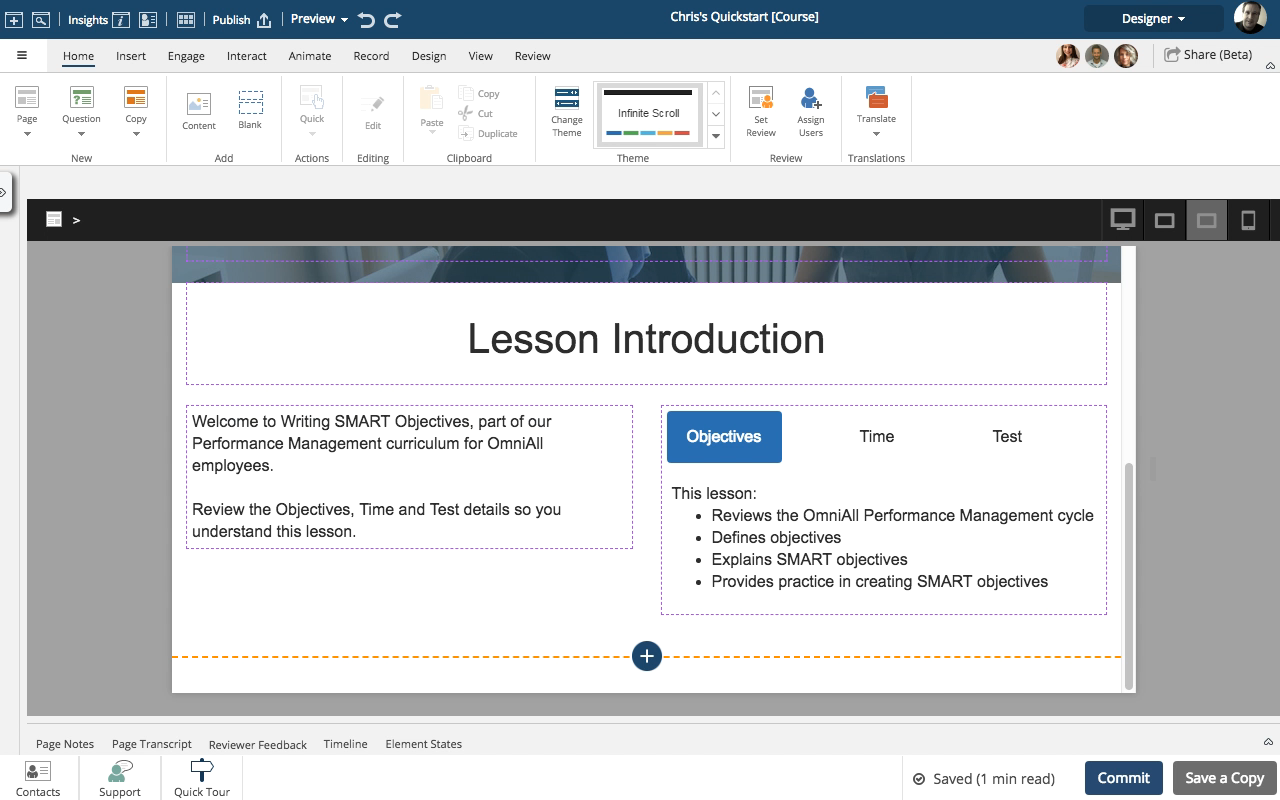
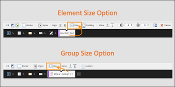
UPDATE: I also learned about the "Size" feature in the Typography section of the Theme Builder. Setting it to -10% will automatically reduce the size of a font that uses H1, H2, H3, or H4 when the viewport is extra-small (mobile phone).


Comments ( 0 )
Sign in to join the discussion.