Create meaningful and engaging custom interactions in any elearning project

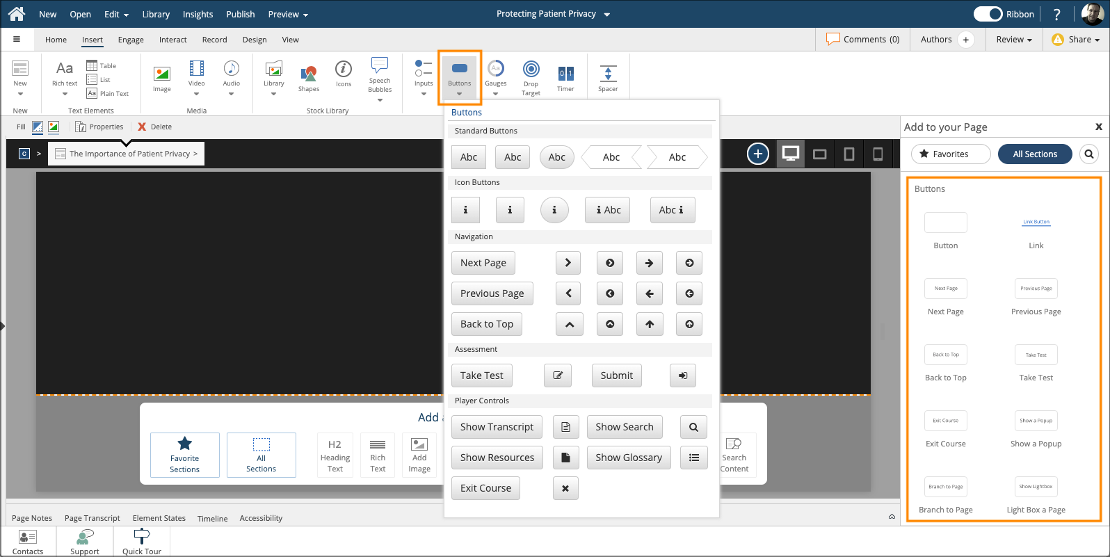
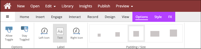
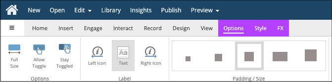
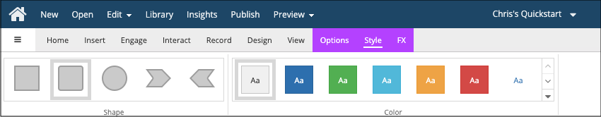
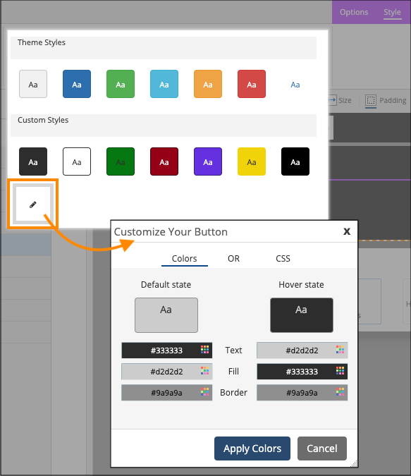
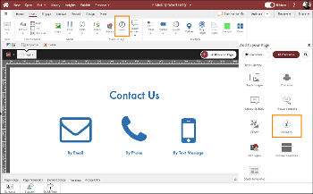
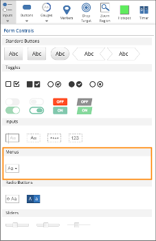
You can add a button element to any Page in Claro or Flow.

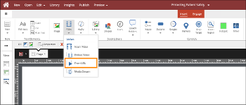
You can add them from the Buttons section of the Add to Your Page panel, or from the Buttons drop-down menu on the Insert tab on the Ribbon.

Both places have options for buttons that do not yet have actions assigned to them as well as pre-set action buttons, such as buttons already set up to go to the next or previous page or carry out other functions.


Edit the Button’s Label Text

To edit the Button’s Label Text, select the element then select the Edit option (pencil icon).

Adding and Editing Actions 

To add Actions to the button, select the element then select the Actions option (lightning bolt).

If the button was pre-set with an action (such as a Next Button), or if you’ve already set up actions, the Actions option (lightning bolt) will show a dark bubble.

Selecting the Actions option will show you options to edit the Actions previously added to the Button.

Button Elements Options Tab

The Options tab is different in Claro and Flow.


Options Tab in Claro

In Claro the Options tab has settings for: 

  • Allow Toggle: This option will set the button to its alternate color when clicked and return it to its original color when clicked again.
  • Stay Toggled: Will lock the button in its alternate state when clicked. Additional clicks will not restore original color.

You can also show or hide an icon on the left or right side of the button plus show or hide the button’s text label.

In Claro, the Padding/Size options are not available as they don’t apply.


NOTE: In Claro you can set the size of the button by selecting the element then dragging the triangular handle in its lower right corner or set specific dimensions using the Height and Width fields in the selection control bar above the stage.

Options Tab in Flow

In Flow, the button’s width will be set by default based on the amount of text added in its label.  

On the Options tab in Flow you can choose to set the button to fit the Full Size (width) of its element.

Just as in Claro, you also have settings for:

  • Allow Toggle: This option will set the button to its alternate color when clicked and return it to its original color when clicked again.
  • Stay Toggled: Will lock the button in its alternate state when clicked. Additional clicks will not restore original color.

And you can also show or hide an icon on the left or right side of the button plus show or hide the button’s text label.

In Flow, you cannot set a specific button size. But you can use the Padding/Size options to set a relative size for the button. 


Button Elements Style Tab

On the Button element’s Style tab you can set a shape for the button.

You can also set the button’s color. 


When you select the down-triangle on the Color list, the first row of color options are based on the Theme’s default color settings.

The second row of colors are the additional button styles you can set in the Theme.

If you select the Edit option (pencil icon) you can also set custom color or CSS values for the button you are currently working with.


  0     0

Similar Projects

Questions  ( 0 )