
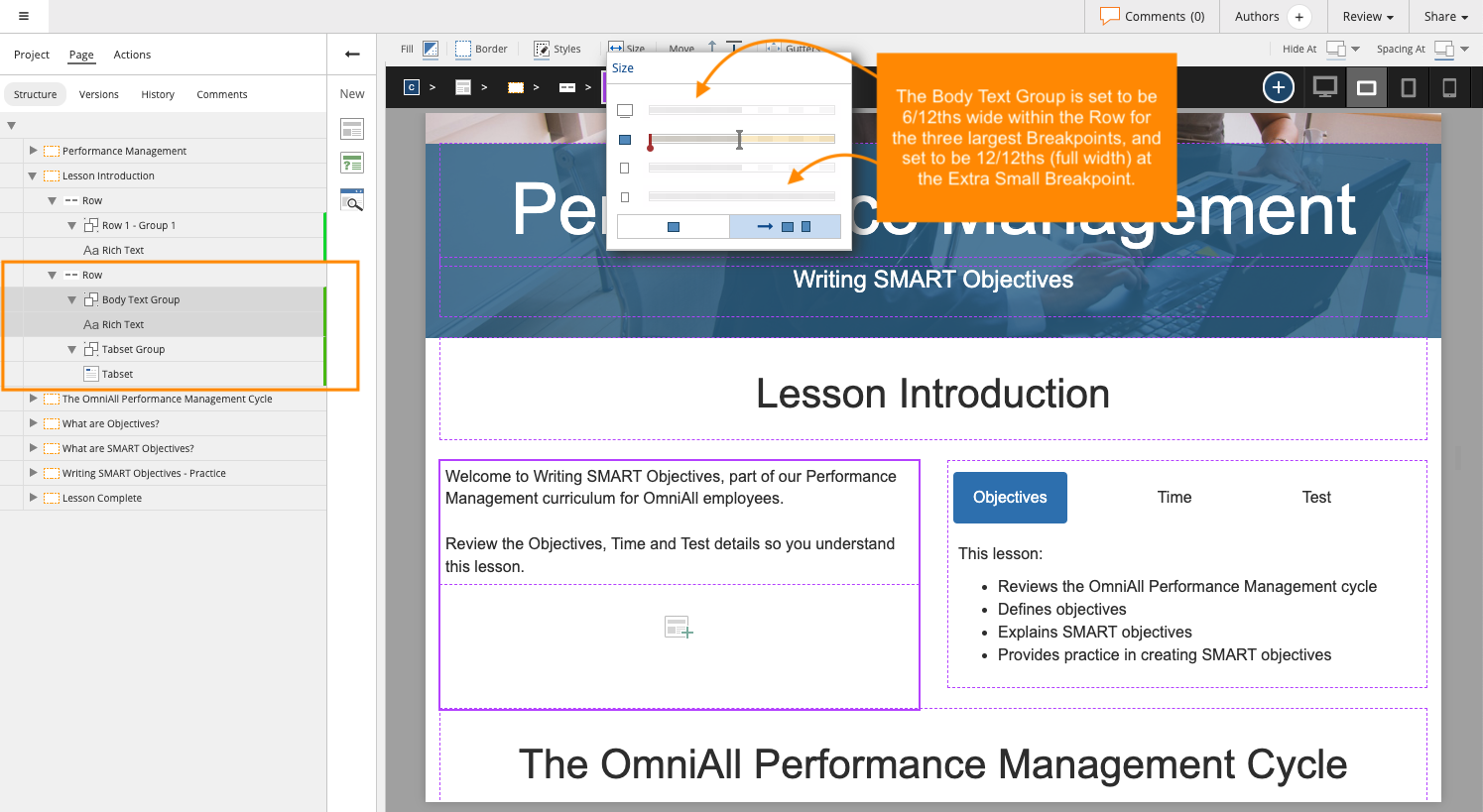
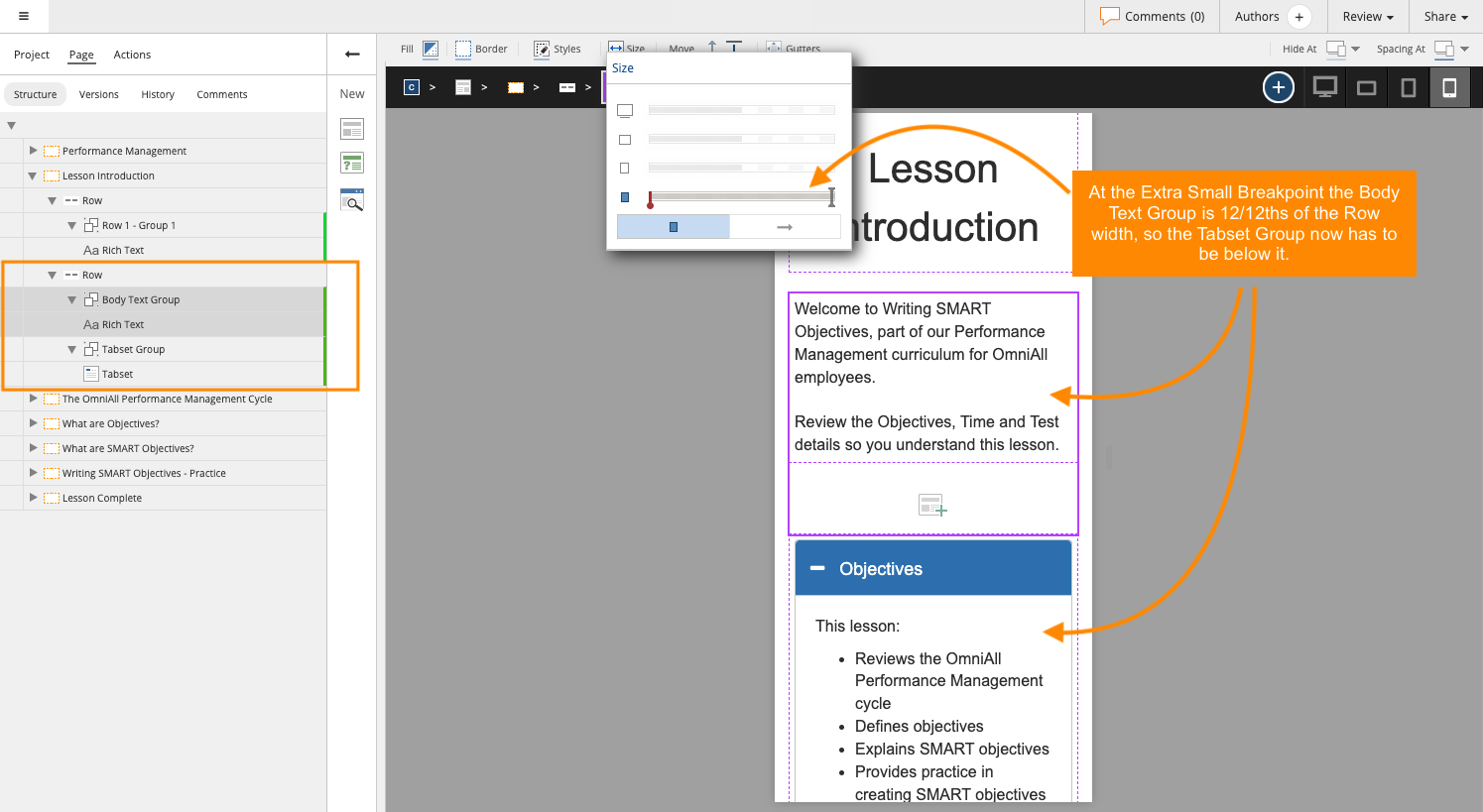
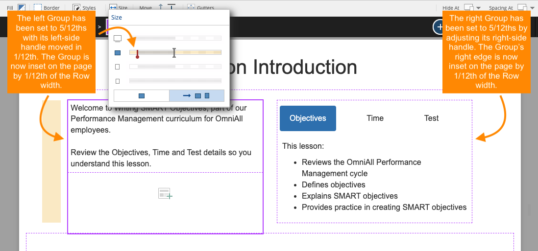
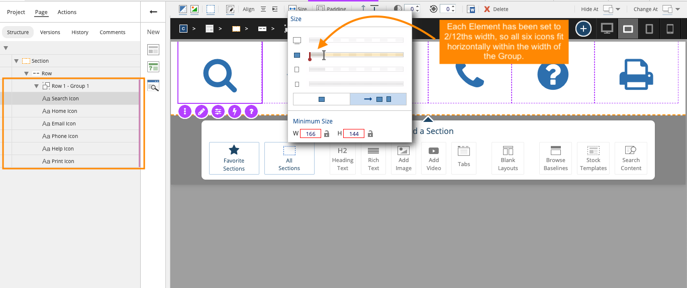
The power of a Flow page is that your content layout can switch from horizontal to vertical at different breakpoints. This means you can create experiences that better-serve your learners across different devices and browser widths.
Of course, if you're using Flow already, you already know this.
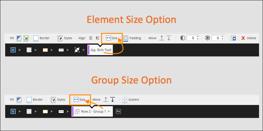
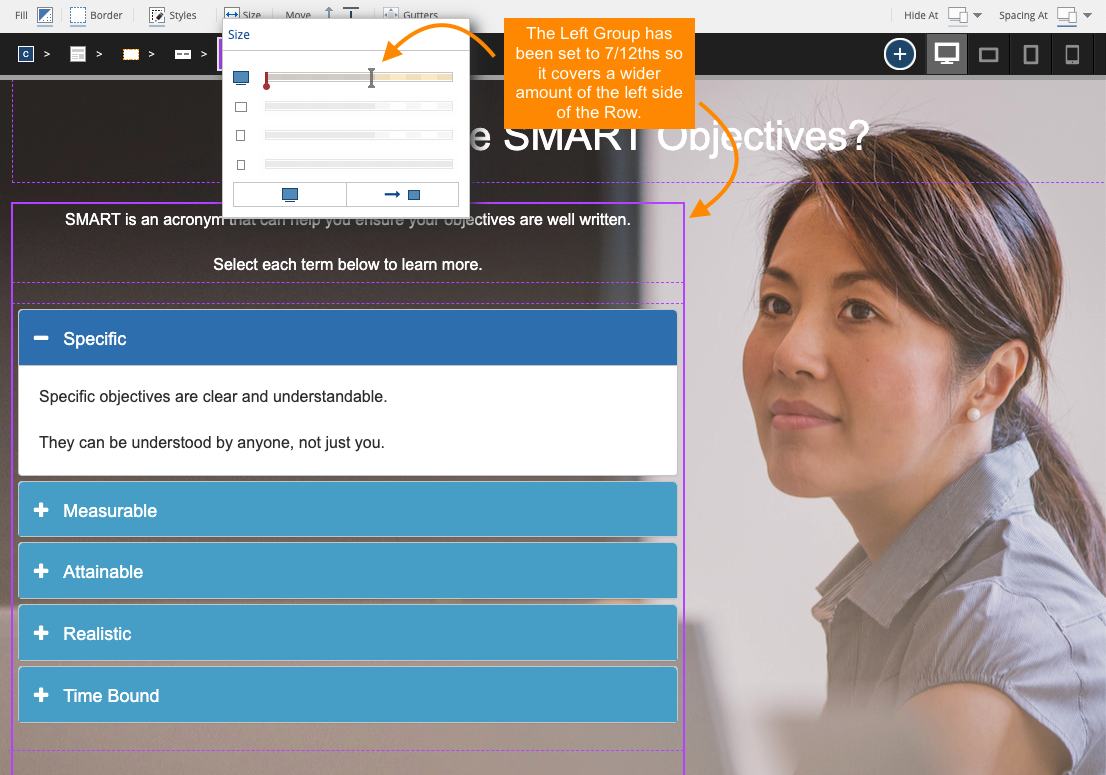
What’s less-known is how this switch from horizontal to vertical is actually carried out. And understanding this can open up a range of control over responsive layout behavior as well as layout design options for you.


Comments ( 0 )
Sign in to join the discussion.