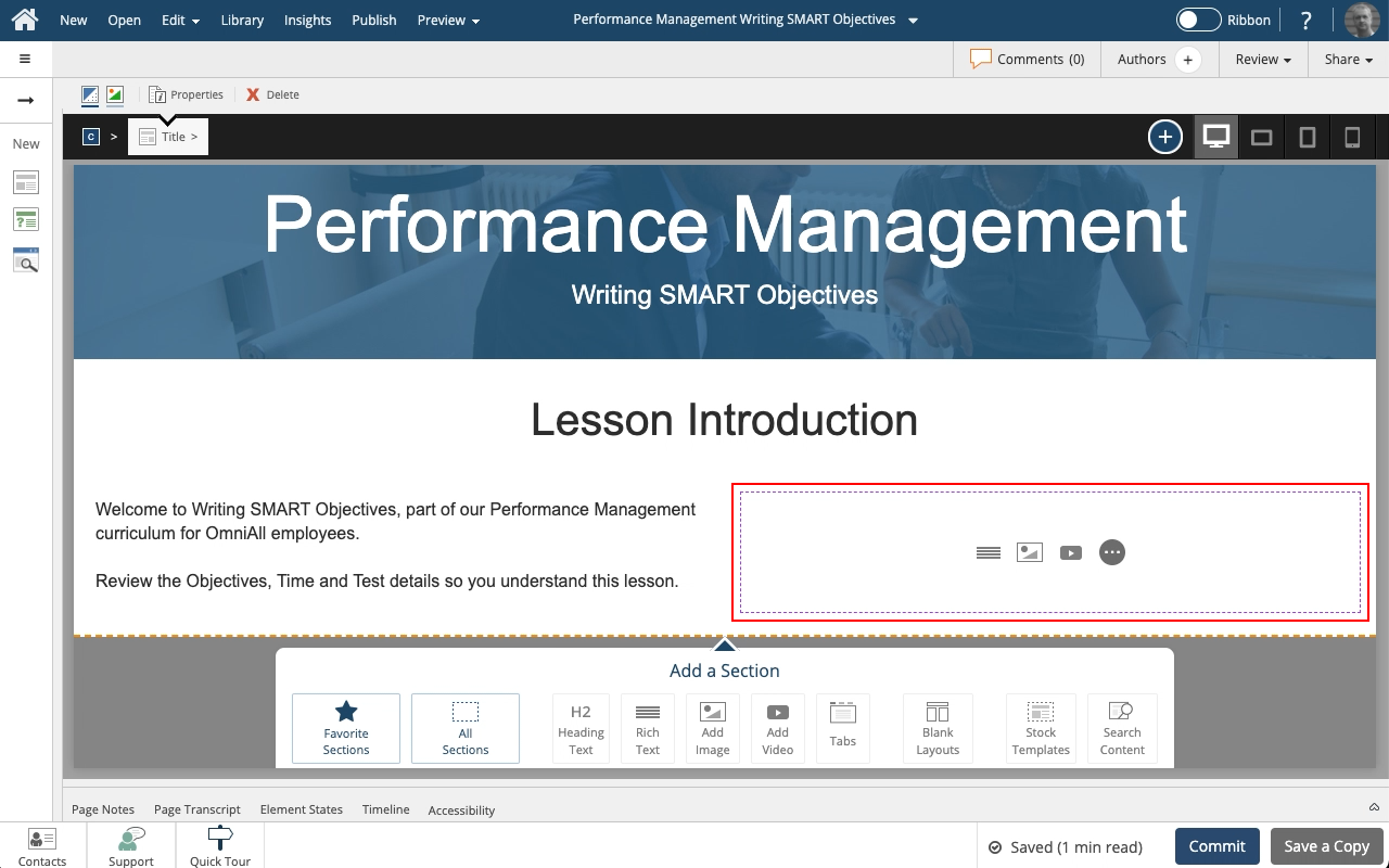
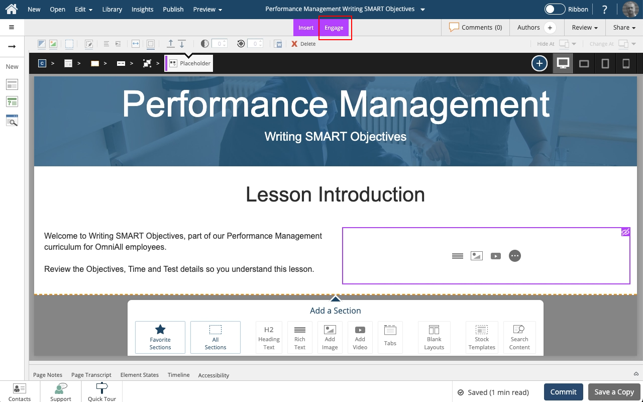
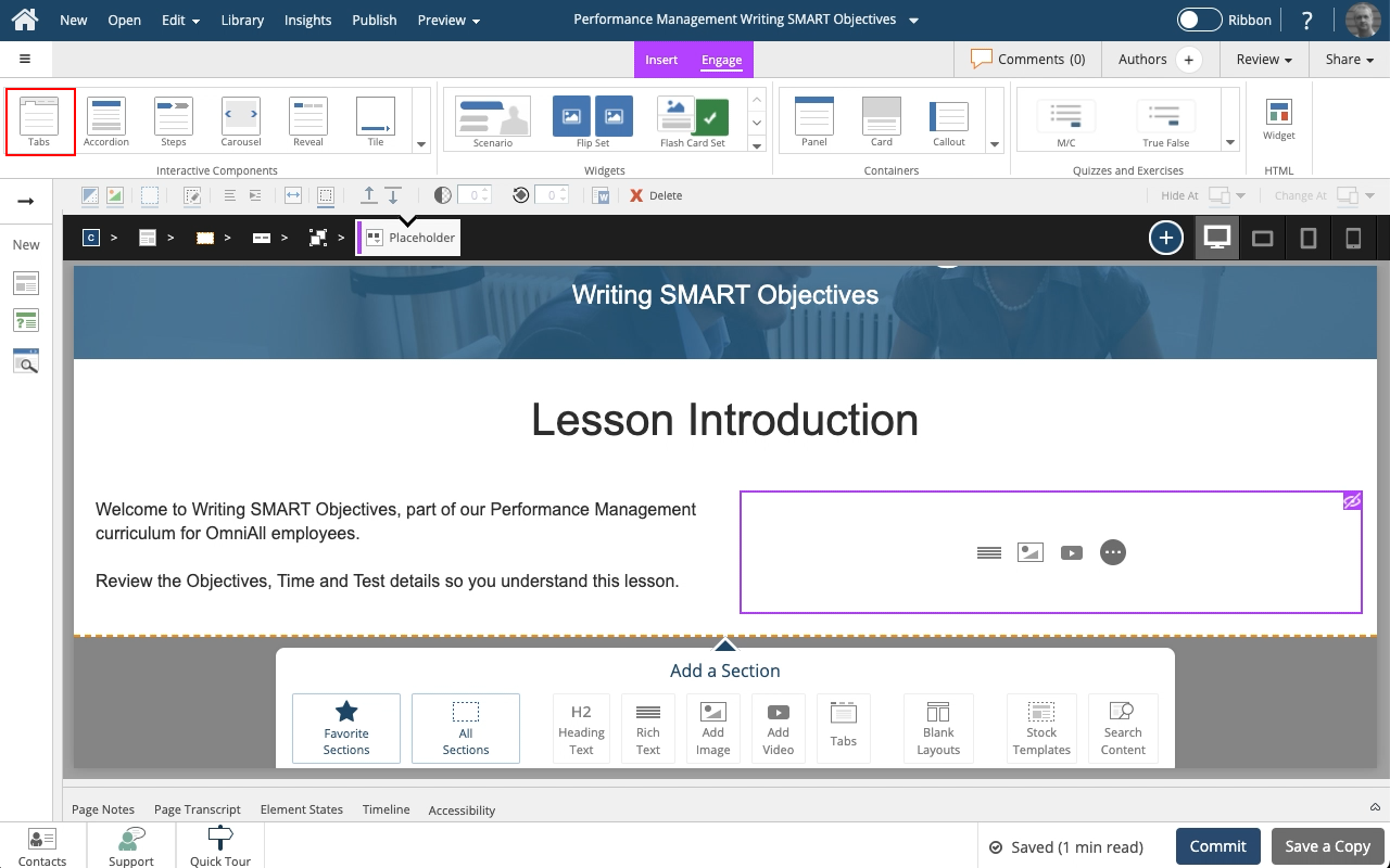
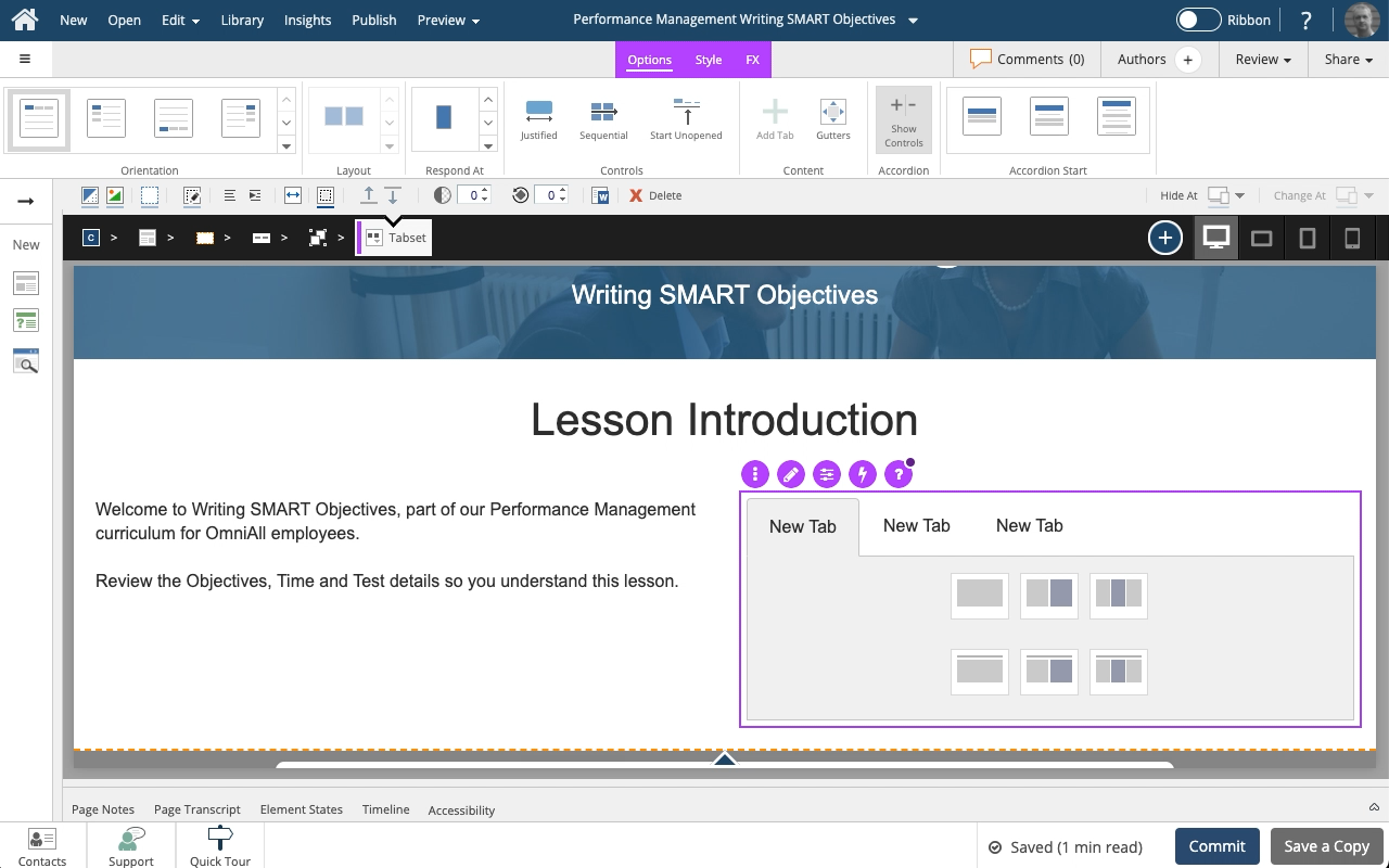
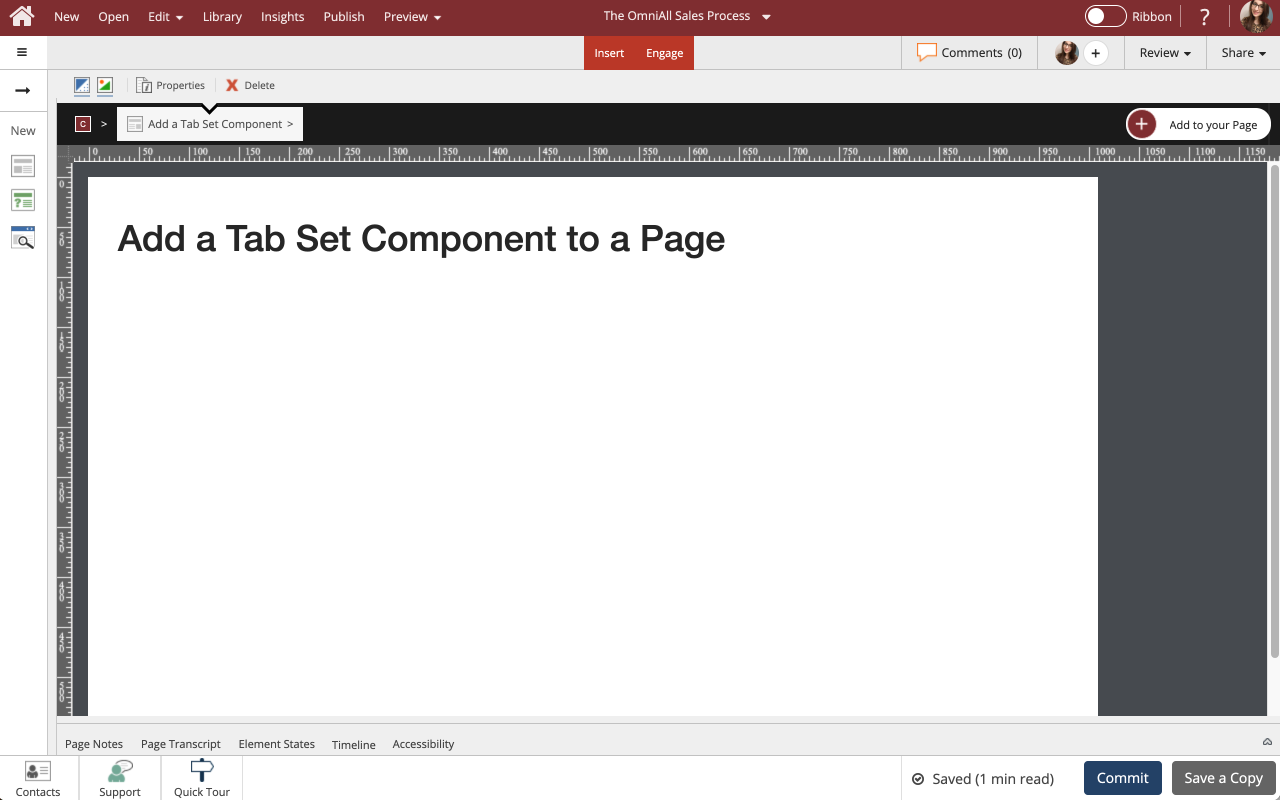
Steps to add a Tab Set component from the Engage tab to an empty Placeholder on a Flow Page.
Engage components have their own internal responsive behavior when used in Flow pages. Tab Sets, for example, can change from a horizontal tab set to a vertical accordion menu based on breakpoint. This provides a better user experience on a narrower screen such a smartphone held in portrait orientation.
Steps to add a new element to an existing Group on a Flow Page.
This lesson outlines adding a Text element. The same steps can be used to add an image, video or any other element type.
Steps to add a Tab Set Component to a Page.
Tab Sets are one of many components available on the Engage Tab.
The learner can interact with the Tab Set by clicking each tab to change the content shown.
Steps to add a new element to an existing Group on a Flow Page.
Steps to add a standard button to a Placeholder on your page.
Steps to add a Text Input box to a Placeholder on your Page.
Flow allows you to control what content on your page gets shown at different breakpoints. It’s quick and easy to Hide content this way.
In this lesson we’ll set a graphic to be hidden when the page is viewed within the Extra Small breakpoint range.
Steps to add a Tab set component from the Engage tab to an empty Placeholder on a Flow Page.
Engage components have their own internal responive behavior when used in Flow pages. Tab sets, for example, can change from a horizontal tab set to a vertical accordion menu based on breakpoint. This provides a better user experience on a narrower screen such a smartphone held in portrait orientation.
Steps to add an Icon to a Tab Set, Accordion, Steps, and Reveal Components.
Icons are one of many design options you can add to Components on the Engage tab.
Flow allows you to control what content on your page gets shown at different breakpoints. It’s quick and easy to Hide content this way.
In this lesson we’ll set a graphic to be hidden when the page is viewed within the Extra Small breakpoint range.
Steps to set a background (fill) color on an element.
Setting a background color can be used for many visual effects.
In this example, we have a text element over an image and it's difficult to read the text.
We can add a background or fill color to help the text stand out more.
Giving the background color a slight transparency allows the image to still be seen through the text element, which can be an interesting visual design effect.
Steps to add a new element to an existing Group on a Flow Page.
This lesson outlines adding a Text element. The same steps can be used to add an image, video or any other element type.
Steps to add a Tab Set Component to a Page.
Tab Sets are one of many components available on the Engage Tab.
The learner can interact with the Tab Set by clicking each tab to change the content shown.
Steps to add a new element to an existing Group on a Flow Page.
Steps to add a standard button to a Placeholder on your page.
Steps to add a Text Input box to a Placeholder on your Page.
Flow allows you to control what content on your page gets shown at different breakpoints. It’s quick and easy to Hide content this way.
In this lesson we’ll set a graphic to be hidden when the page is viewed within the Extra Small breakpoint range.
Steps to add a Tab set component from the Engage tab to an empty Placeholder on a Flow Page.
Engage components have their own internal responive behavior when used in Flow pages. Tab sets, for example, can change from a horizontal tab set to a vertical accordion menu based on breakpoint. This provides a better user experience on a narrower screen such a smartphone held in portrait orientation.
Steps to add an Icon to a Tab Set, Accordion, Steps, and Reveal Components.
Icons are one of many design options you can add to Components on the Engage tab.
Flow allows you to control what content on your page gets shown at different breakpoints. It’s quick and easy to Hide content this way.
In this lesson we’ll set a graphic to be hidden when the page is viewed within the Extra Small breakpoint range.
Steps to set a background (fill) color on an element.
Setting a background color can be used for many visual effects.
In this example, we have a text element over an image and it's difficult to read the text.
We can add a background or fill color to help the text stand out more.
Giving the background color a slight transparency allows the image to still be seen through the text element, which can be an interesting visual design effect.
Comments ( 0 )
Sign in to join the discussion.