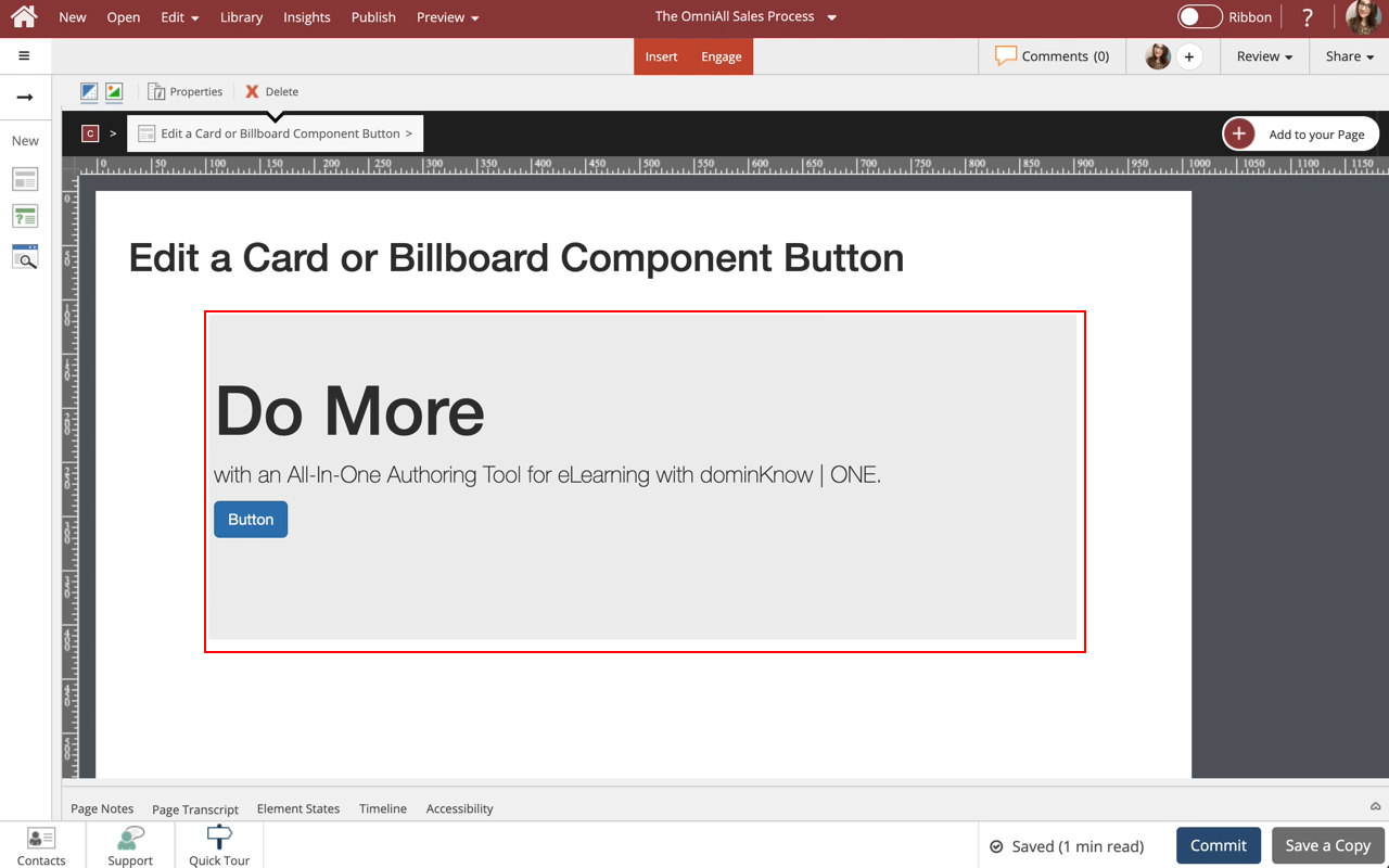
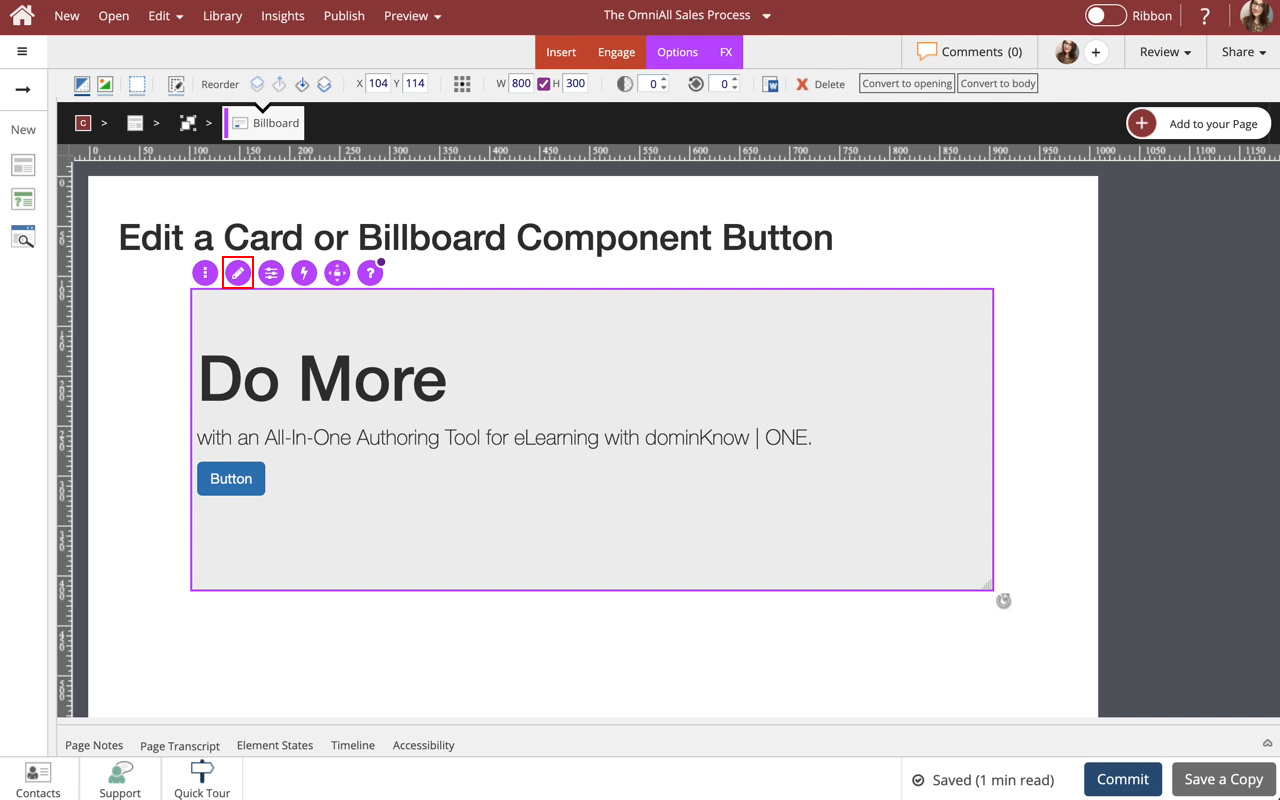
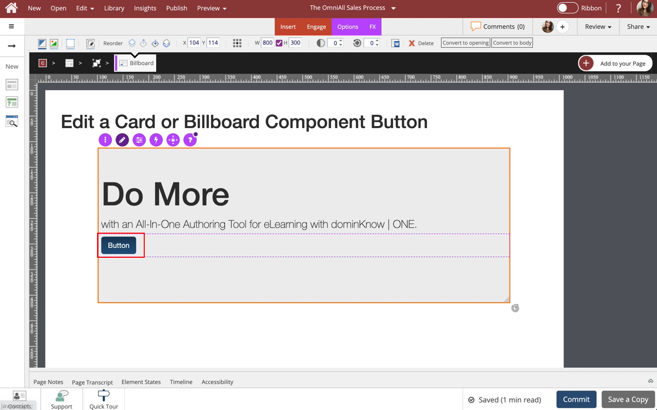
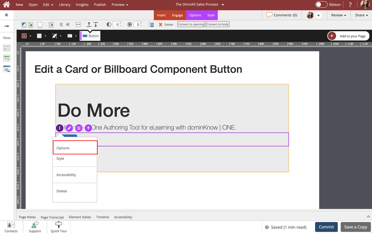
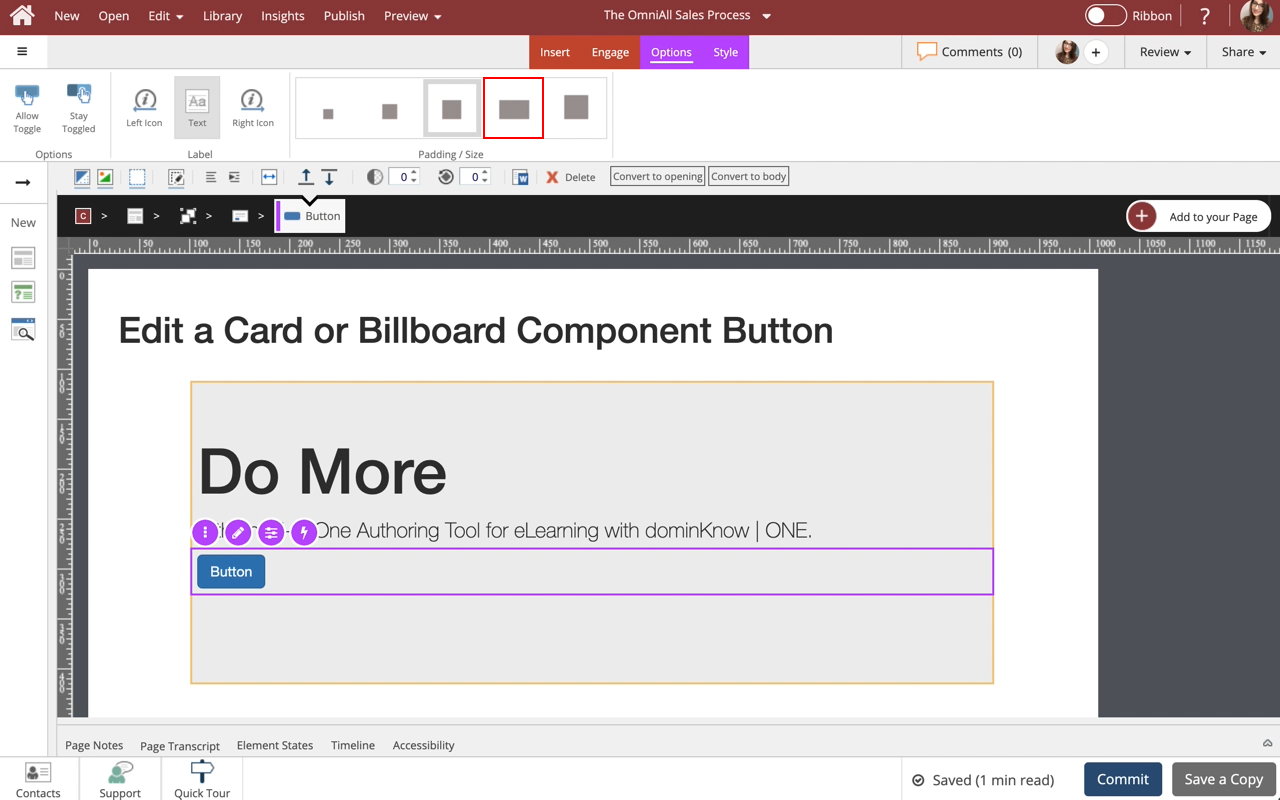
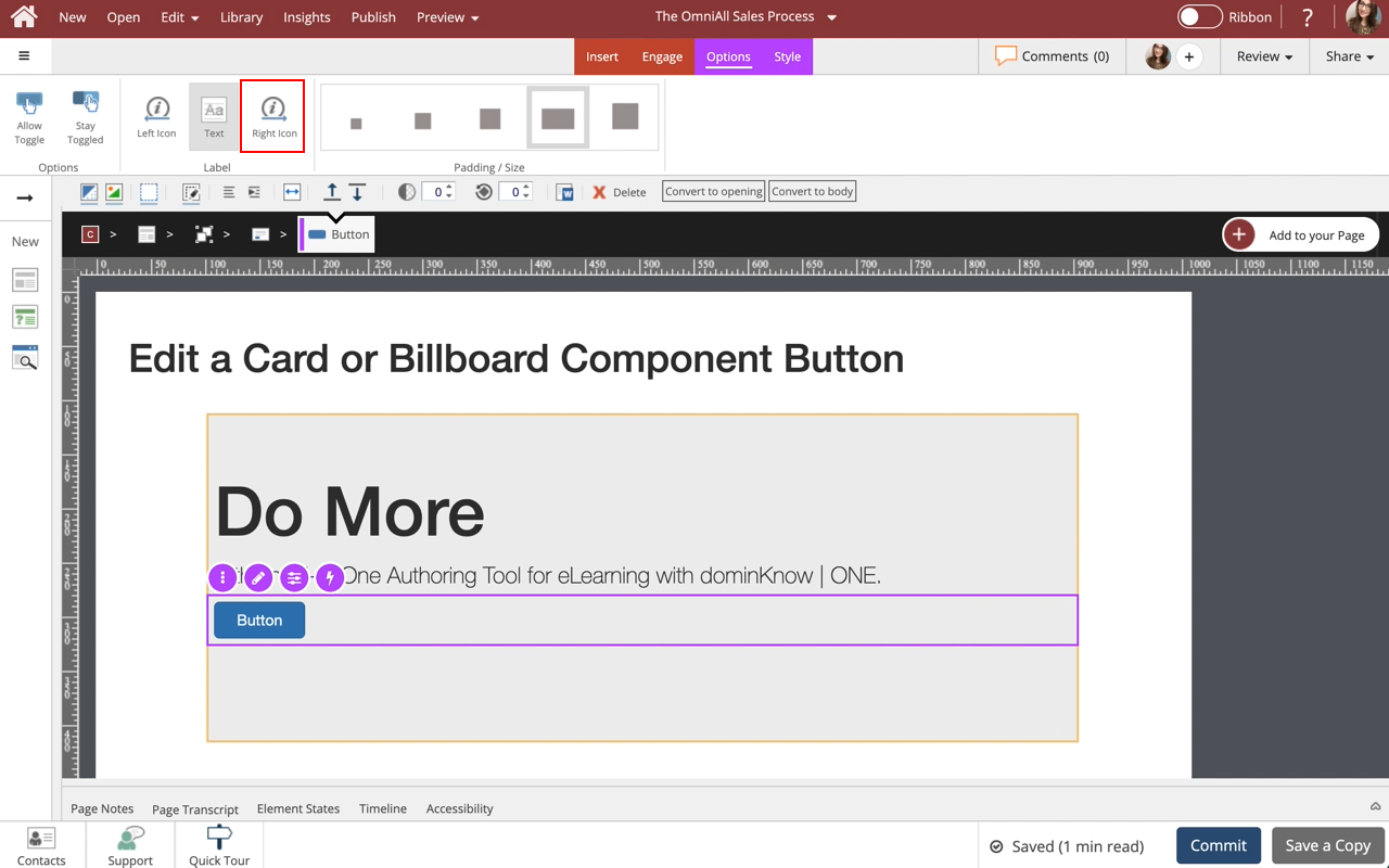
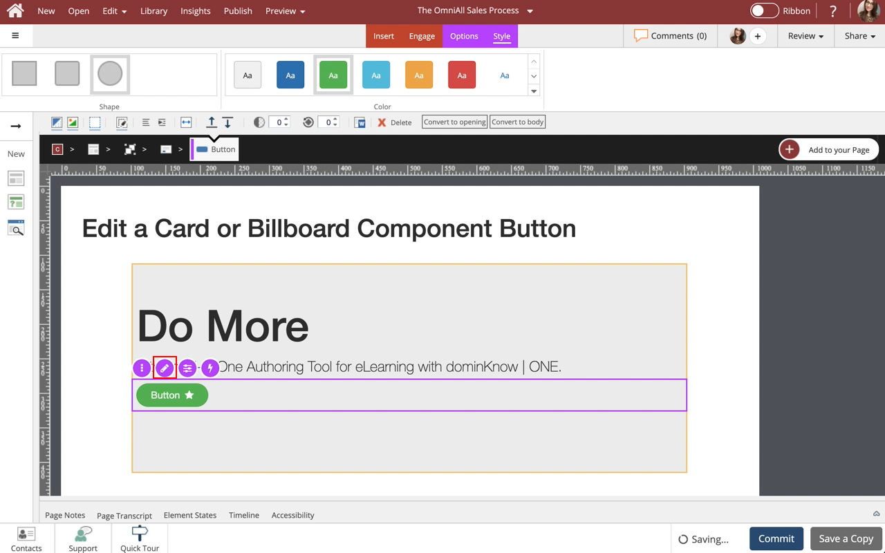
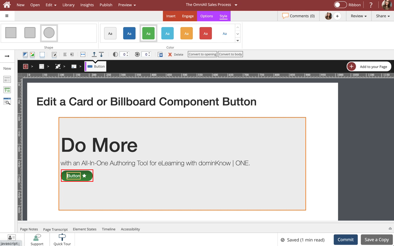
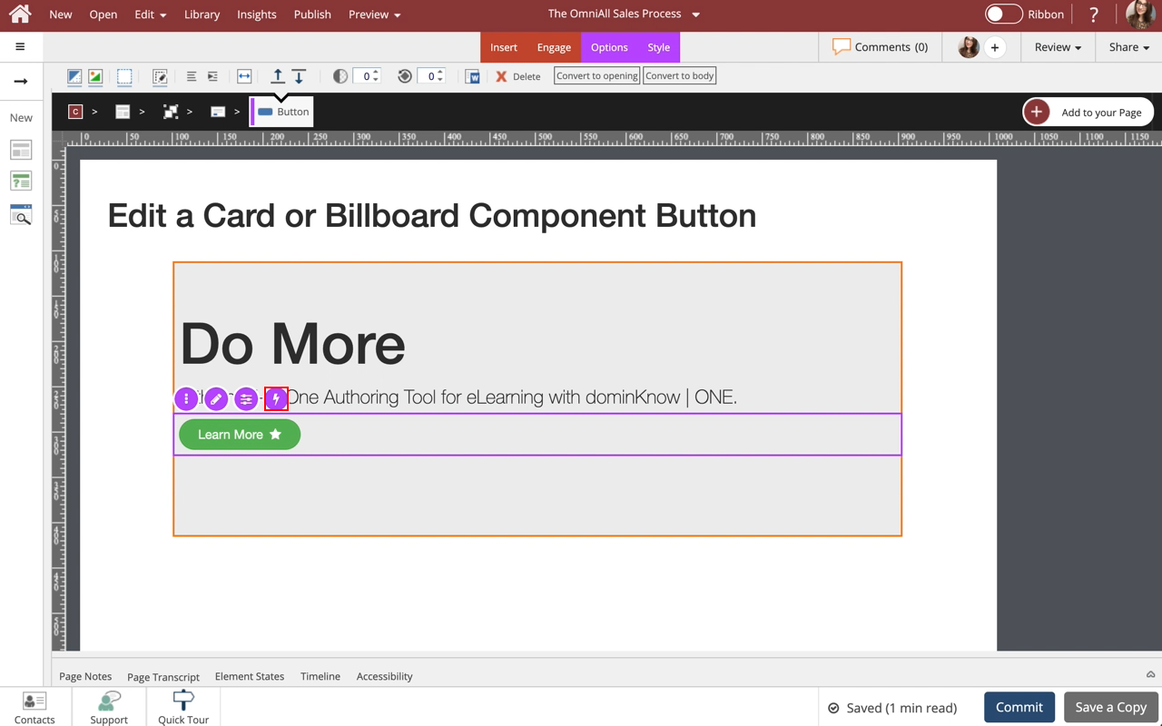
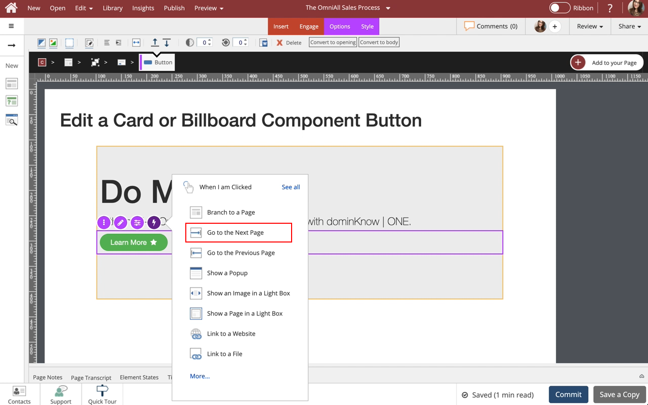
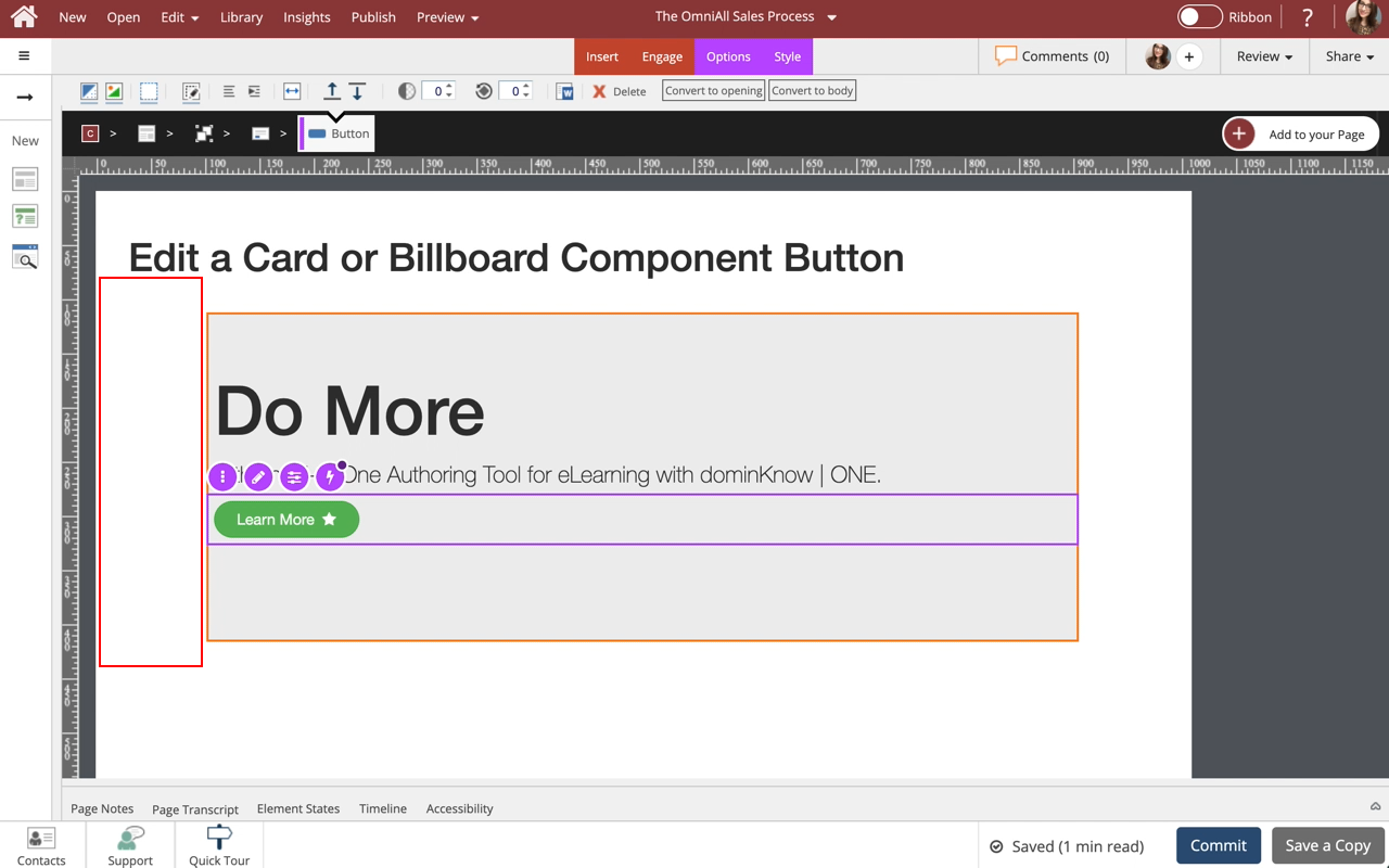
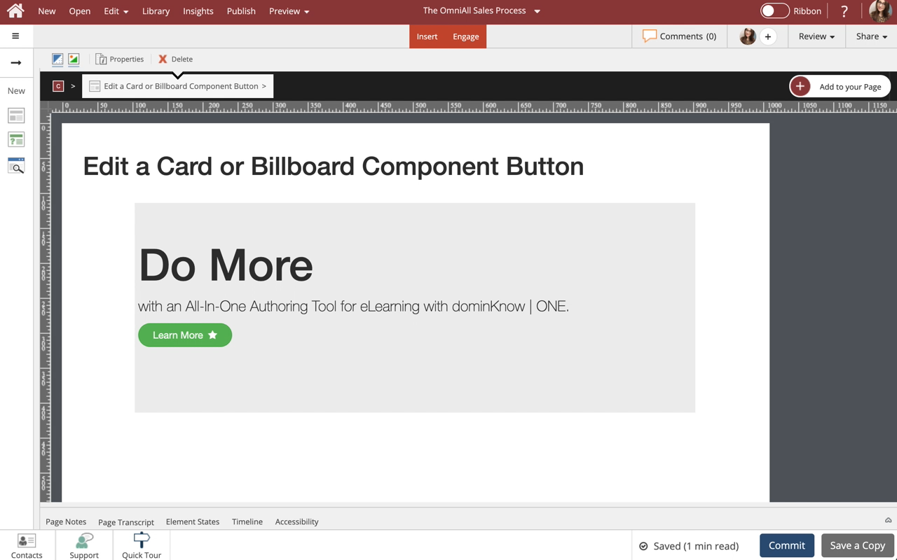
Edit a Card or Billboard Component Button
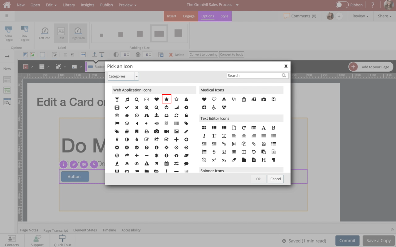
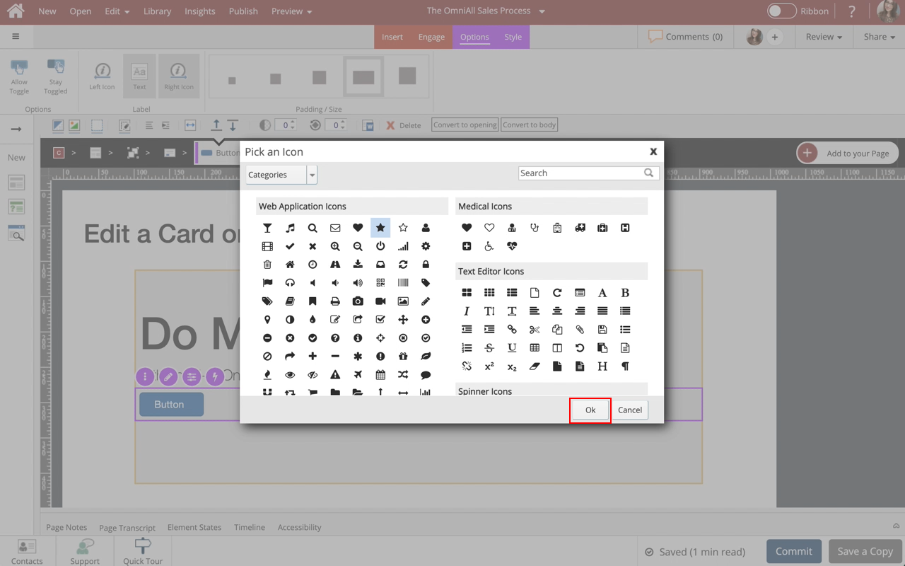
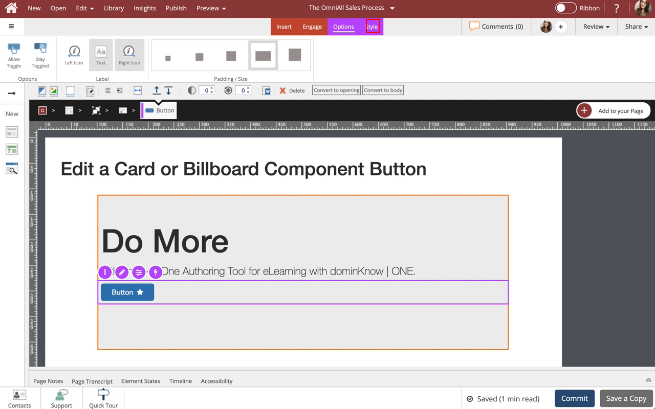
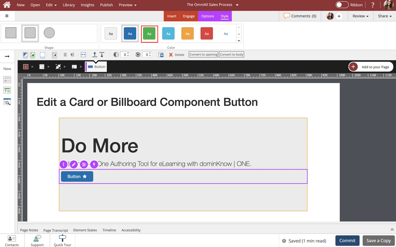
Steps to edit a Card or Billboard component button.

Steps to edit a Card or Billboard component button.
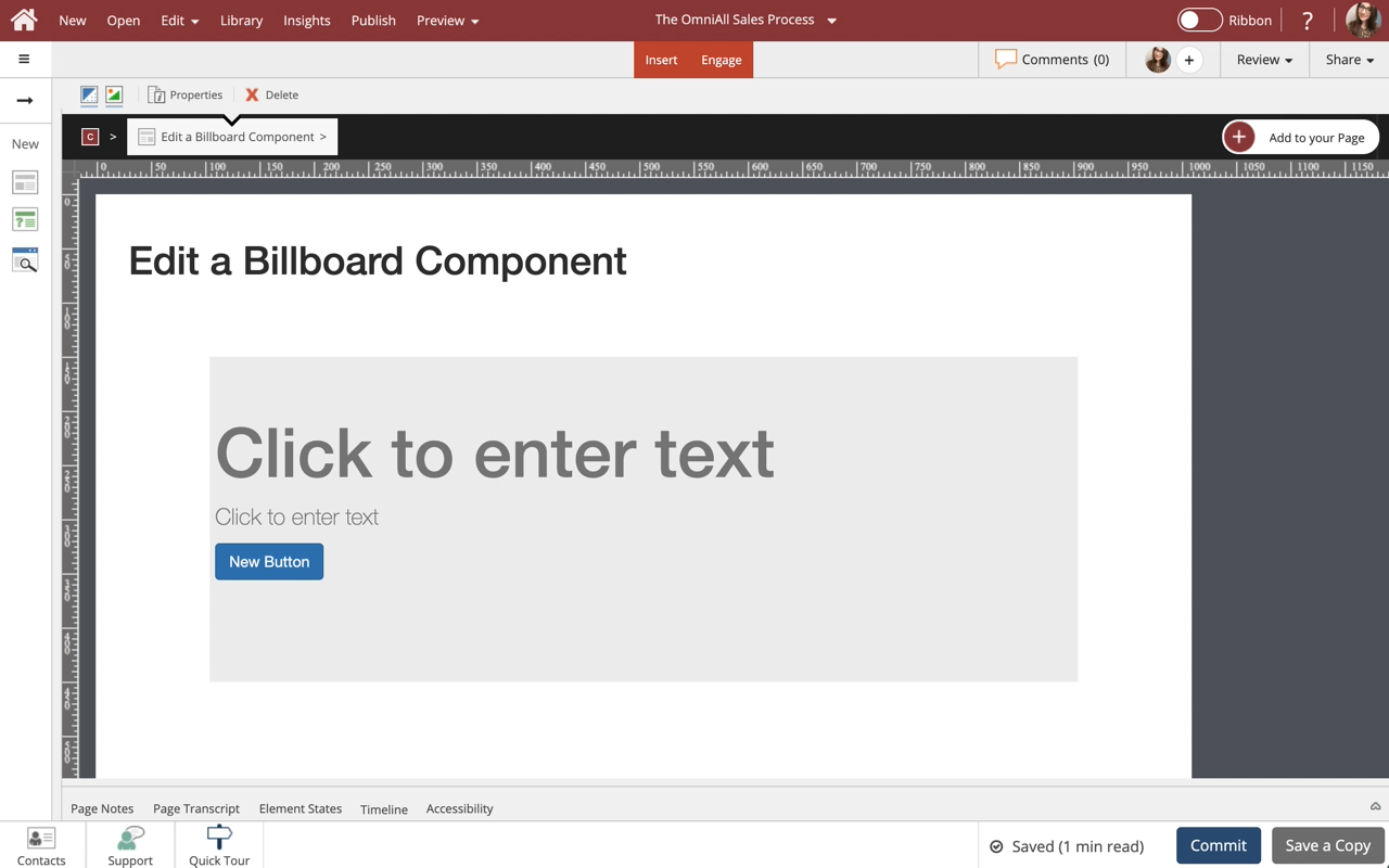
Steps to Edit a Billboard component.
Use billboards as your big attention-grabbers. This lesson covers controlling the display properties of the Billboard component to suit your design needs.
Note: Billboards are available in multiple styles with or without a Button. The buttons are easily set up just like any other button in dominKnow | One.
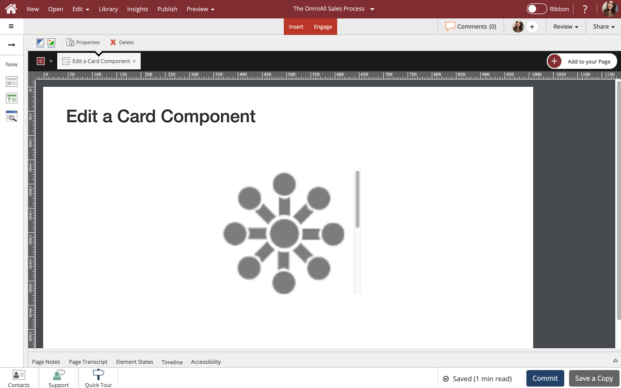
Use cards to set apart certain information, and assign headers, footers, borders and styles as you see fit. This lesson covers controlling the display properties of the Card component to suit your design needs.
Note: Cards are available in multiple styles with or without a Button. The buttons are easily set up just like any other button in dominKnow | One.
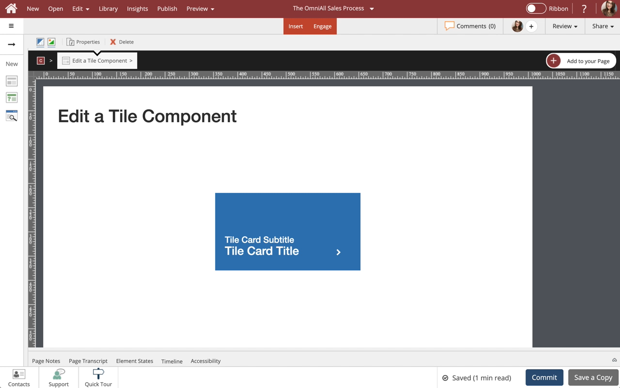
Steps to edit a Tile Card component.
You can edit the text, change the icon on the Tile Card, as well as control the background display options.
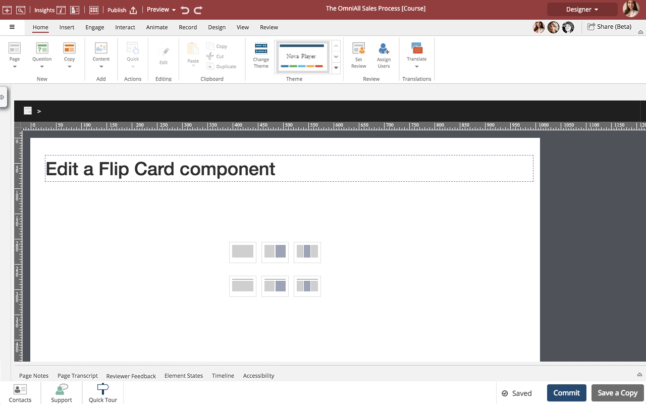
Steps to edit a Flip Card component.
You can add any content to the front and back of a Flip Card as well as control many display properties.
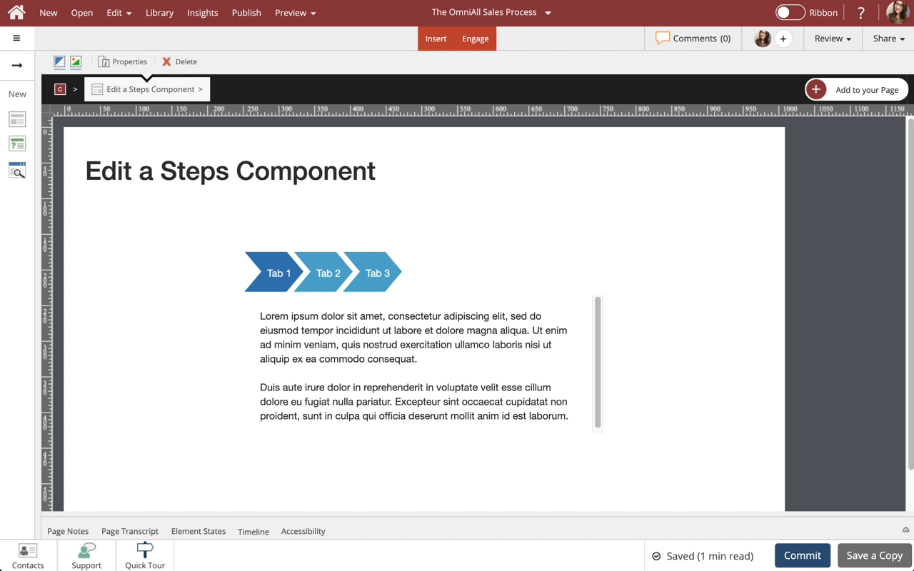
Steps to edit a Steps component.
Use Steps to display information in a tabbed layout. Steps are available in a variety of orientations for you to choose from. All types can be formatted and styled for numerous appearances and behaviors.
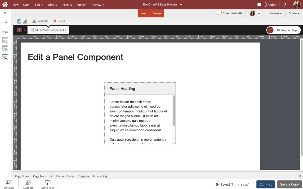
Steps to edit a Panel component.
Use Panels to set apart certain information, and assign headers, footers, borders and styles as you see fit. This lesson covers controlling the display properties of the Panel component to suit your design needs.
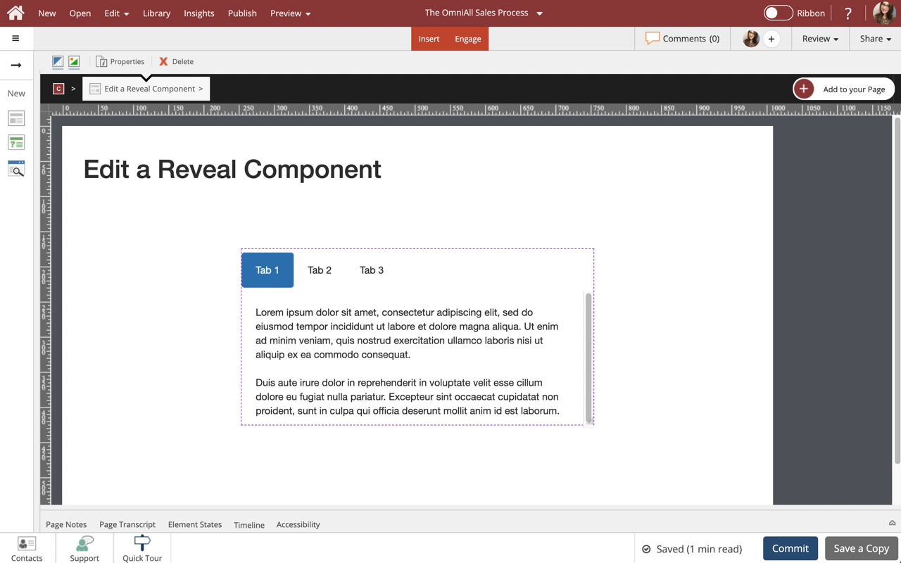
Steps to edit a Reveal component.
You can add any content to the Reveal component, add multiple tabs, as well as control many display properties.
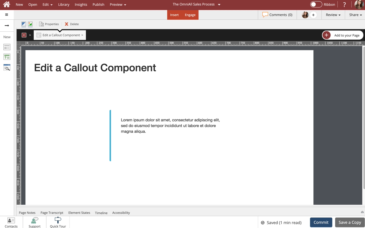
Steps to edit a Callout component.
Use callouts to set apart certain information, and add various styles, borders and icons. This lesson covers controlling the display properties of the Callout component to suit your design needs.
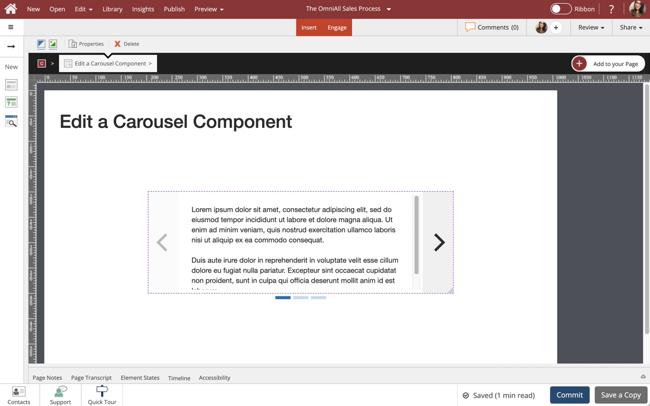
Steps to edit a Carousel component.
You can add any content to each slide within the Carousel, as well as control many display and play options.
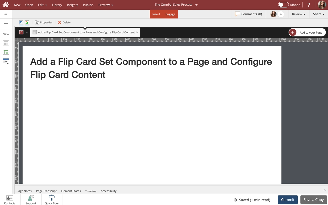
Steps to add and a Flip Card Set component to a page and configure the Flip Cards within the set.
Flip Card Sets are one of many components available on the Engage tab.


Comments ( 0 )
Sign in to join the discussion.