Edit a Card or Billboard Component Button
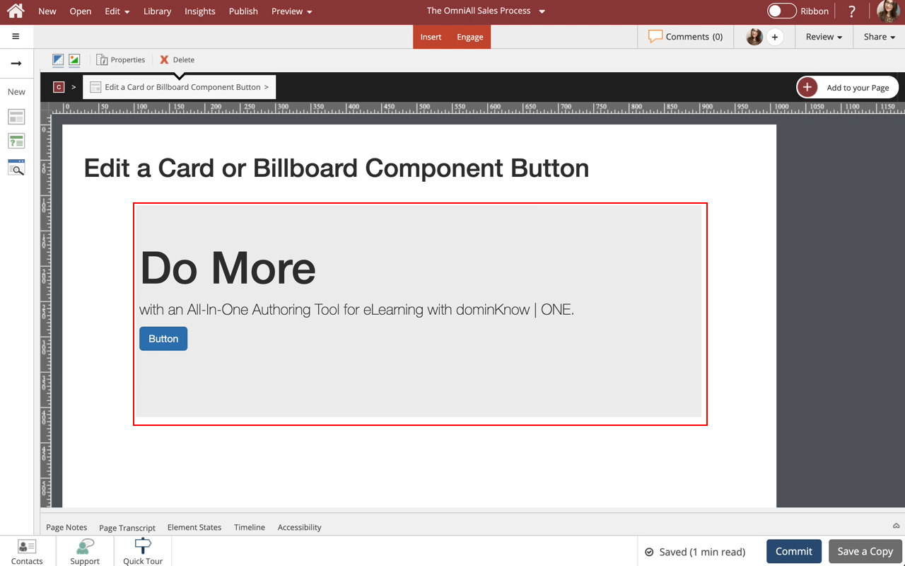
Steps to edit a Card or Billboard component button.

Step 2
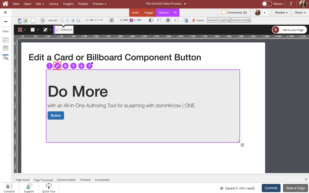
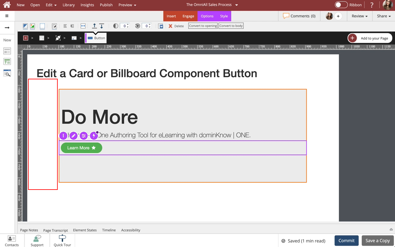
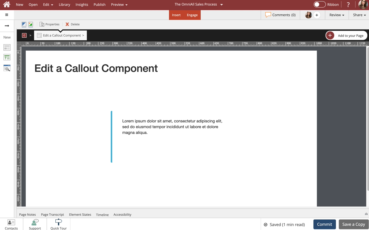
To edit the content within the Component, select the Edit Icon in the Inline Toolbar, or double-click the Callout.
Step 4
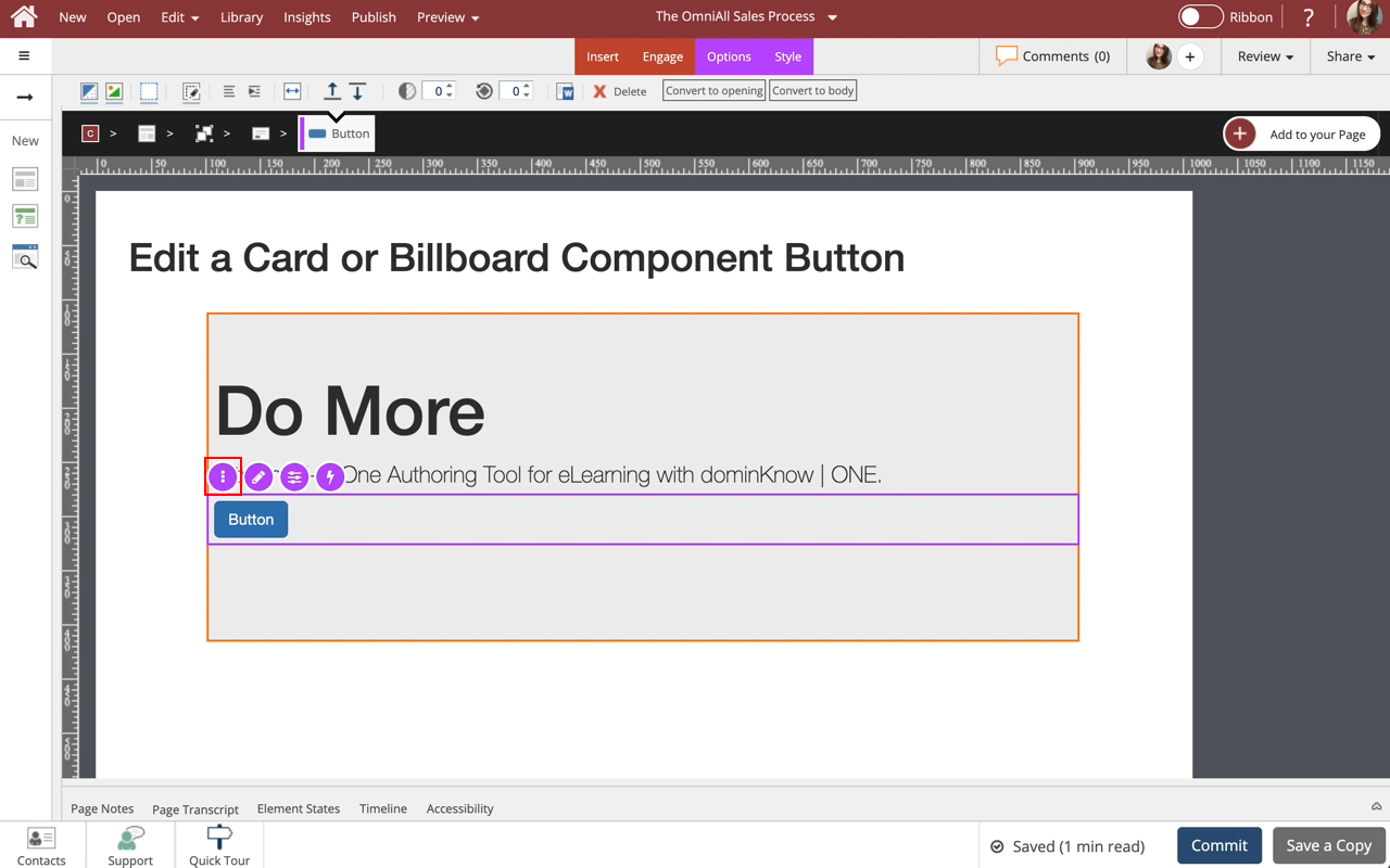
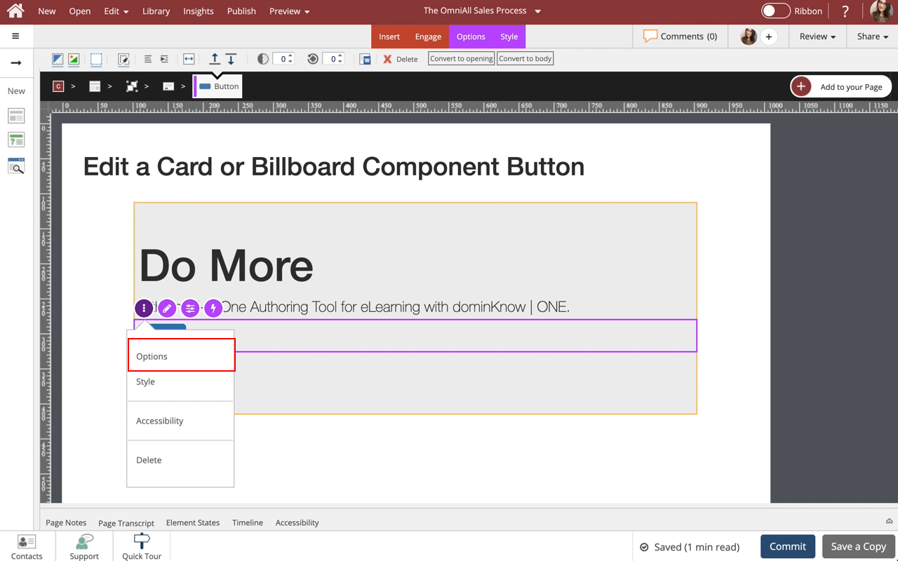
Select the three-dot menu in the Inline Toolbar. Have access to the Options and Style tabs, Accessibility panel, and Delete.
Step 6
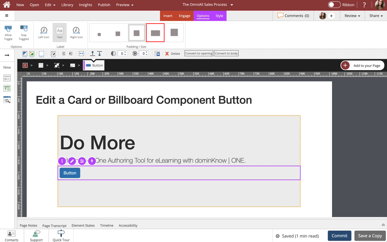
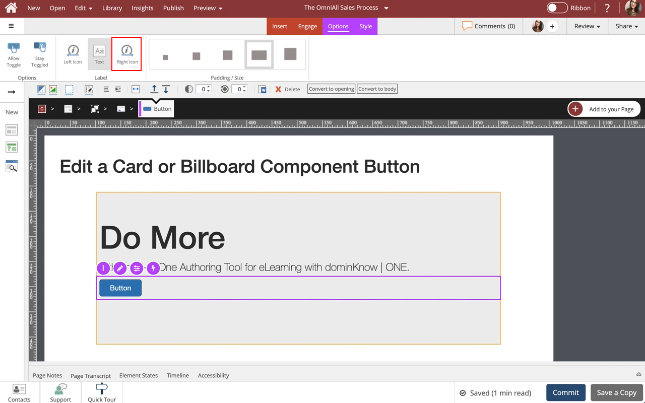
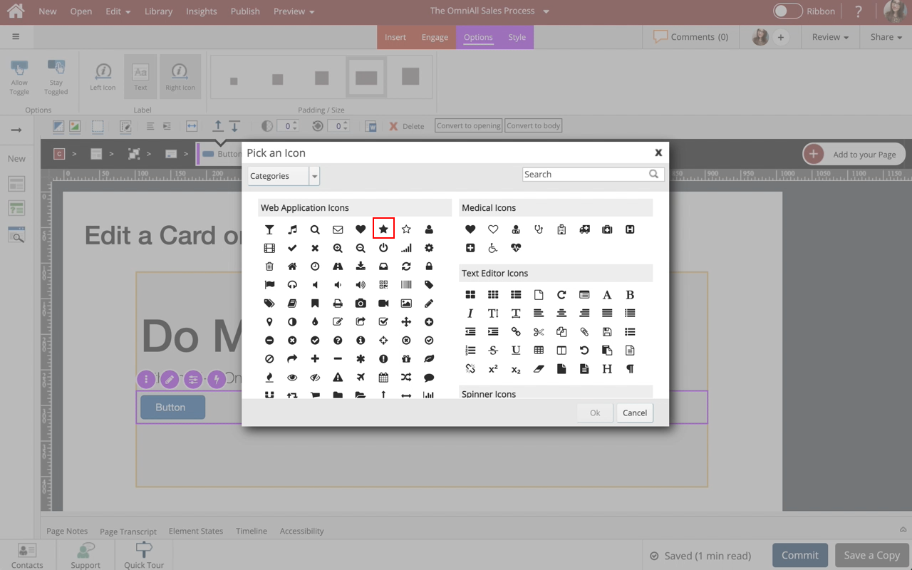
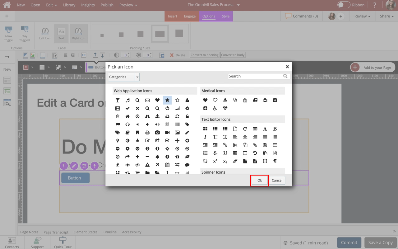
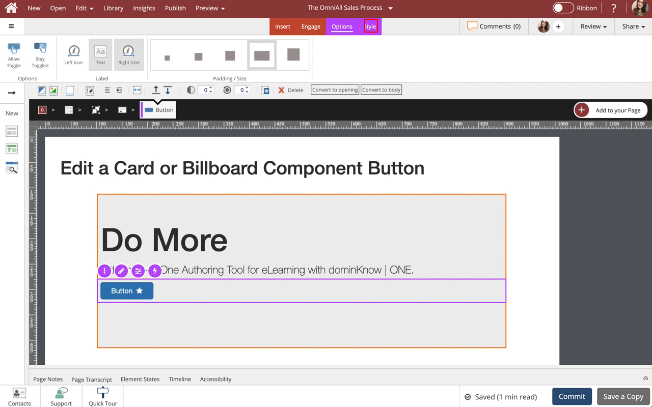
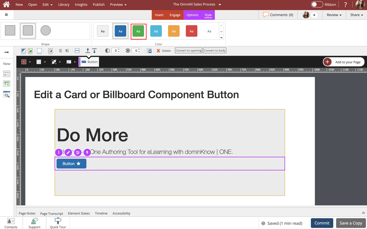
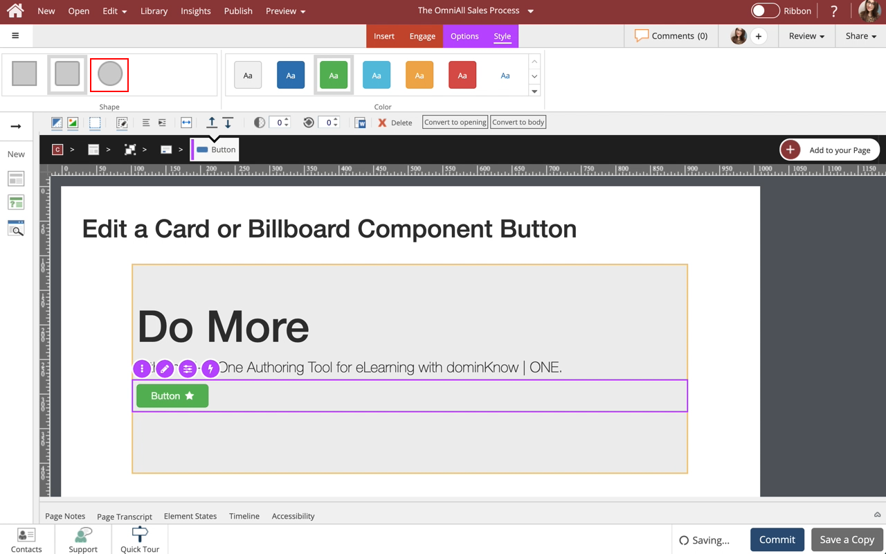
The Options and Style tabs have a number of design options for the Button element as a whole. You can change the toggle Options, add Icons and text to the Label, and adjust the Padding / Size of the Button, Shape, and Color.
Under Padding/Size Select Option 4.
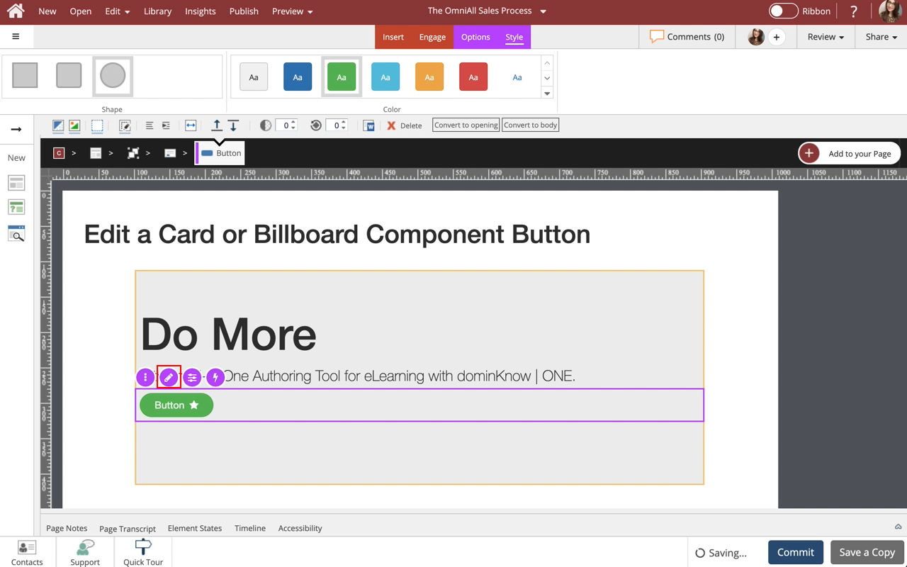
Step 13
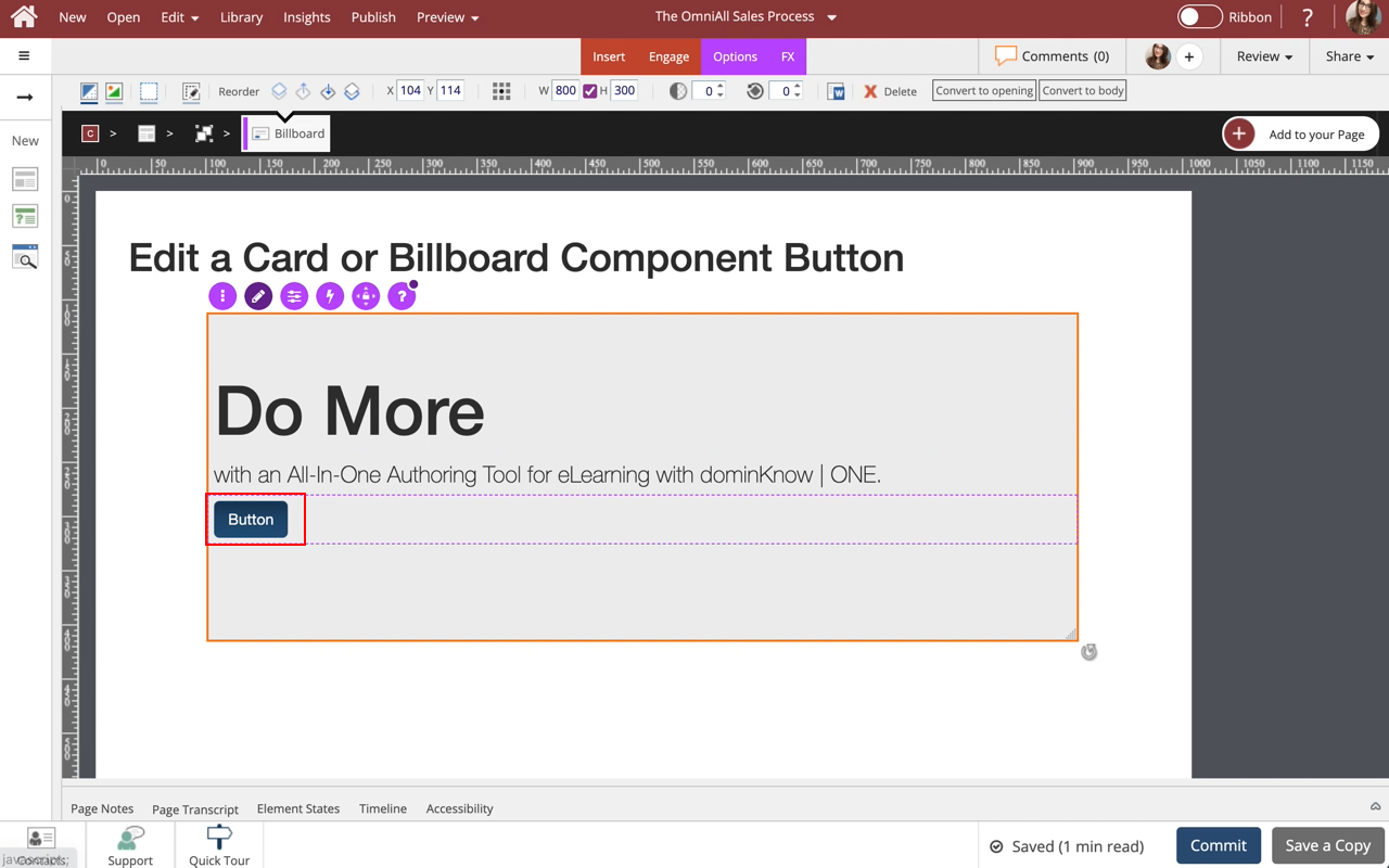
To edit the content within the Button, select the Edit Icon in the Inline Toolbar, or double-click the Button.
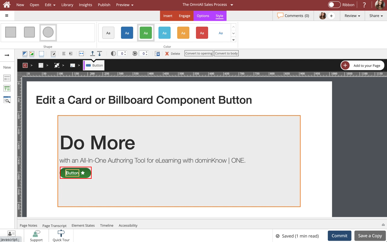
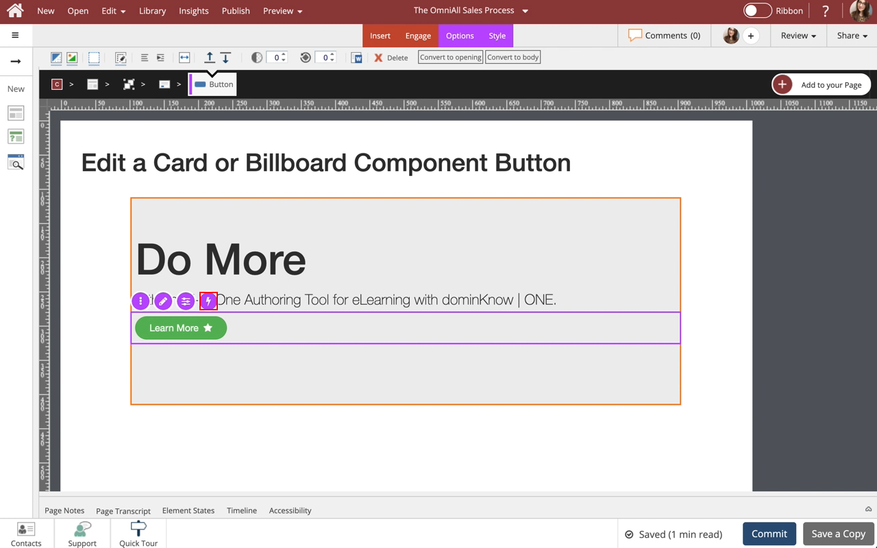
Step 15
To quickly add an action to the button, select the Lightning Bolt Symbol within the Inline Toolbar.
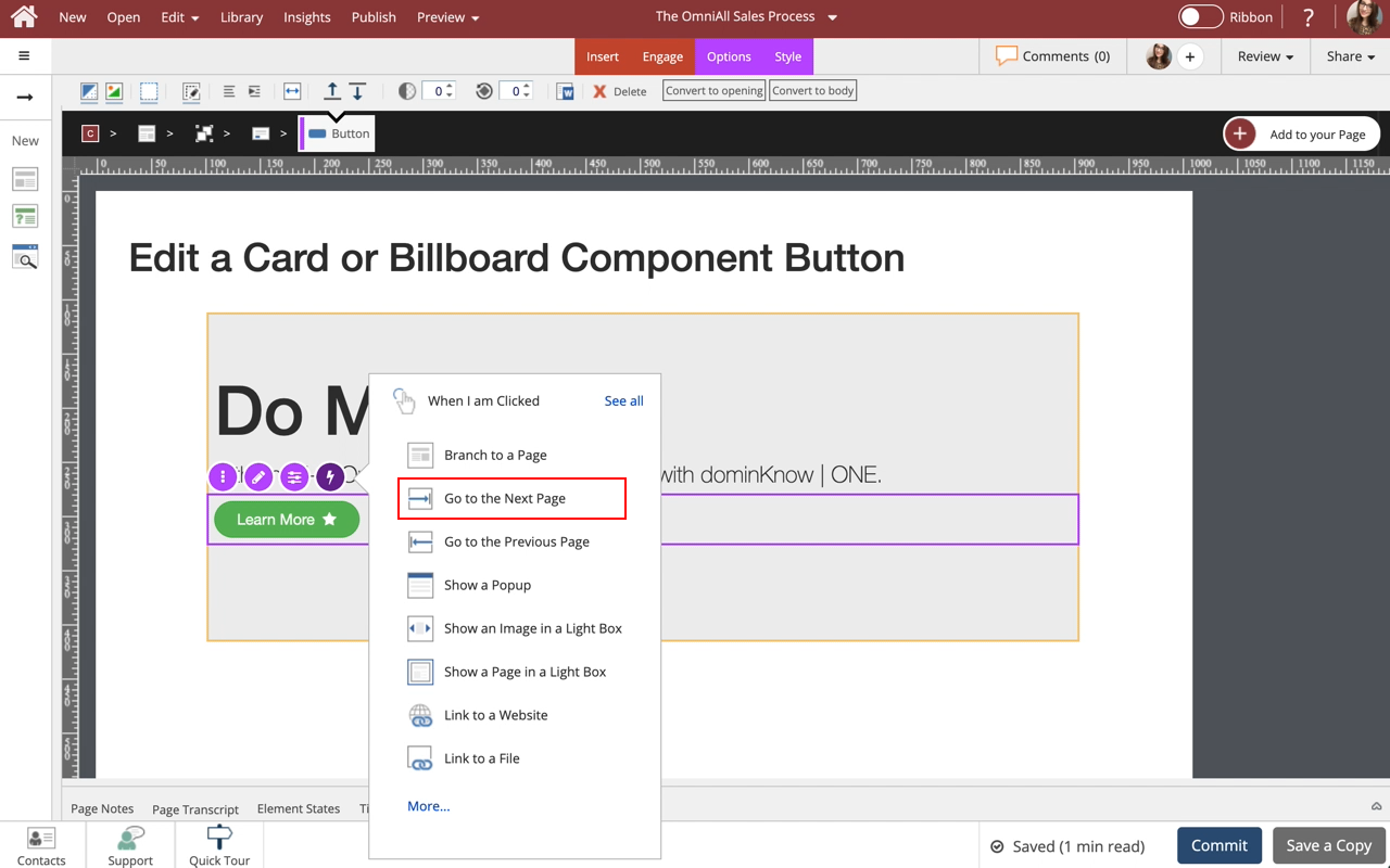
Step 16
Note: The default action will change depending on the Component.
Within the When I am Clicked menu, select Go to the Next Page.
Step 17
The Action is now set.
*Note: A purple dot within the Lightning Bolt Symbol will appear to indicate an action is set.
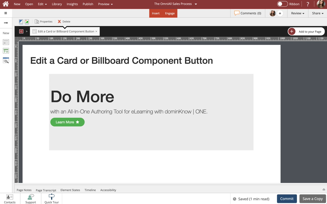
Select the Left side of the Page to return to Page Content.




Comments ( 0 )
Sign in to join the discussion.