Edit a Tab Set Component
Steps to edit a Tab Set component.
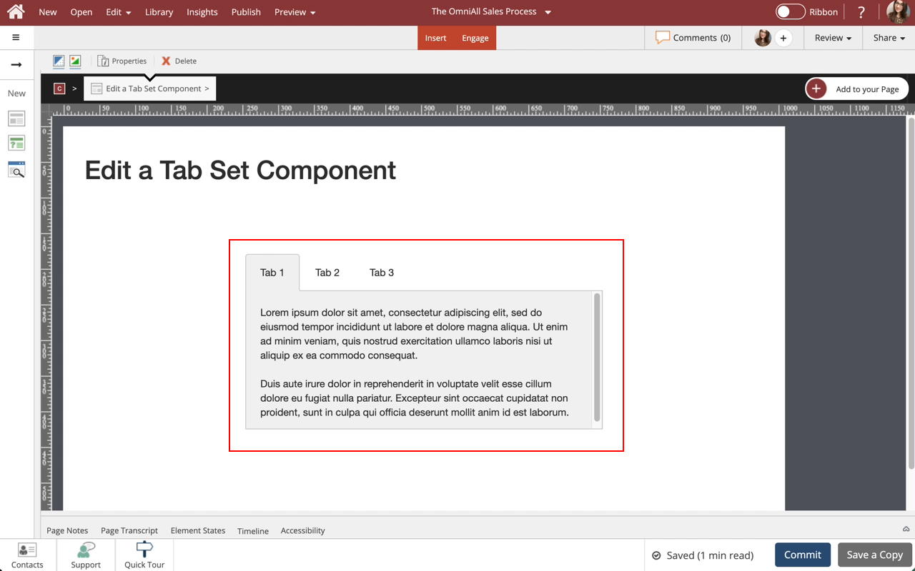
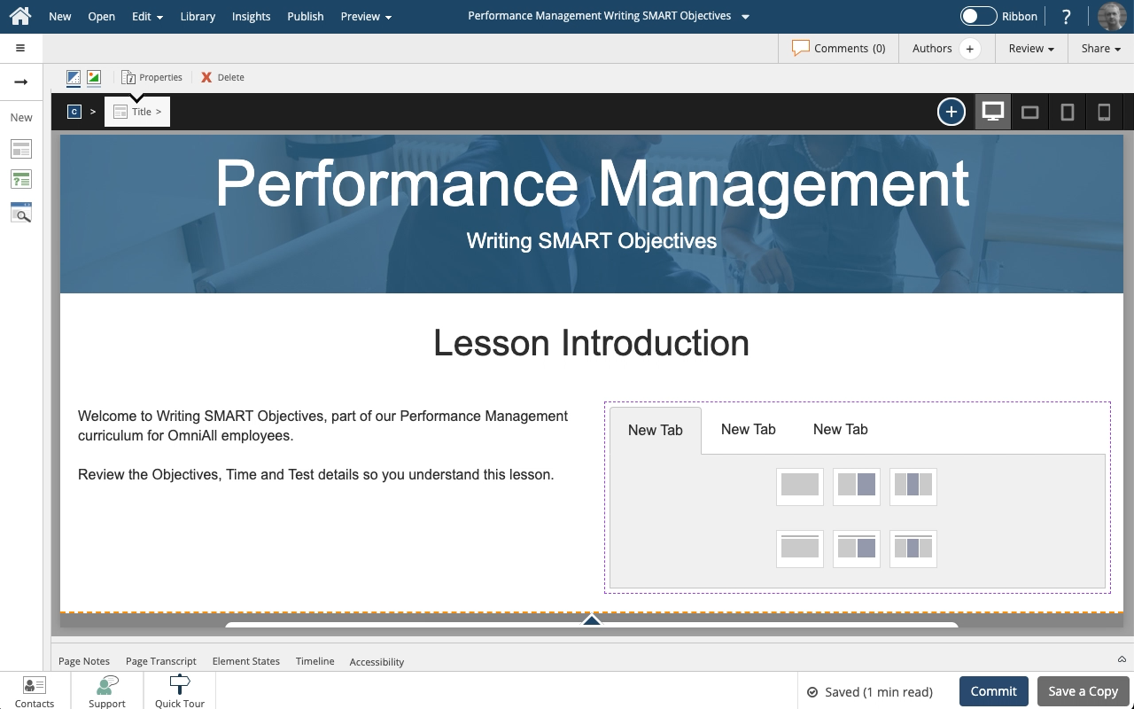
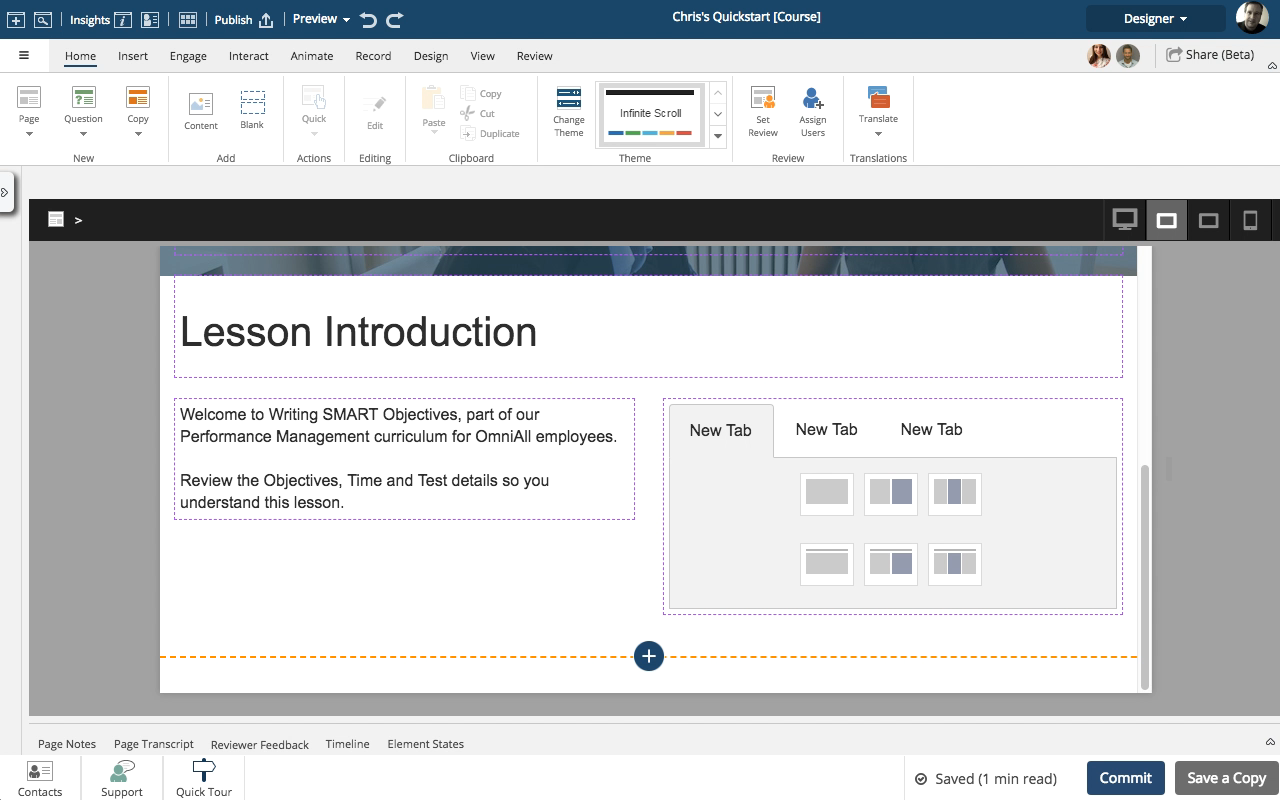
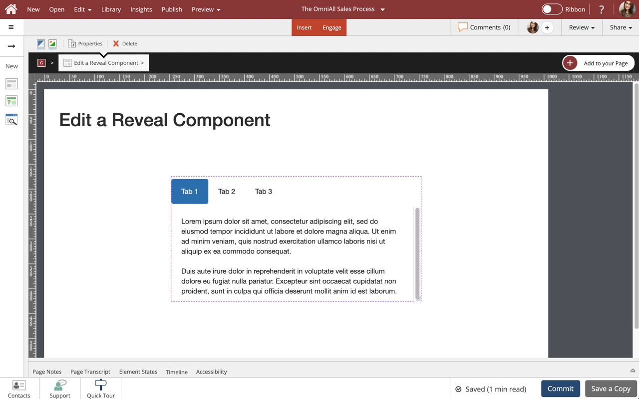
Use Tab Sets to display information in a tabbed layout. Tab Sets are available in a variety of orientations for you to choose from. All types can be formatted and styled for numerous appearances and behaviors.
Notes:
1. There is a publishing profile option that allows you to turn on or off completion checkmarks for tab sets and accordions. See the article: Publishing Profile Options for more information.
2. When in Essentials, only a limited amount of Options are shown in the Options Tab. To see all Options make sure you are in Designer Mode.

Product: dominKnow | ONE | Version: 7.4
Applies to: Flow, Claro
Applies to: Flow, Claro
Step 2
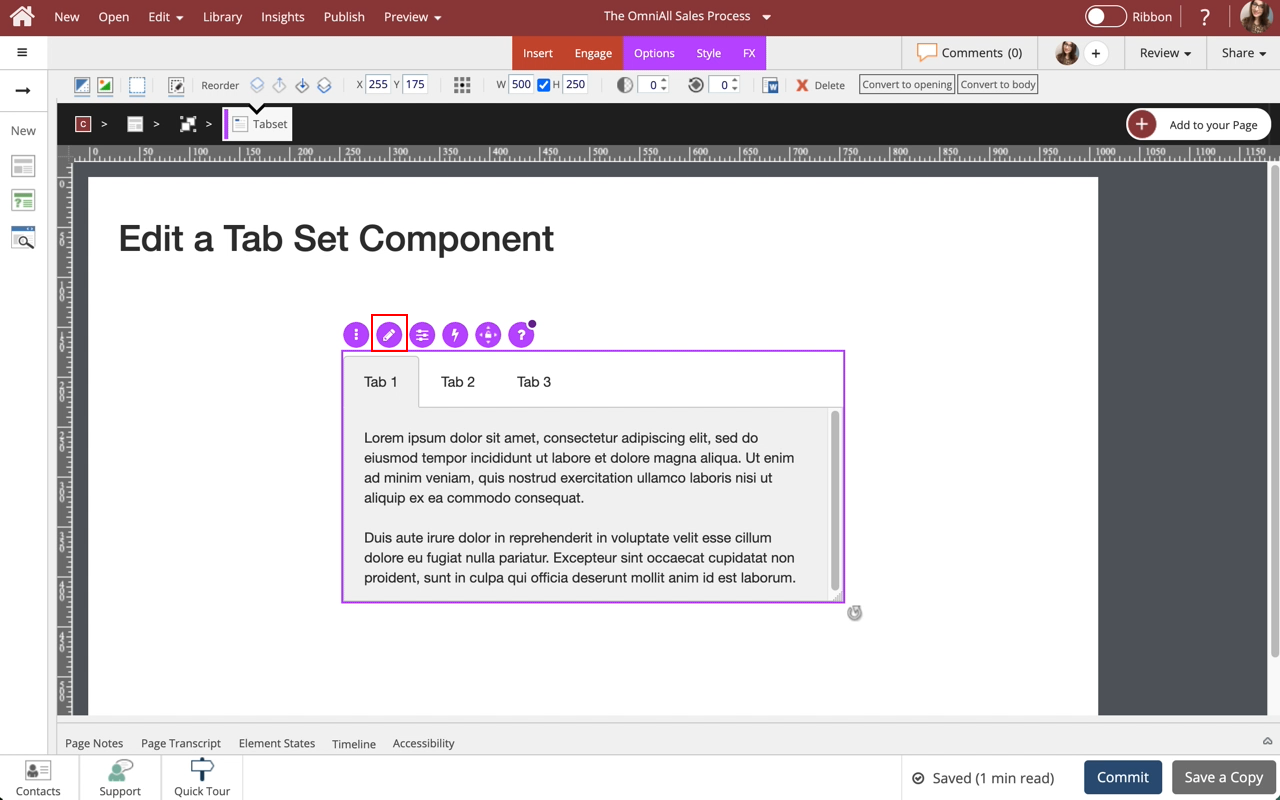
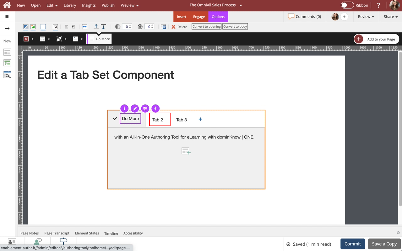
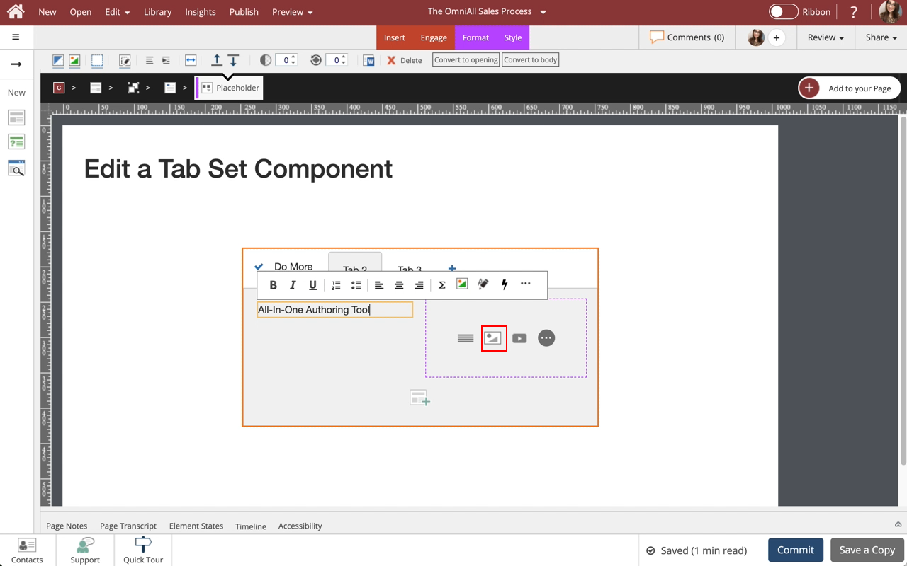
To edit the content within the Tab Set, select the Edit Icon in the Inline Toolbar, or double-click the Tab Set.

Step 4
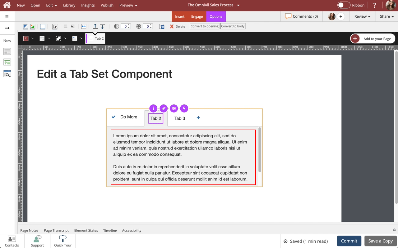
The new text is added.
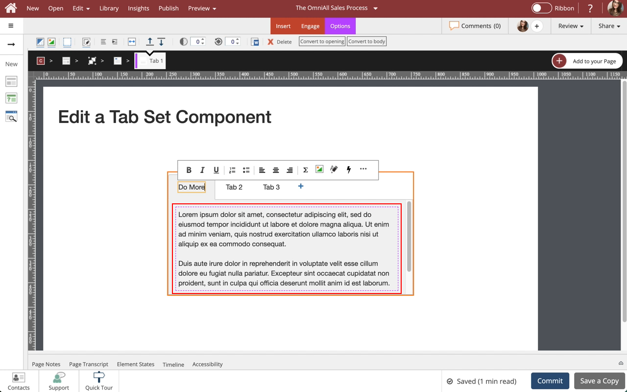
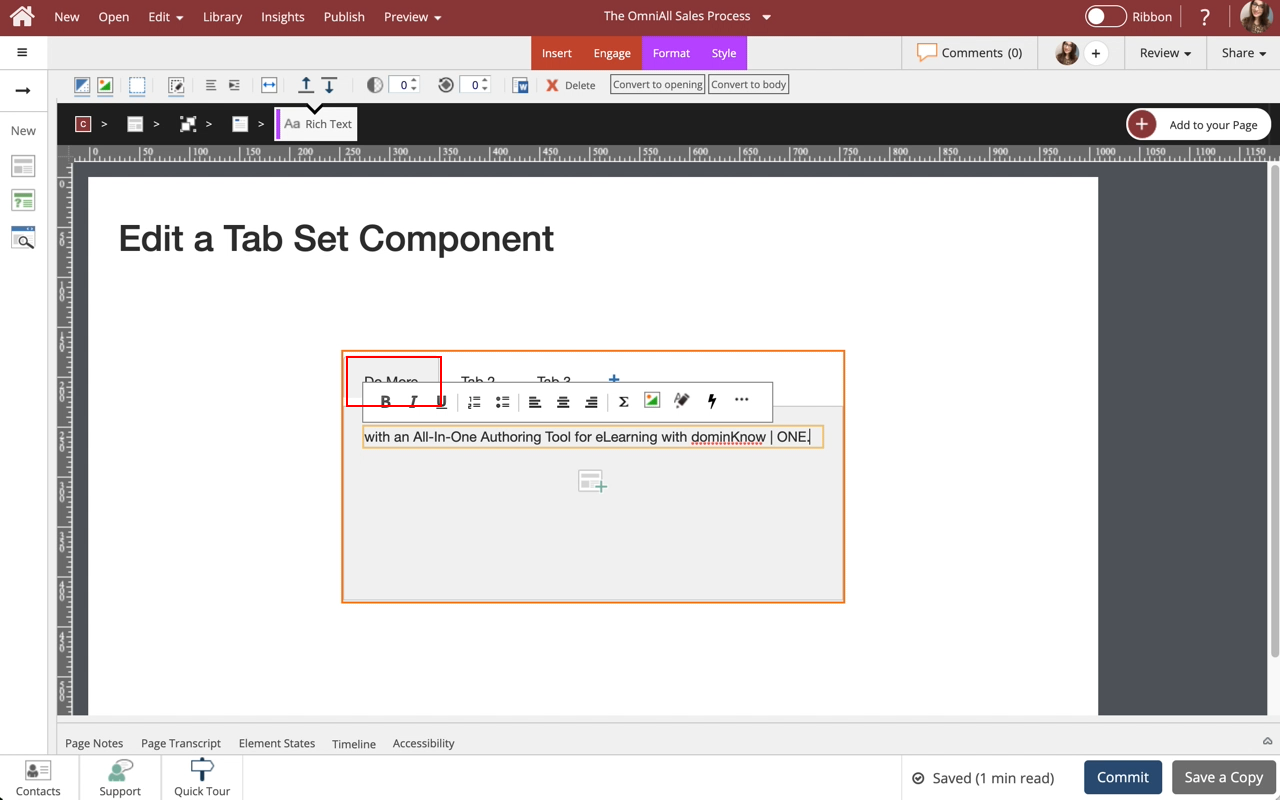
Select the Text within the Tab 1 to edit it and we'll add text for you.


Step 15
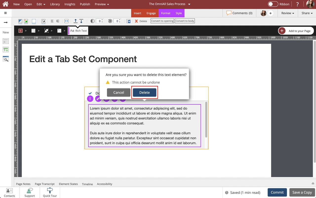
The content is deleted.
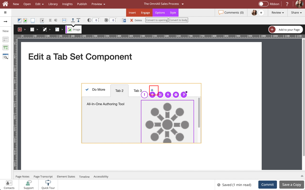
Select the + icon at the bottom of the component to add more content layouts to the Tab.


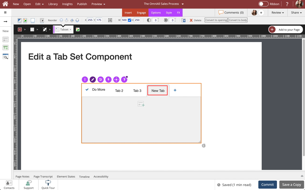
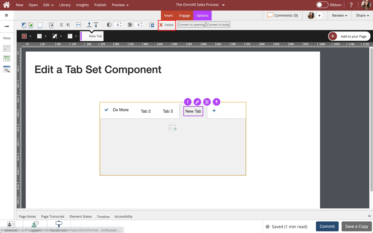
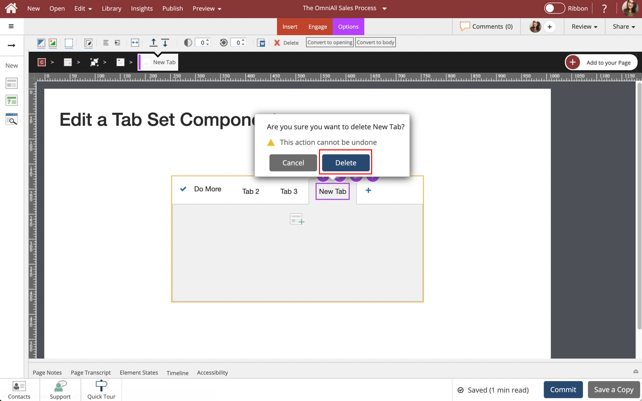
Step 25
The tab is deleted
.
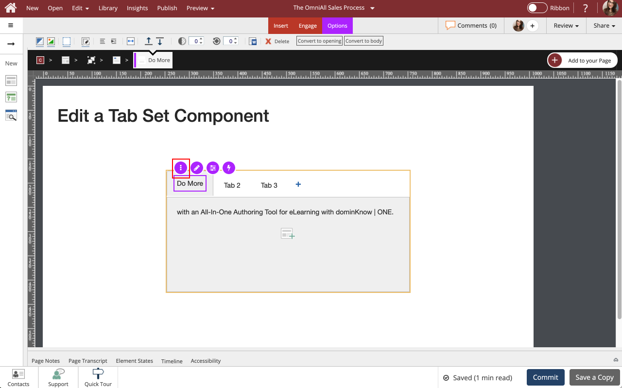
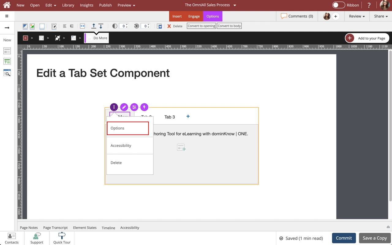
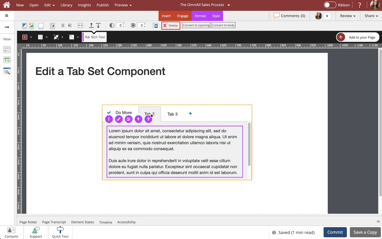
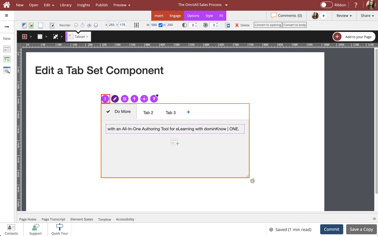
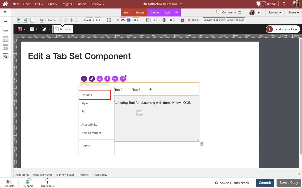
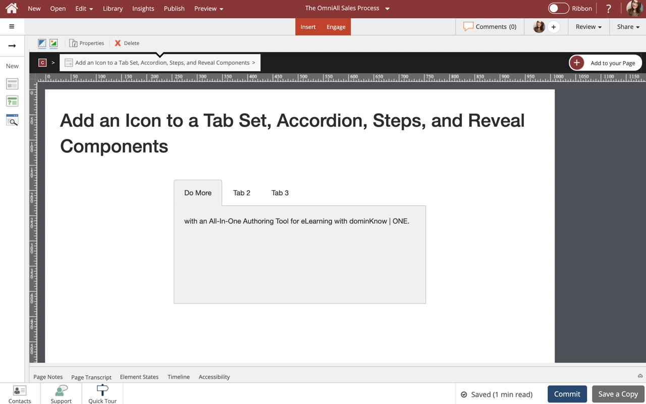
Select the three-dot menu in the Inline Toolbar. Have access to the Options, Styles and FX tabs, Accessibility panel, and add a New Comment, or Delete the component.
Step 27
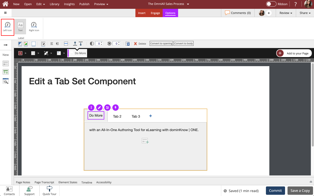
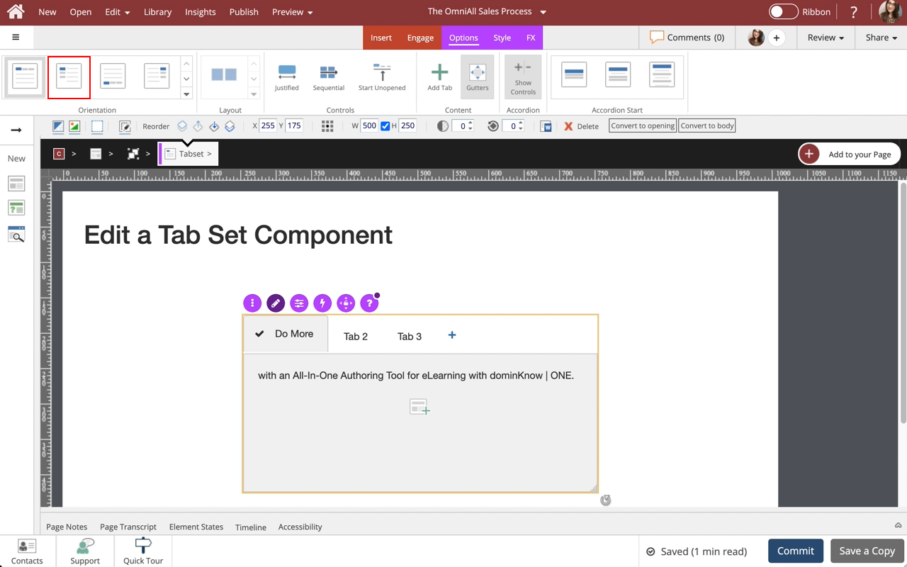
The Options and Style tabs have a number of control and design options for the Tab Set Component as a whole. You can change the Orientation of the Tab Set, color. Use the FX tab to add effects to the component.
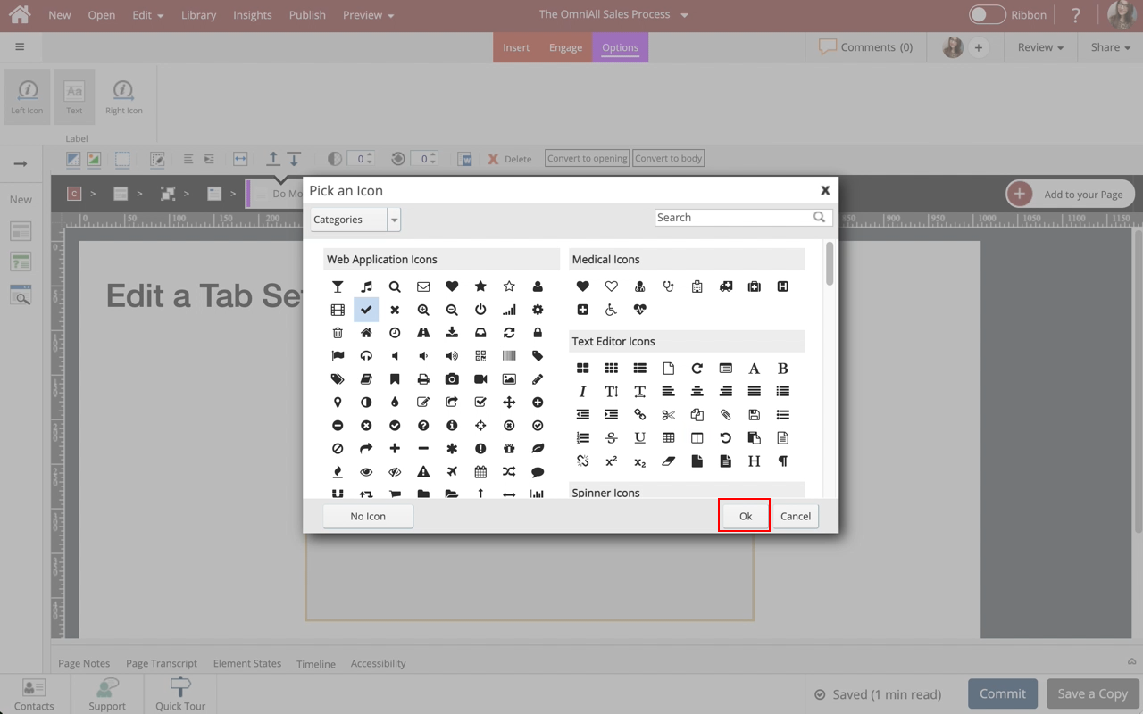
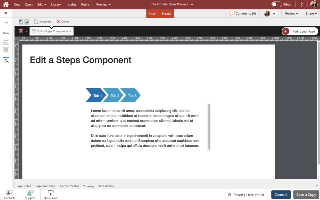
In the Options tab, under Orientation select Option 2.
Step 28
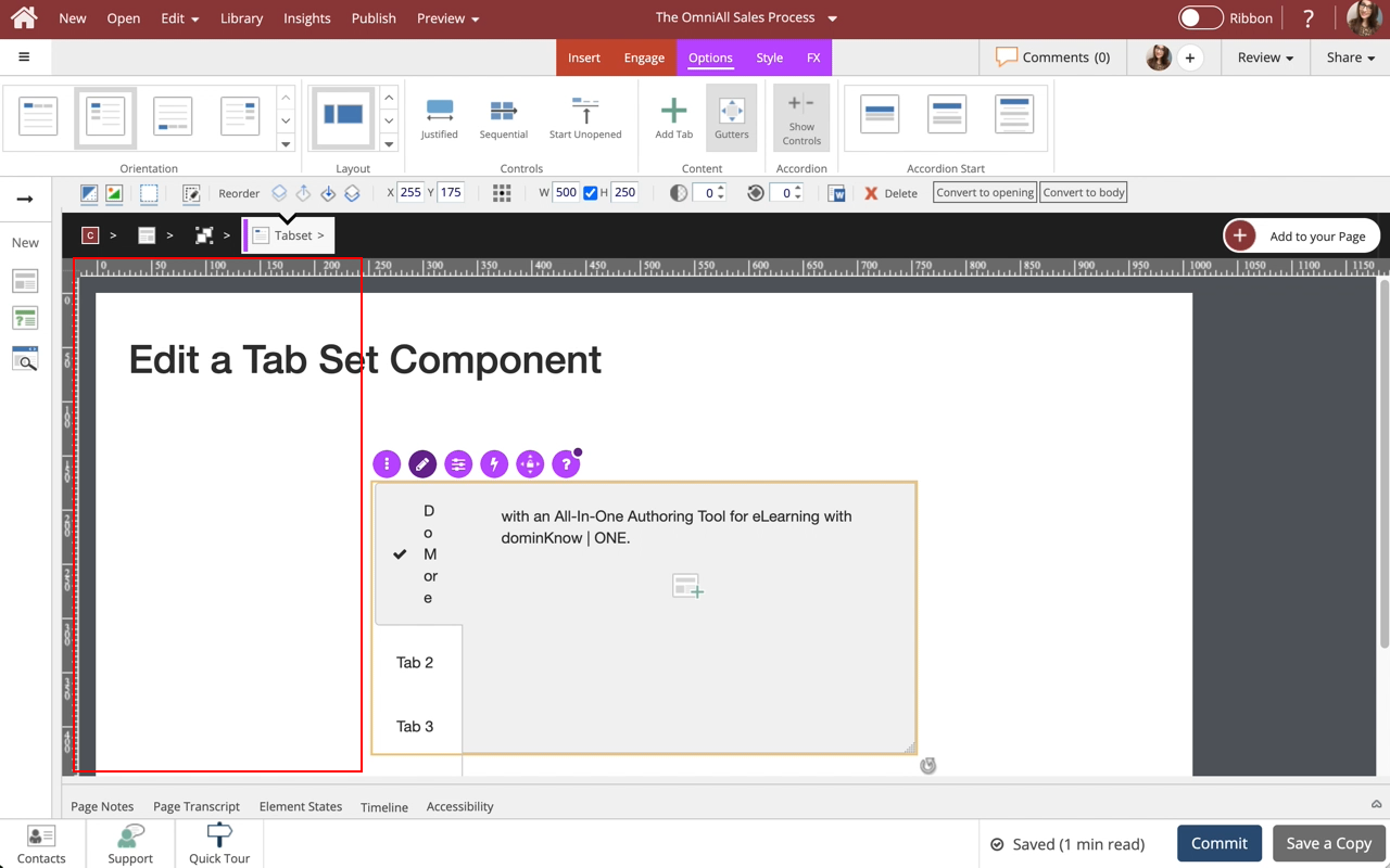
Notice the Tabs are displayed on the left side.
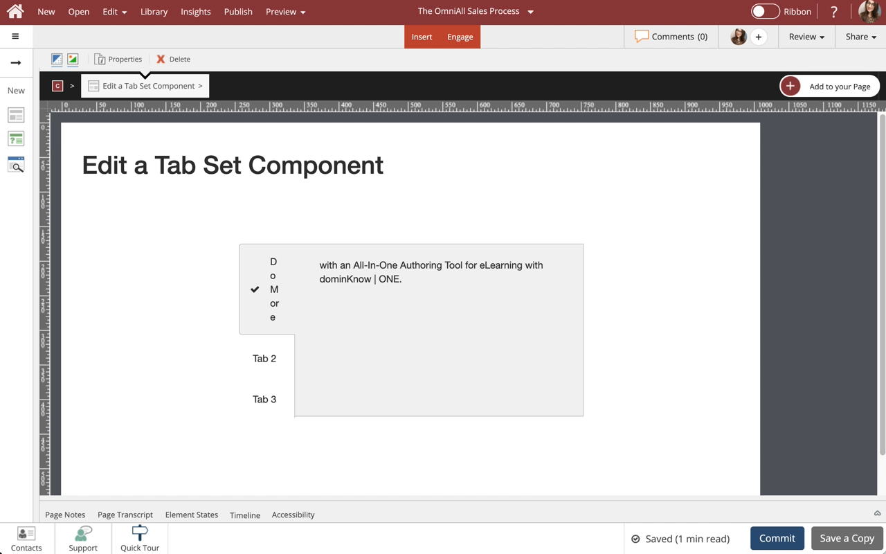
Select the Left side of the Page to return to the Page content.


Comments ( 0 )
Sign in to join the discussion.