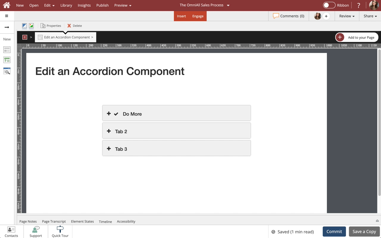
Edit an Accordion Component
Steps to edit an Accordion Component.
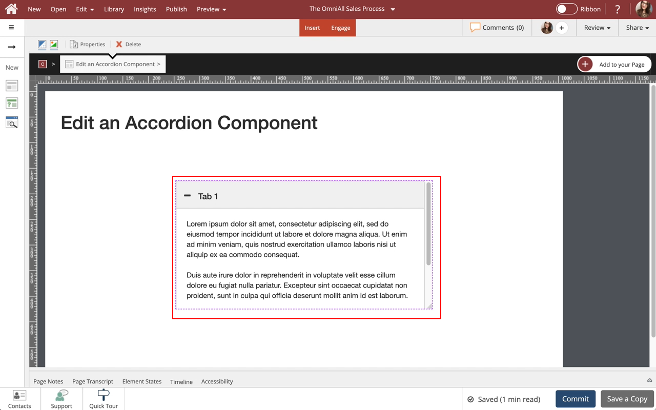
Use the Accordion Component to show information in a tabbed menu, users can open and close tabs to view content within the Component. This lesson covers editing of the Accordion and controlling the display properties of the component to suit your design needs.

Step 2
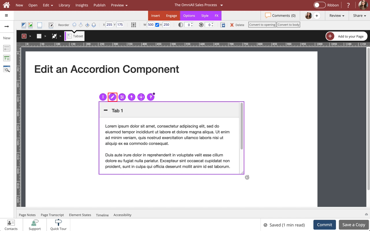
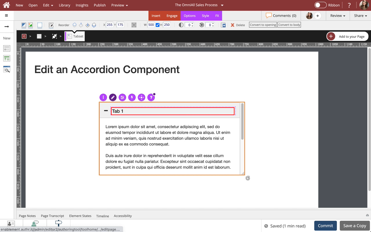
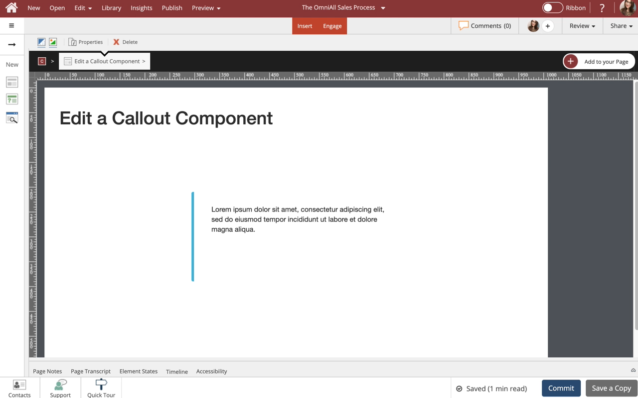
To edit the content within the Callout, select the Edit Icon in the Inline Toolbar, or double-click the Callout.
Step 4
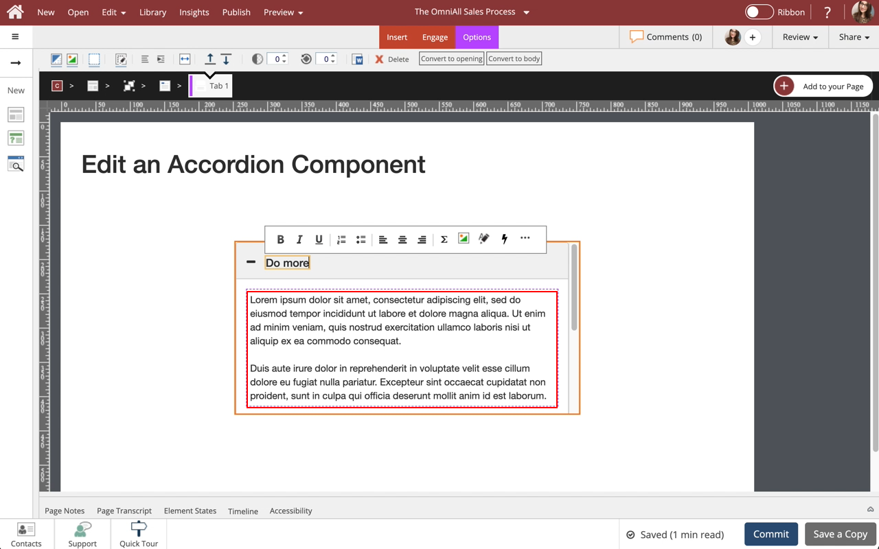
The new text is added.
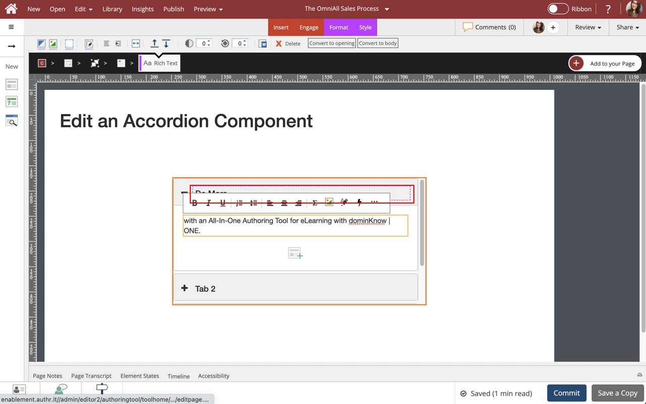
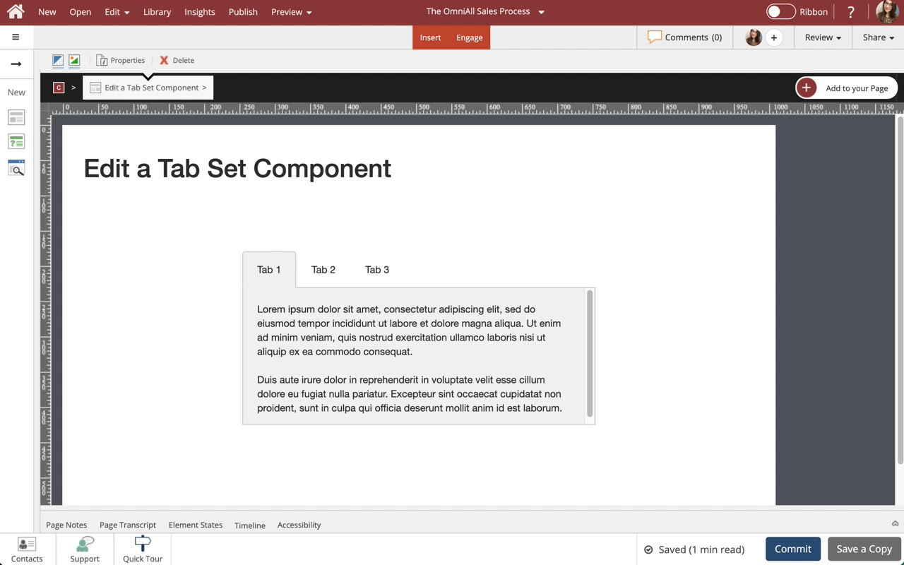
Select the Content Text within Tab 1 to edit it and we'll add text for you.
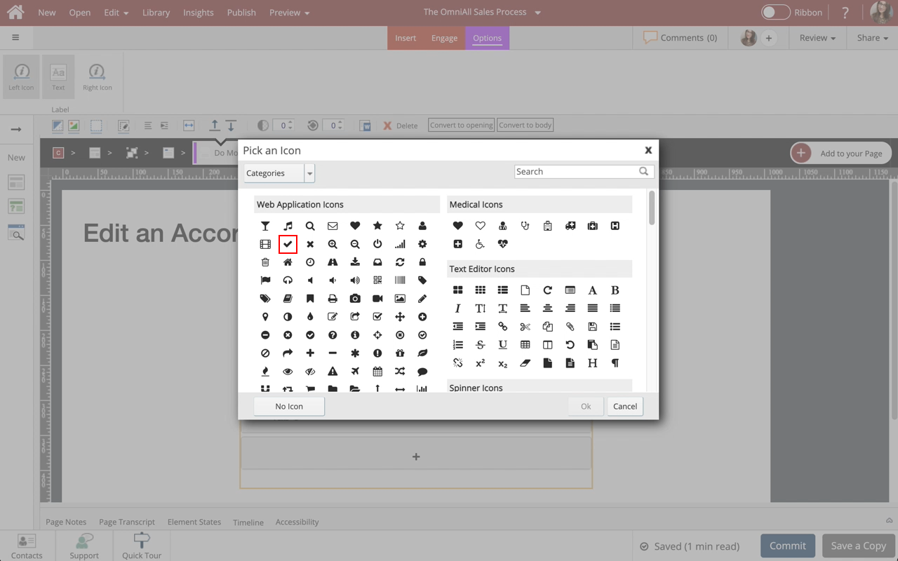
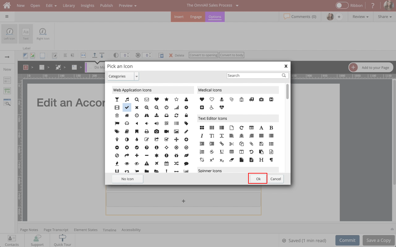
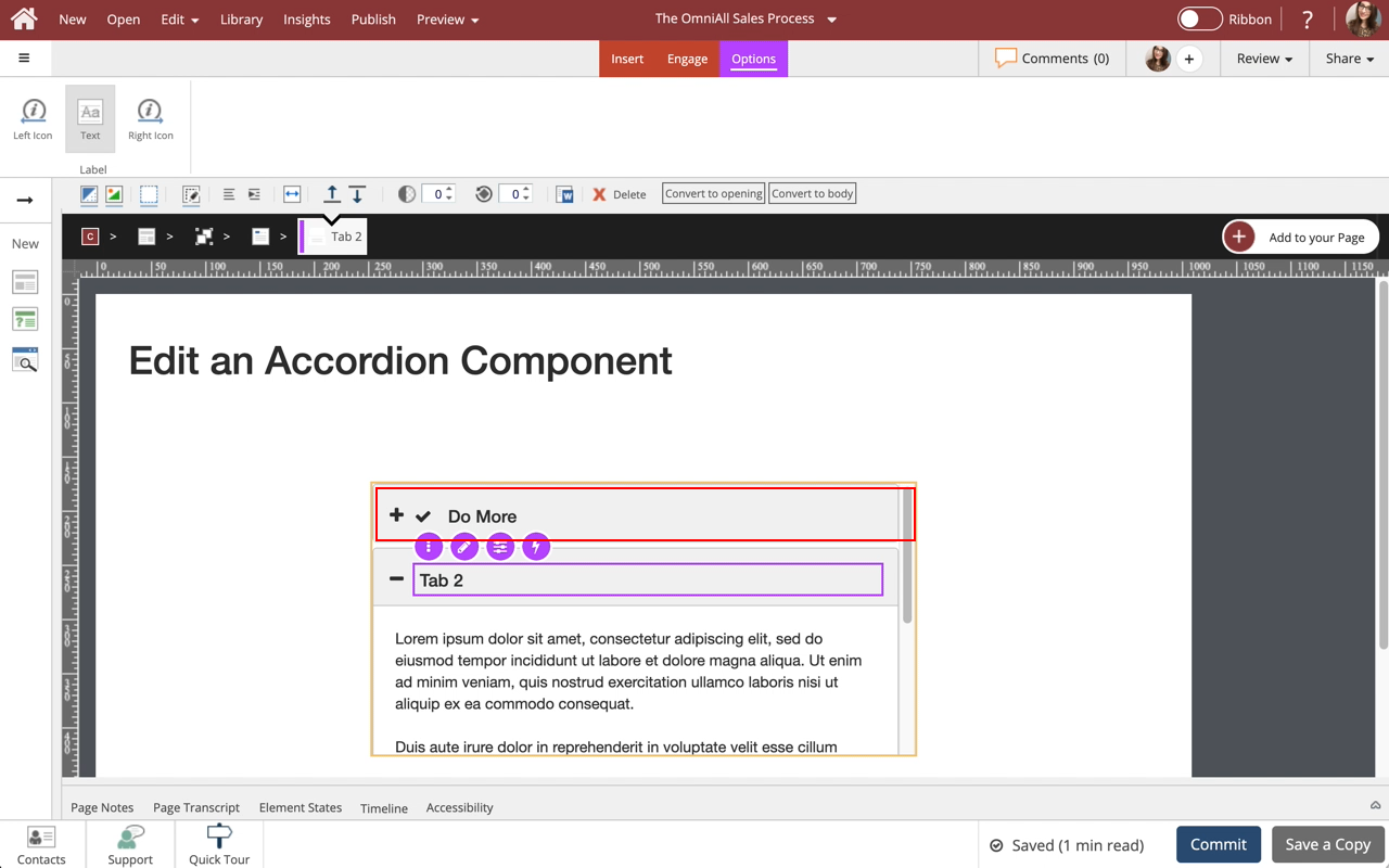
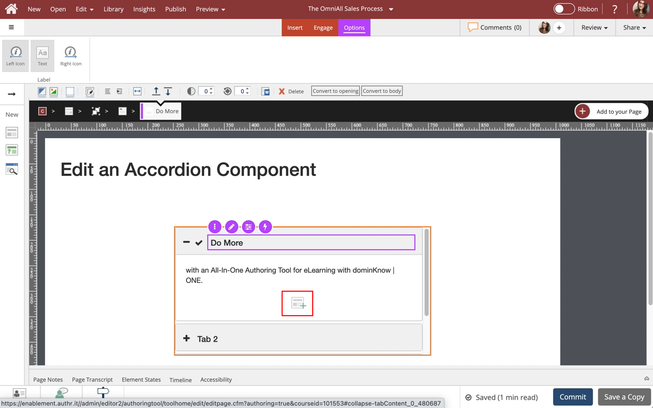
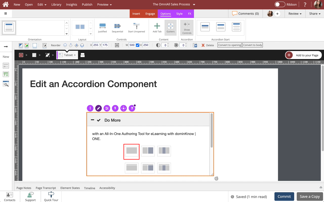
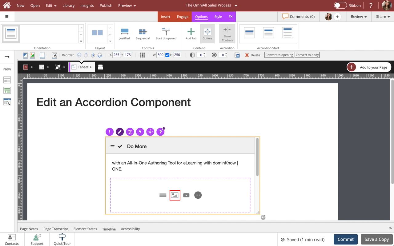
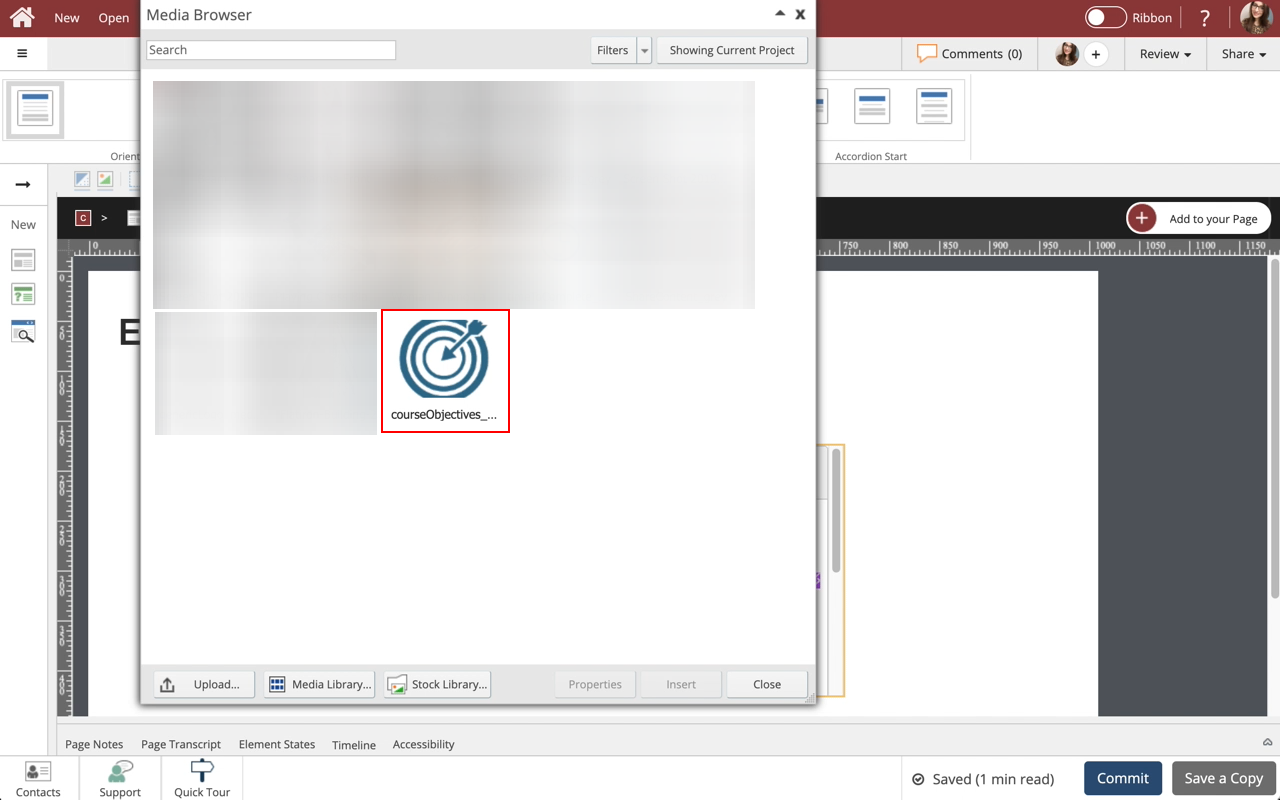
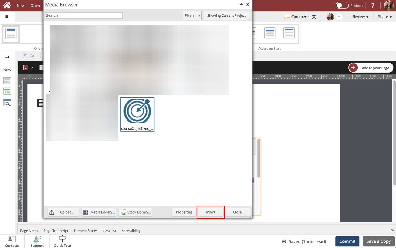
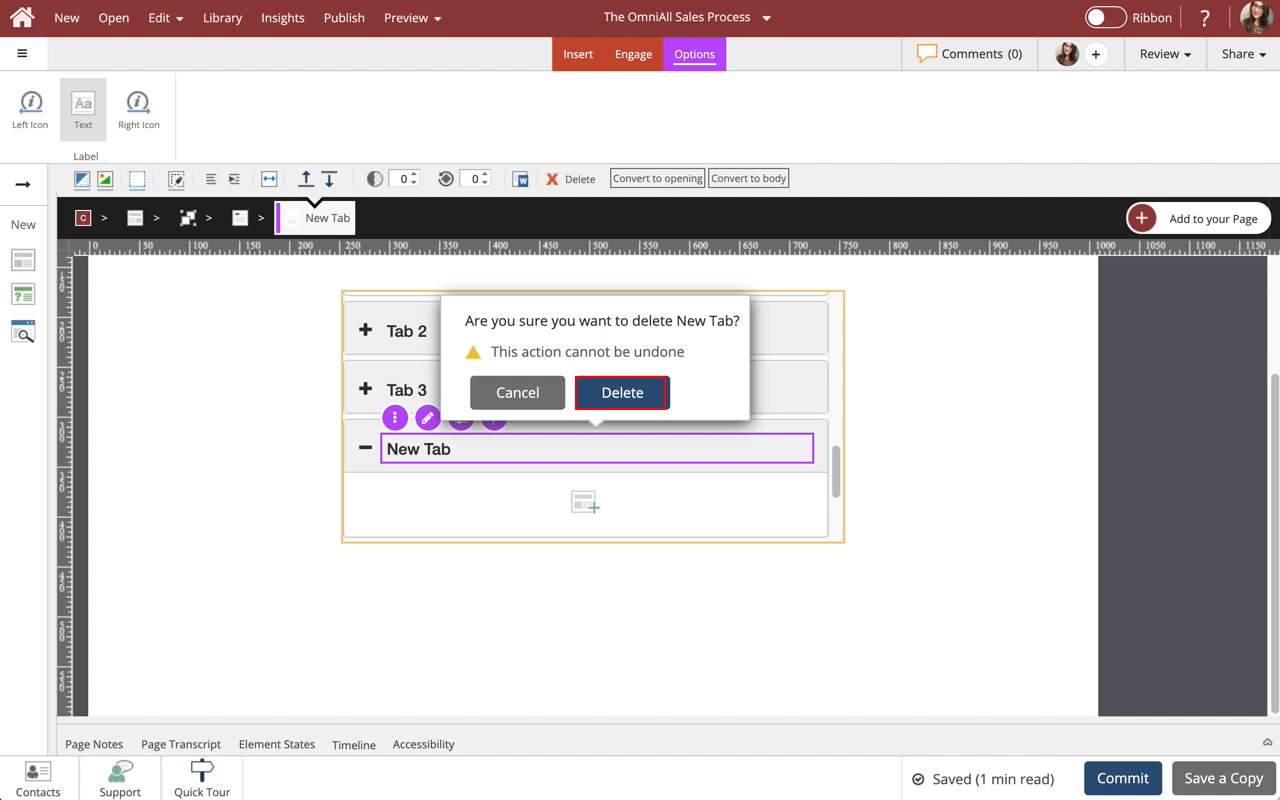
Step 22
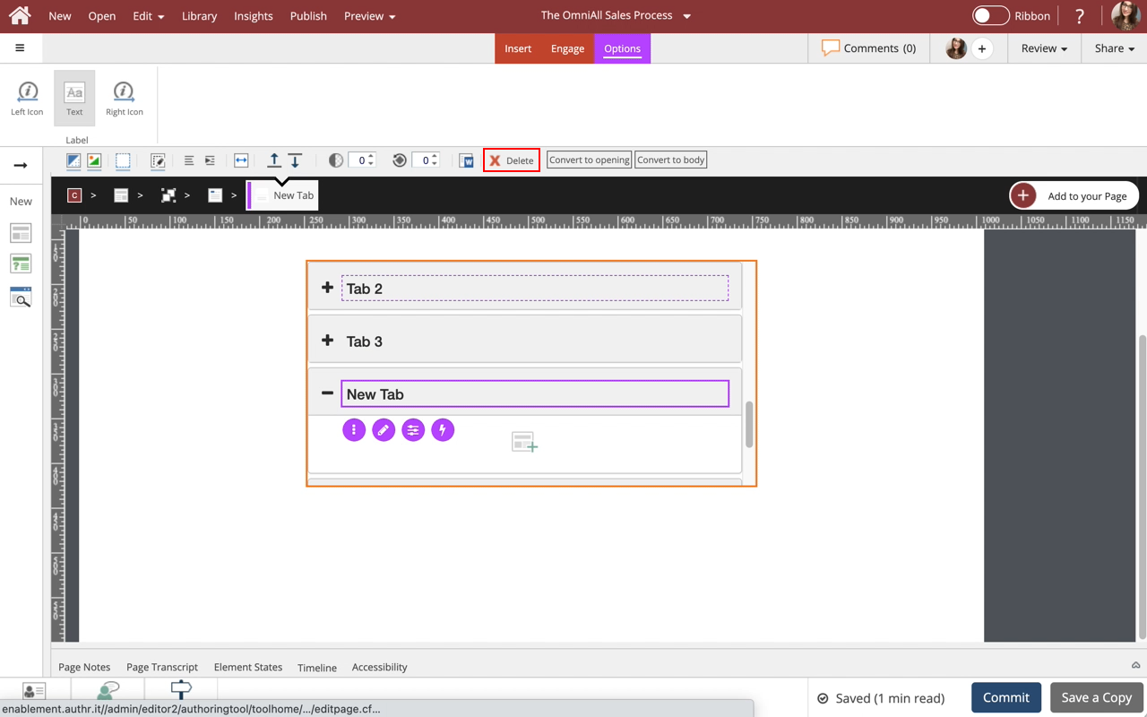
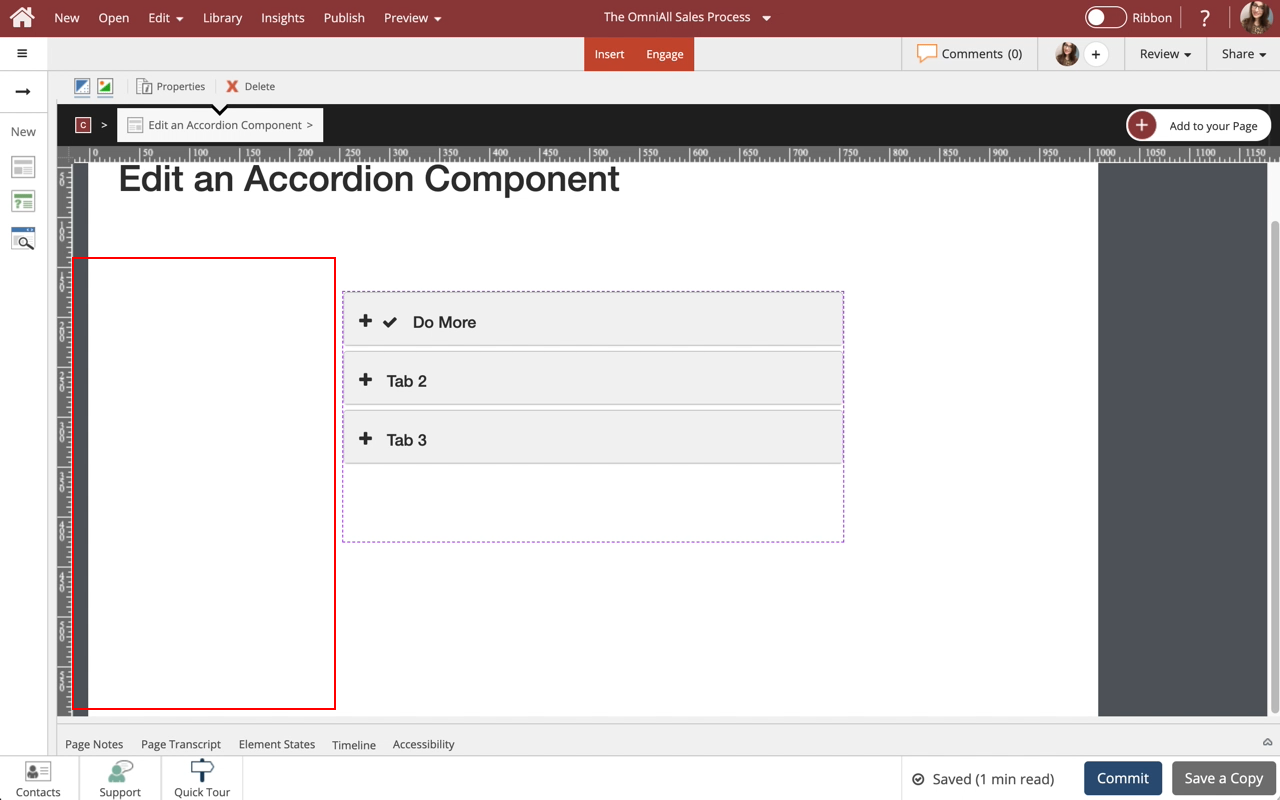
The tab is deleted.
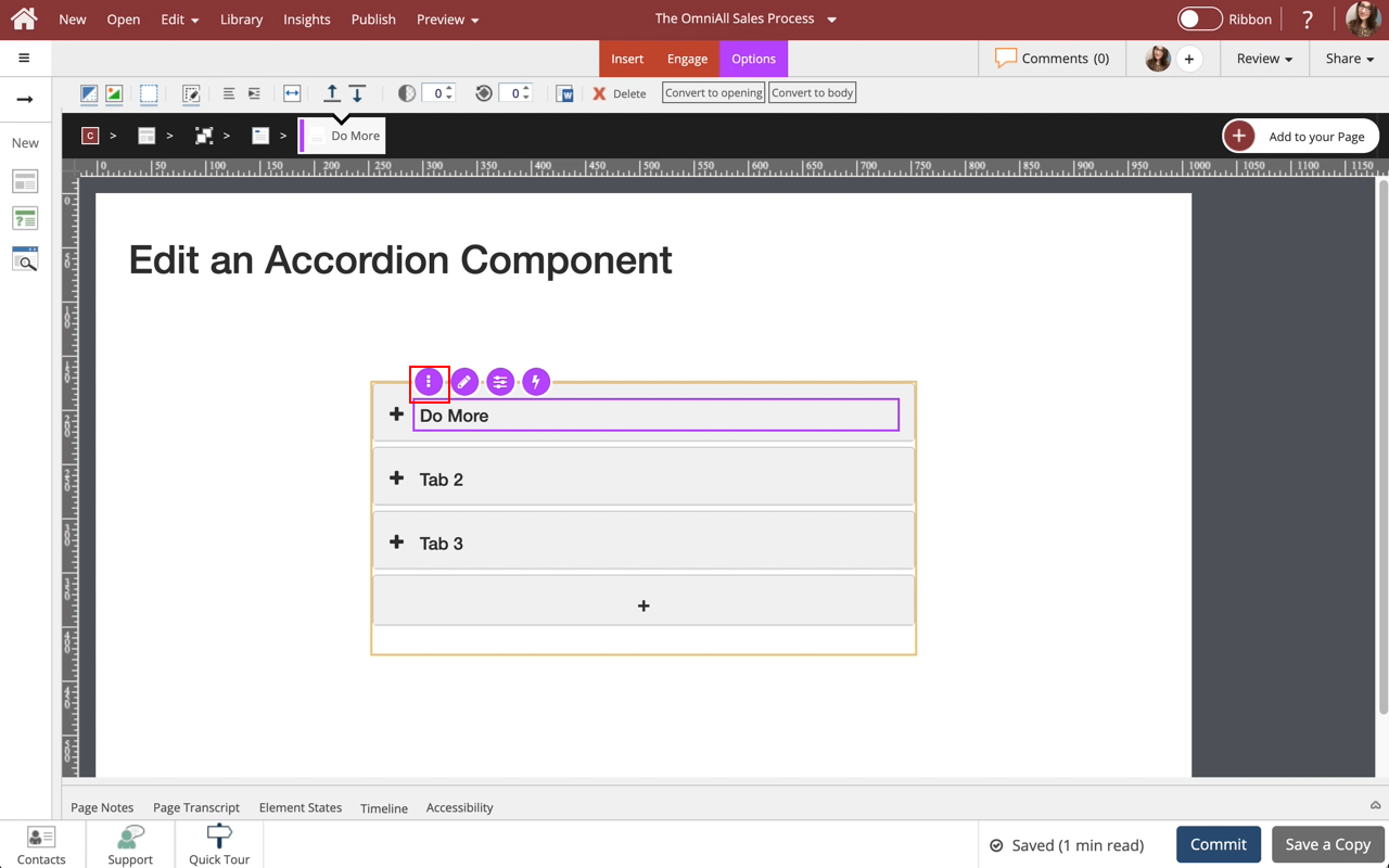
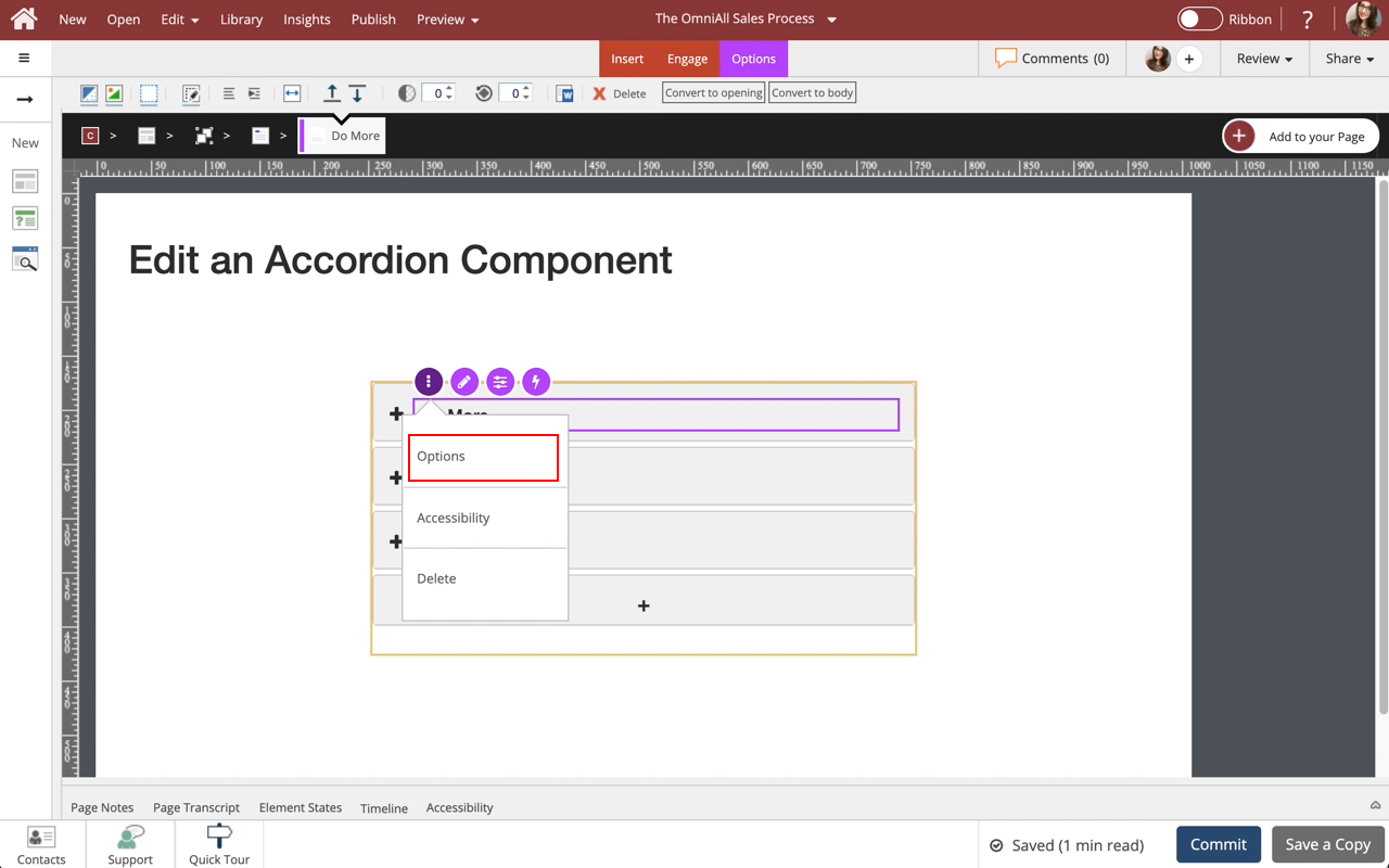
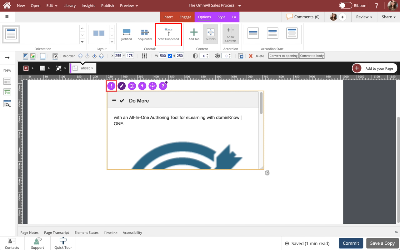
You can use the three-dot menu in the Inline Toolbar within the component to access the Options, Styles and FX tabs, Accessibility panel, and add a New Comment, or Delete the component.
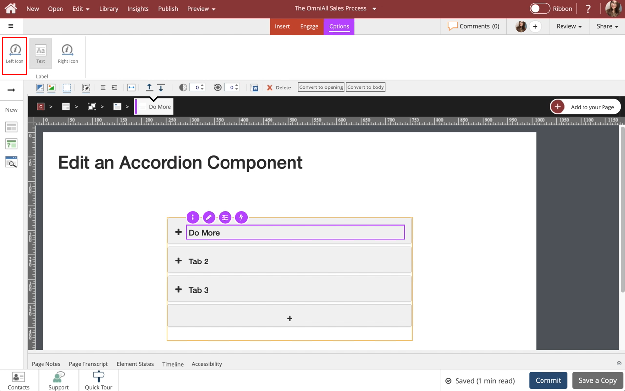
In the Options tab, select Start Unopened.

Comments ( 0 )
Sign in to join the discussion.