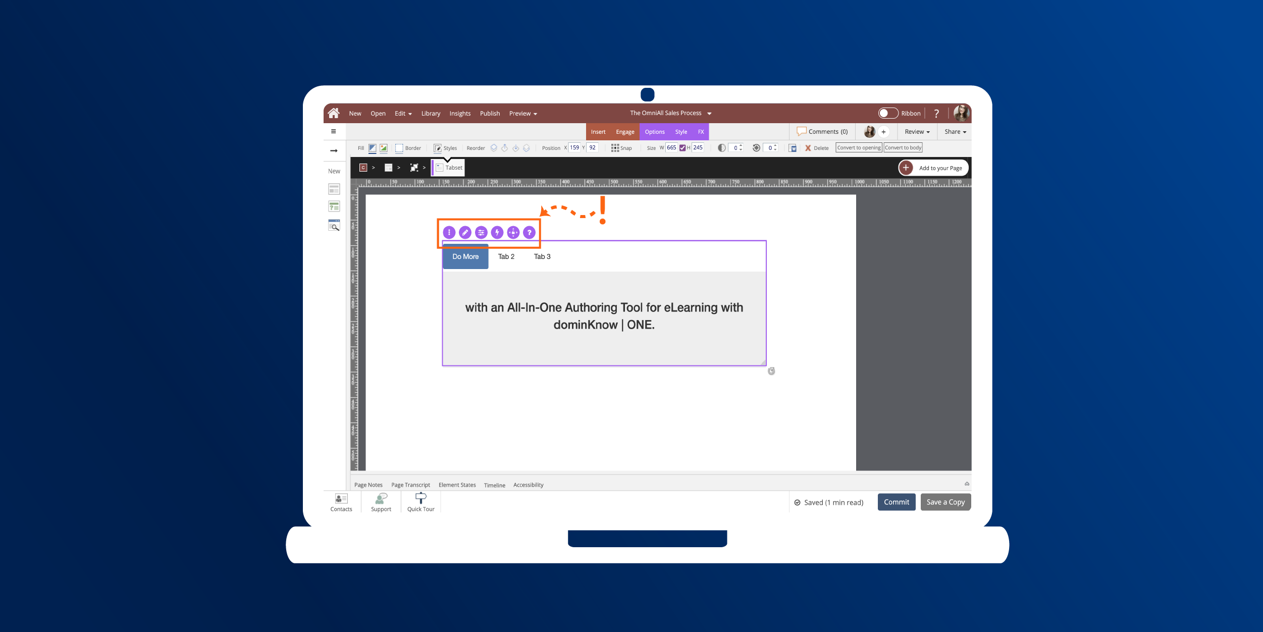
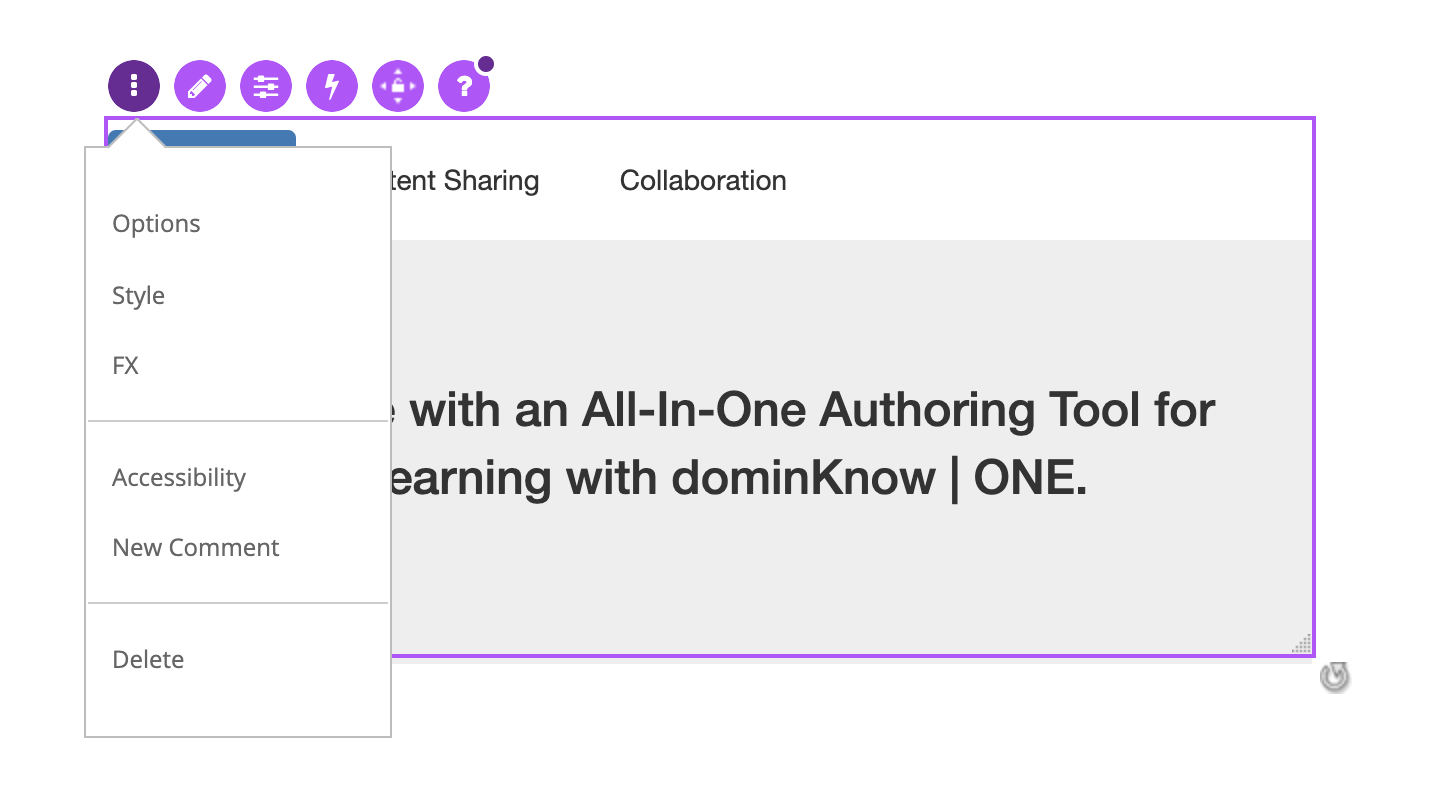
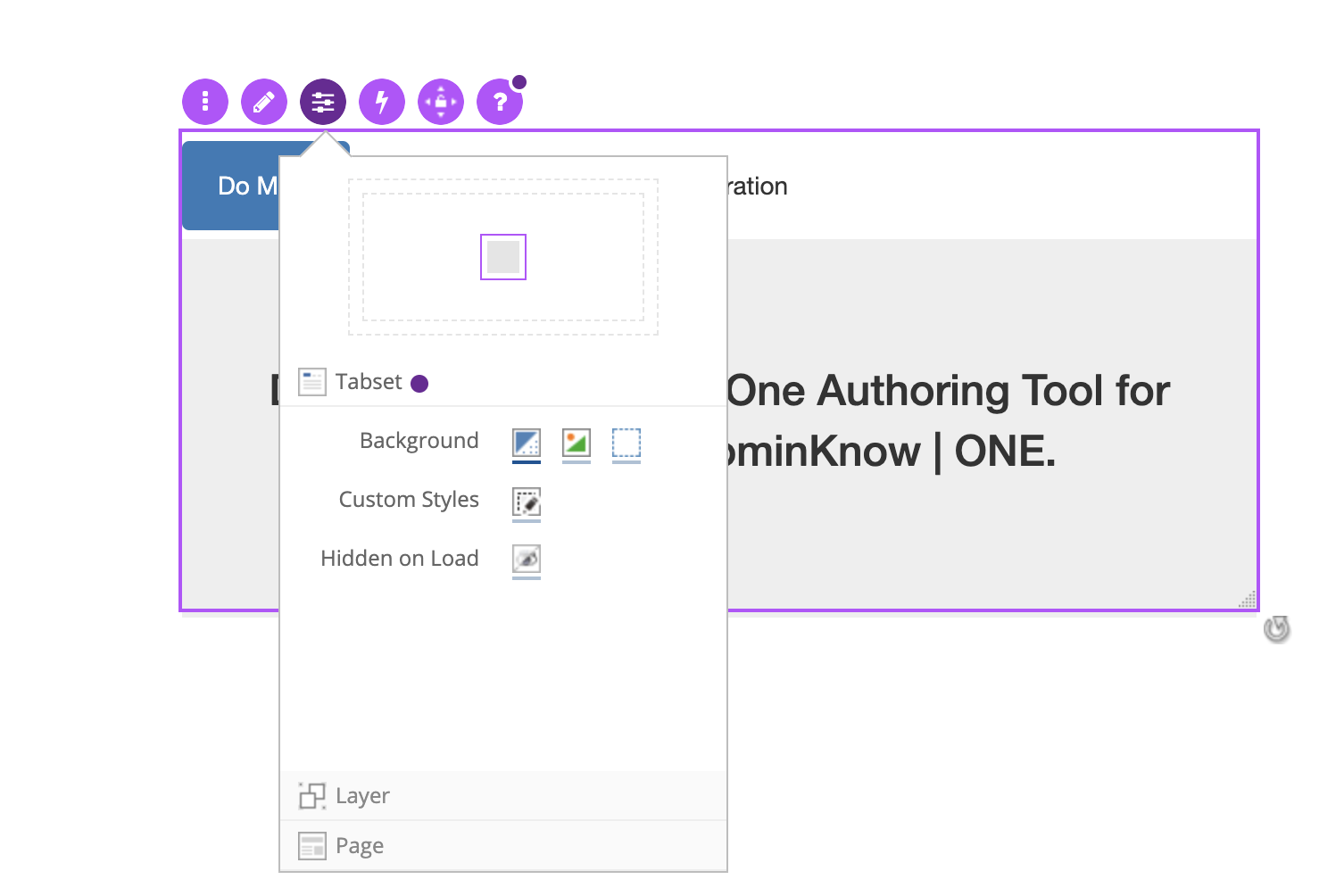
Selecting the Actions control opens the Actions panel.
For Components the default Action will use one of the two options:
- When I am Clicked....
- or When Content is Complete.
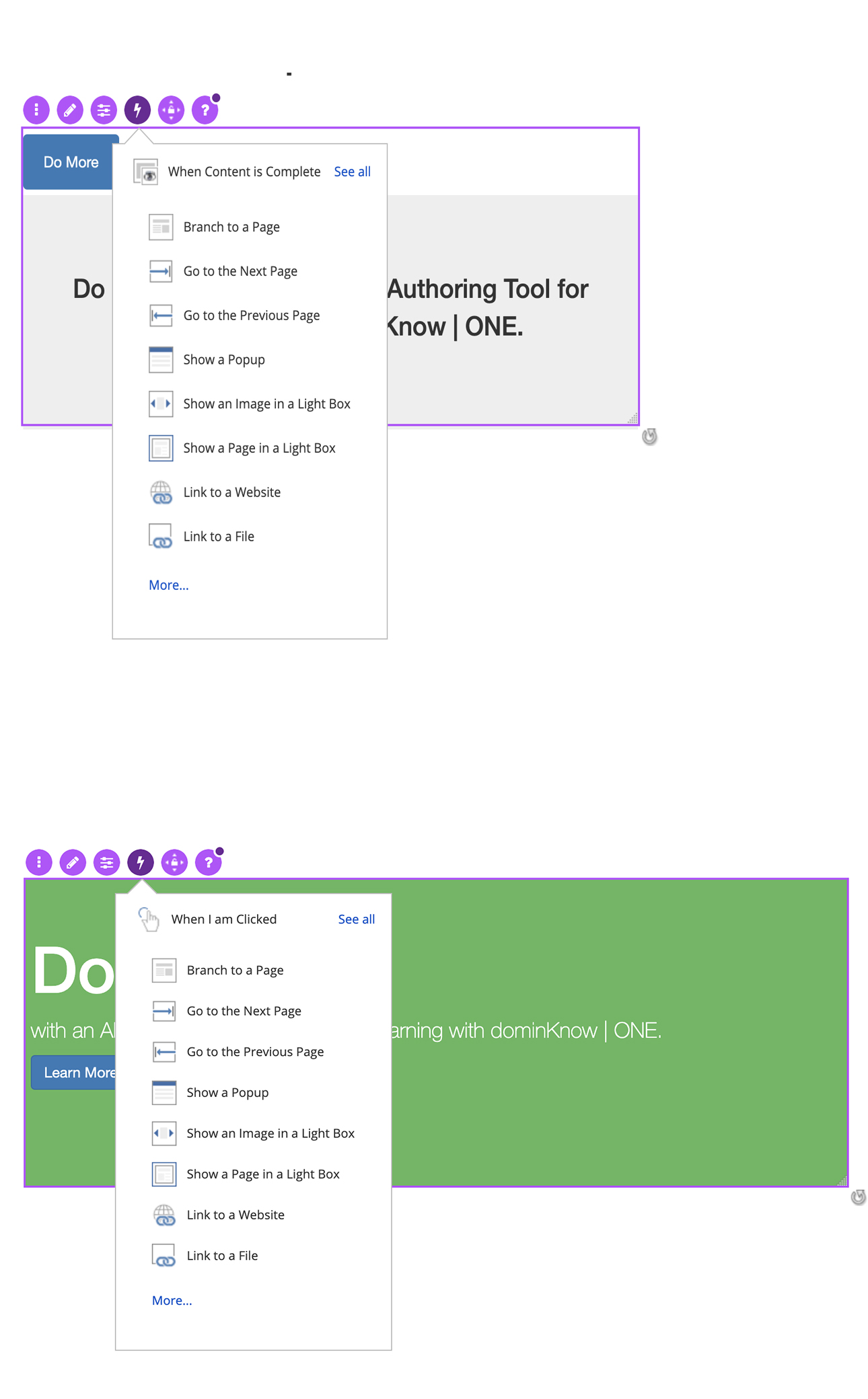
When Content is Complete trigger
This default action is used when a component is best to have all the content completed, before the action is triggered. But you can choose other triggers by selecting See All.
You can quickly select an action for When Content is Complete trigger from the list or select More... to view all available Actions.
When I am Clicked trigger
This default action is used when a component is best clicked to trigger an action.
For Components that must be completed to see all content the action create actions based on the learner completing the content OR within the component, but you can choose other triggers by selecting See All.
You can quickly select an action for the When I am Clicked trigger from the list or select More... to view all available Actions.
If any actions are set for the element the Actions Control icon will show an added dark purple marker/indicator. Selecting the icon will now display a list of the actions with an option to edit them or add more actions.


Comments ( 0 )
Sign in to join the discussion.