Embed
Embed: preview
Embed size:
Maintain aspect ratio
Show steps
Embed code
Create a Collection
Update Collections
Create a
Collection
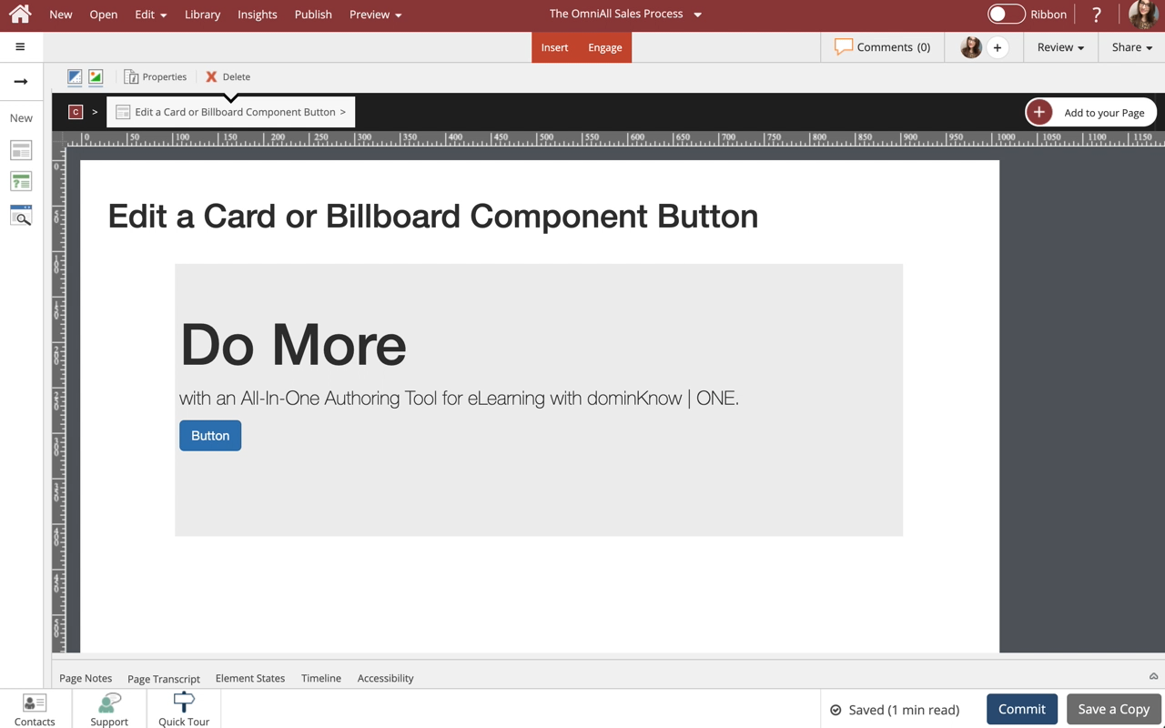
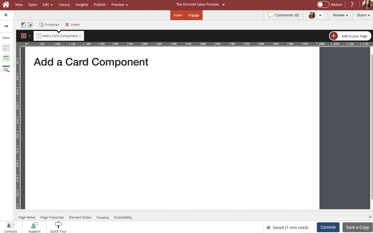
Use cards to set apart certain information, and assign headers, footers, borders and styles as you see fit. This lesson covers controlling the display properties of the Card component to suit your design needs.
Note: Cards are available in multiple styles with or without a Button. The buttons are easily set up just like any other button in dominKnow | One.
Product: dominKnow | ONE | Version: 7.4
Applies to: Flow, Claro
Applies to: Flow, Claro
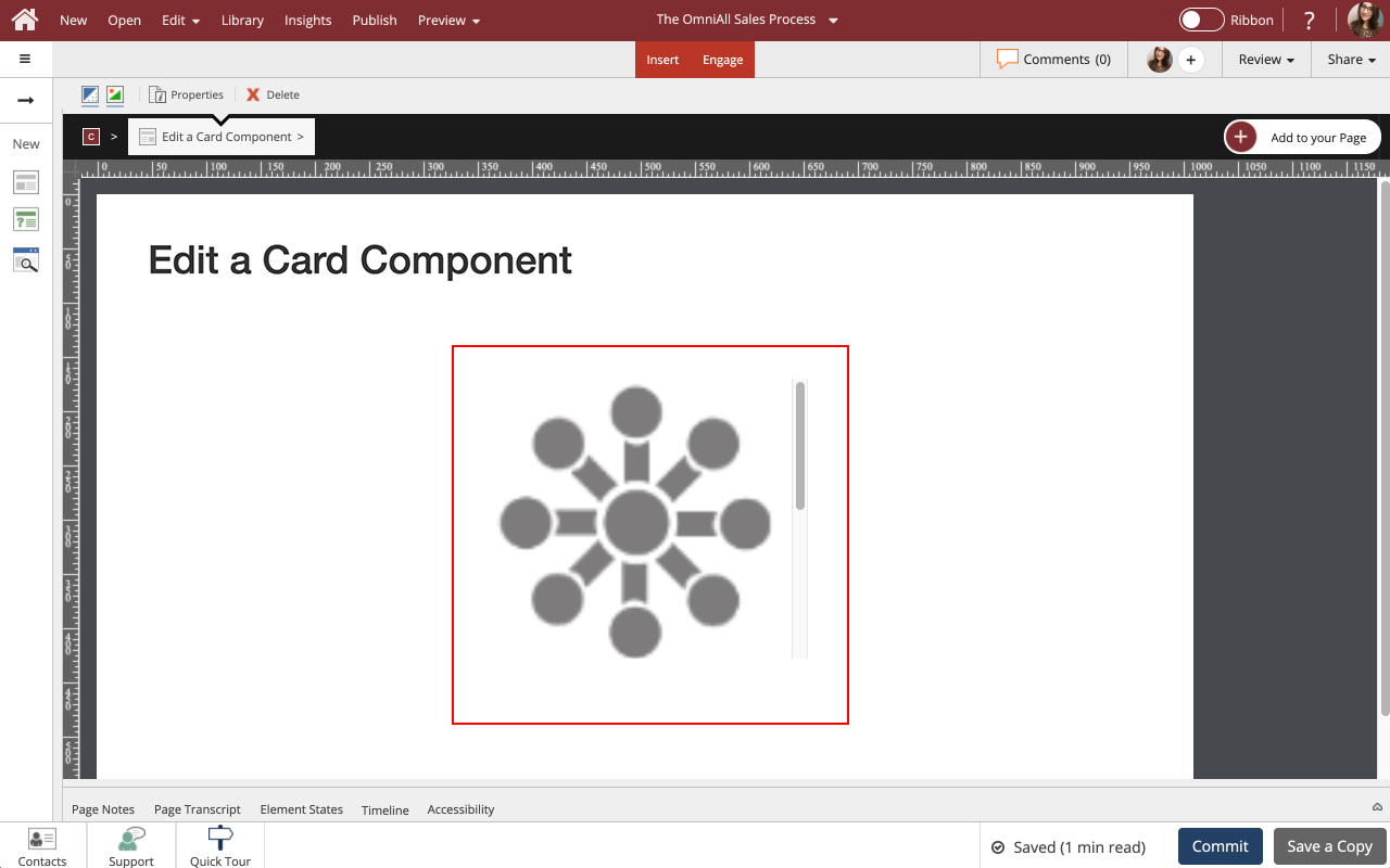
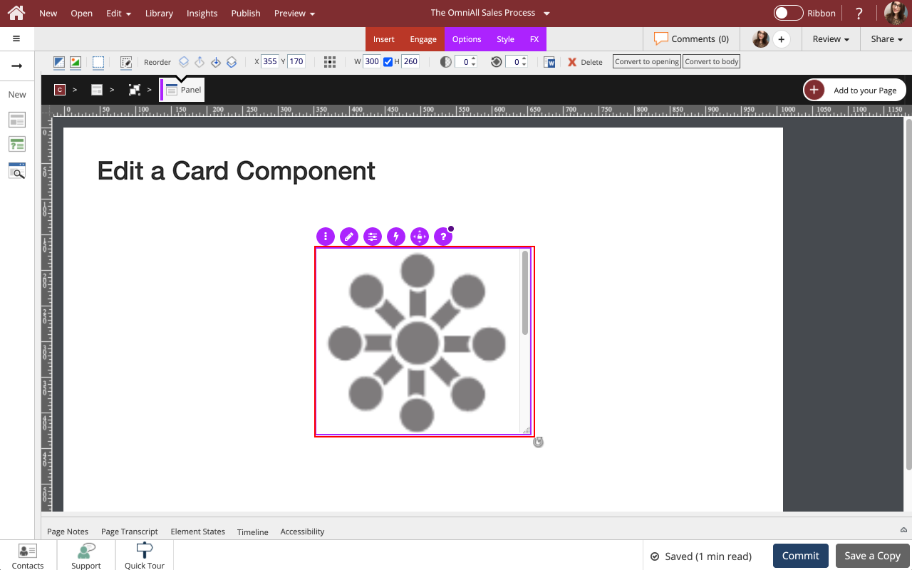
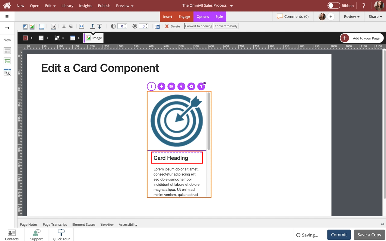
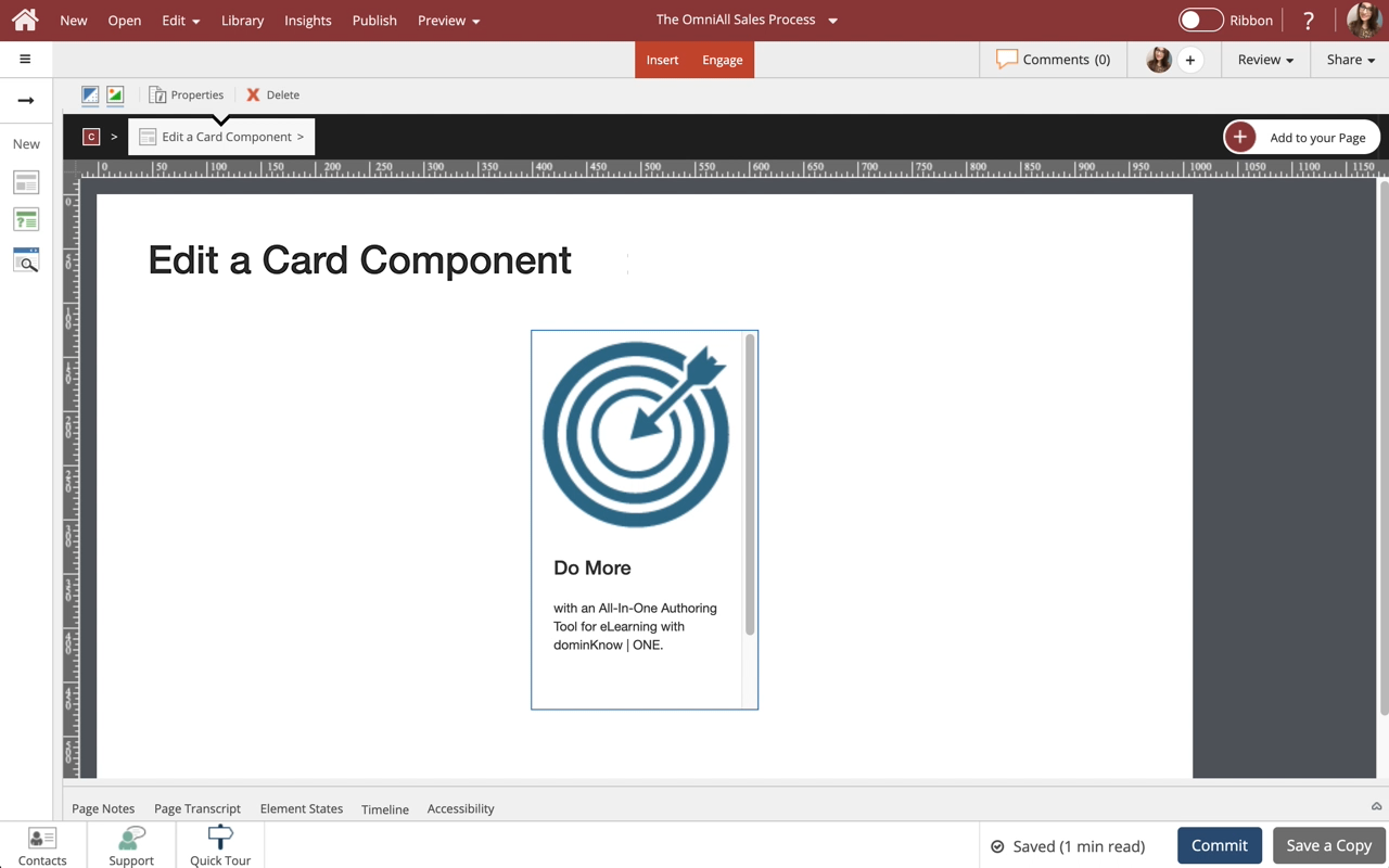
00:00 Select the Card on the page.
00:04 Select the Compnent again, and we'll resize it for you.
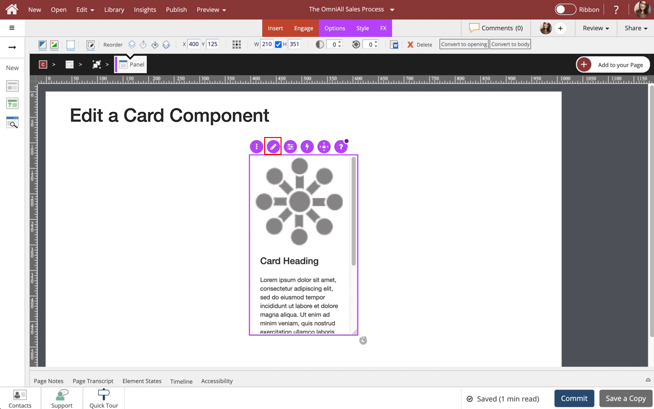
00:08 To edit the content within the Card, select the Edit Icon in the Inline Toolbar, or double-click the Card.
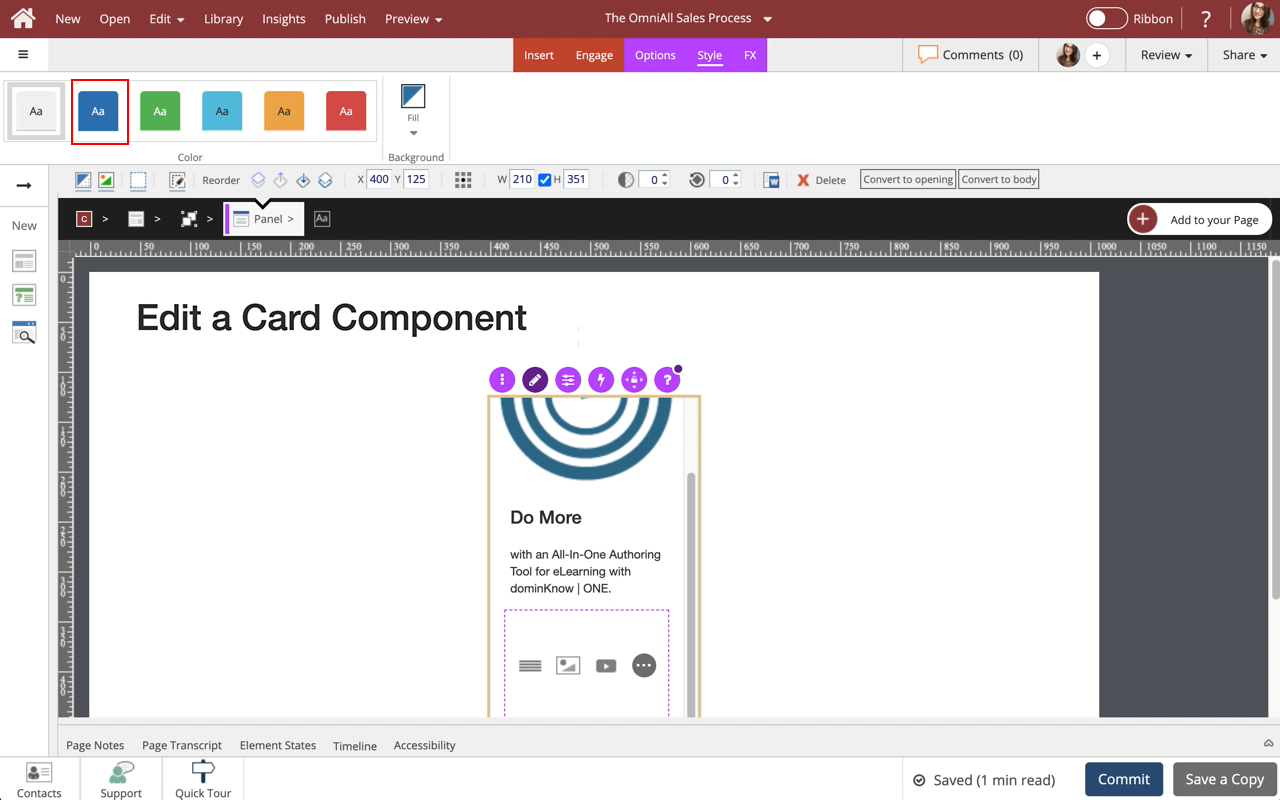
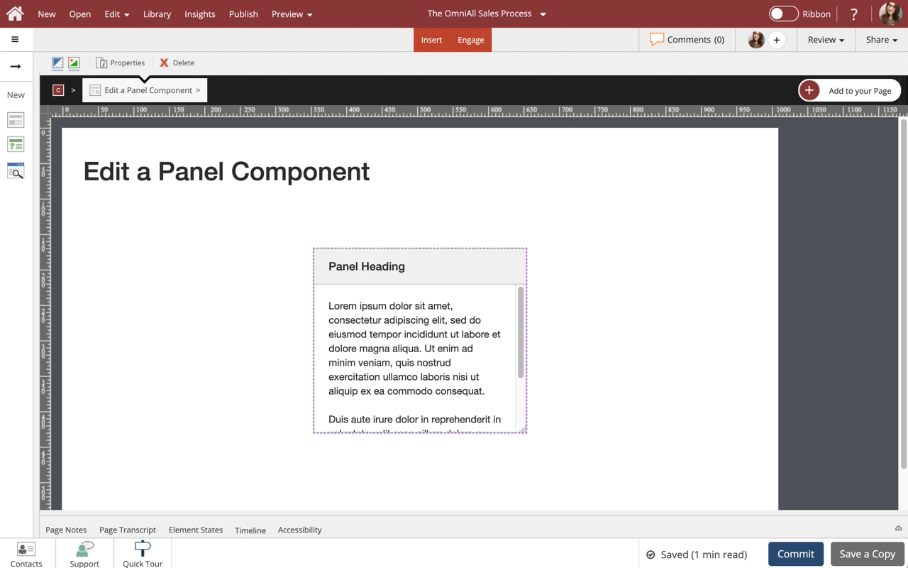
00:12 In the breadcrumb above the stage, you can see that you are editing the Panel for the Card.
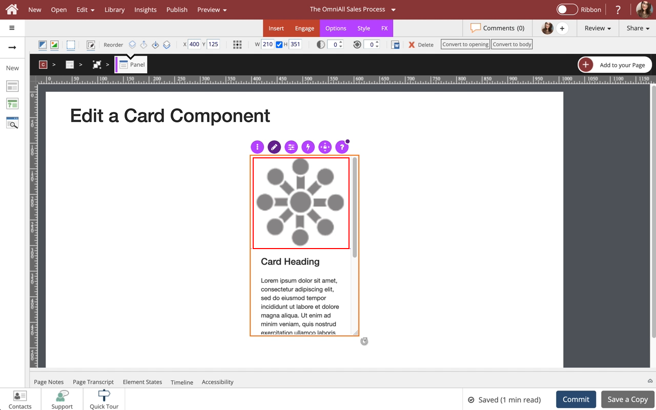
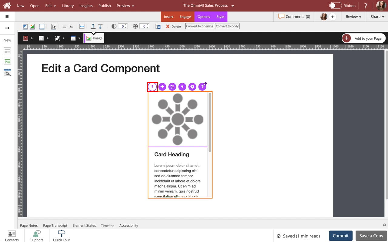
To change the Image in the Card, select the Image.
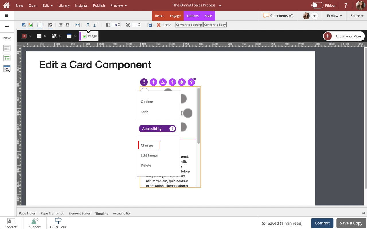
00:16 Select the Three-Dot Menu in the Inline Toolbar.
00:20 Select Change.
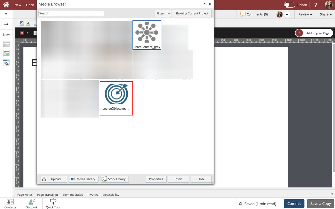
00:24 Select the new image courseObjectives_... from the Media Browser.
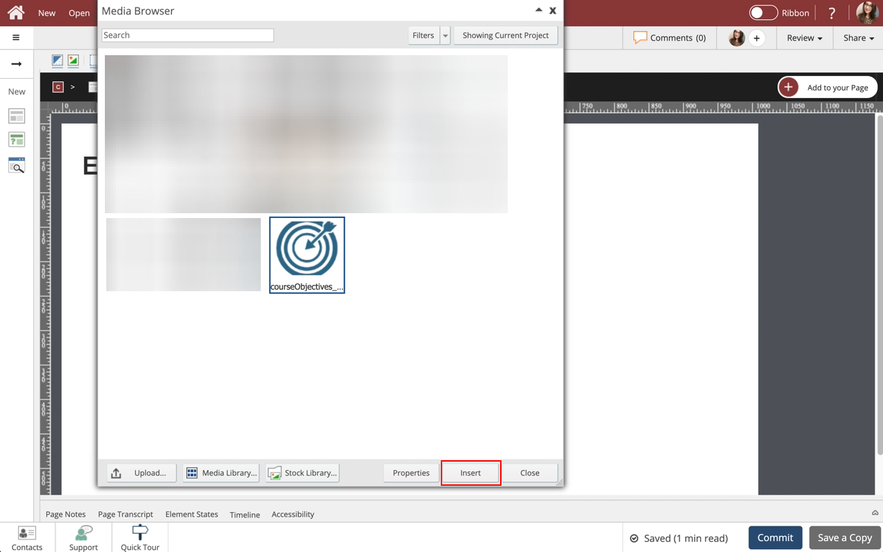
00:28 Select Insert.
00:32 The image has been Changed.
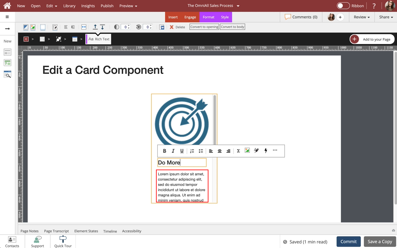
Select the Card Heading to edit it and we'll add text for you.
00:36 The new text is added.
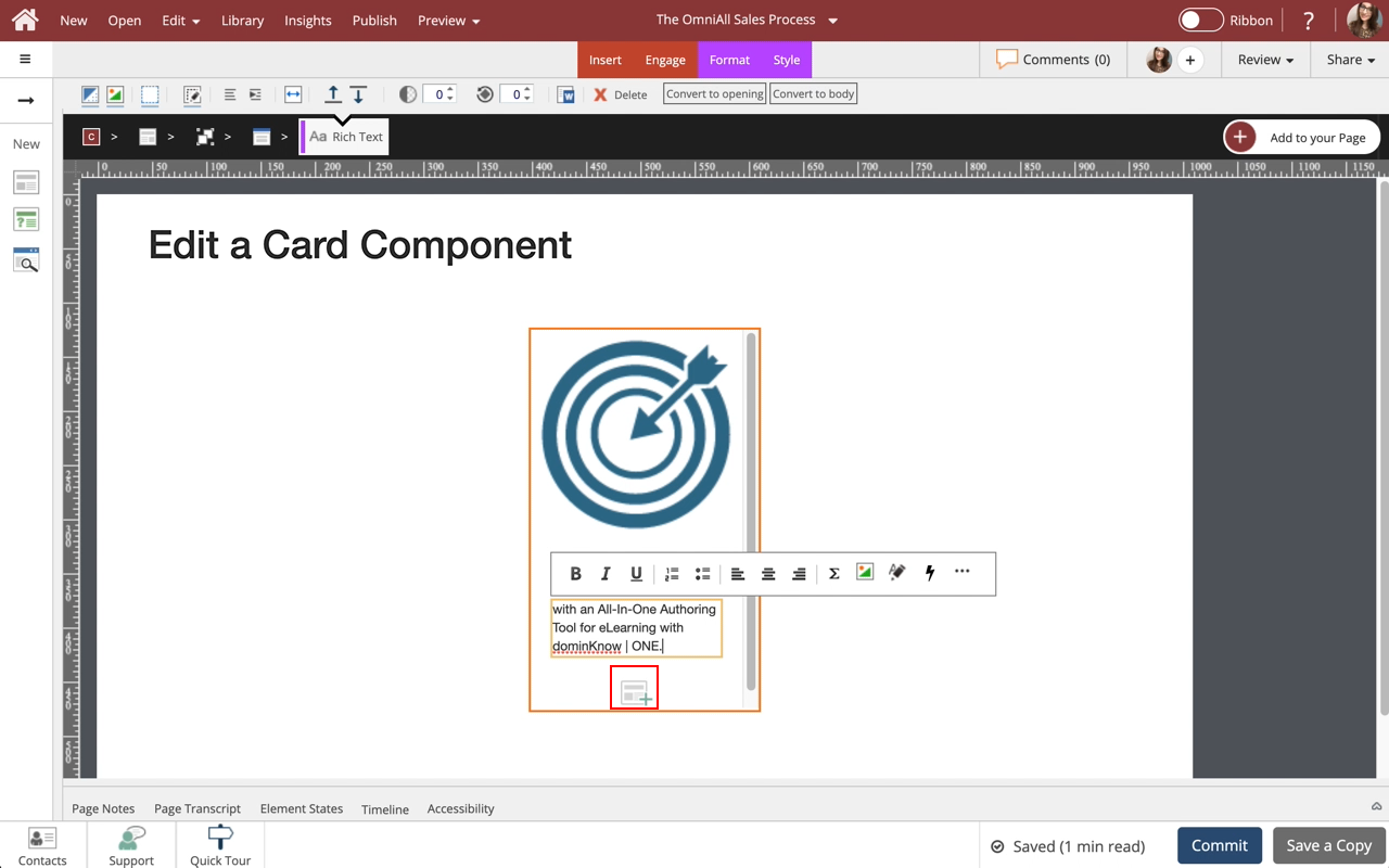
Select the Paragraph Text to edit it and we'll add text for you.
00:40 The new text is added.
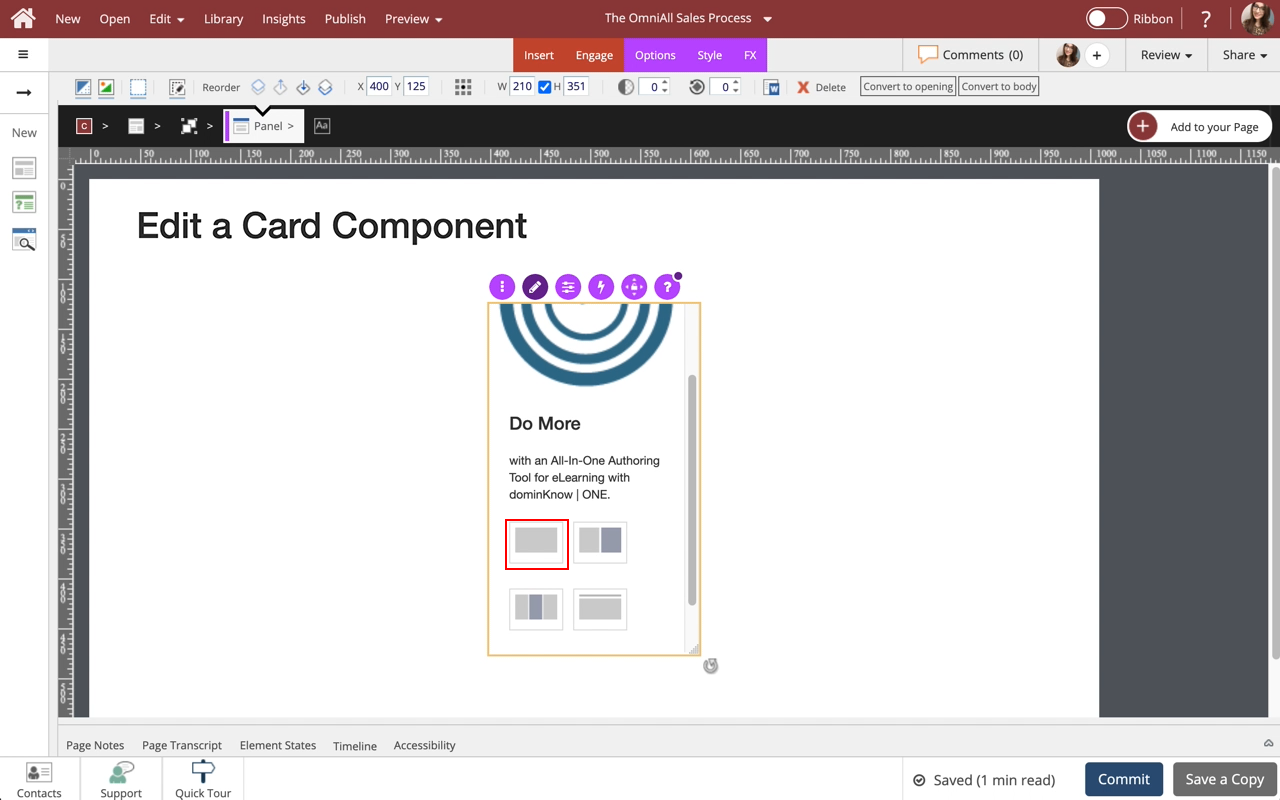
Select the + icon at the bottom of the component to add more content layouts to the Card.
00:44 Select the Single-Body Content option.
00:48 You can use the options to add specific content to this new layout
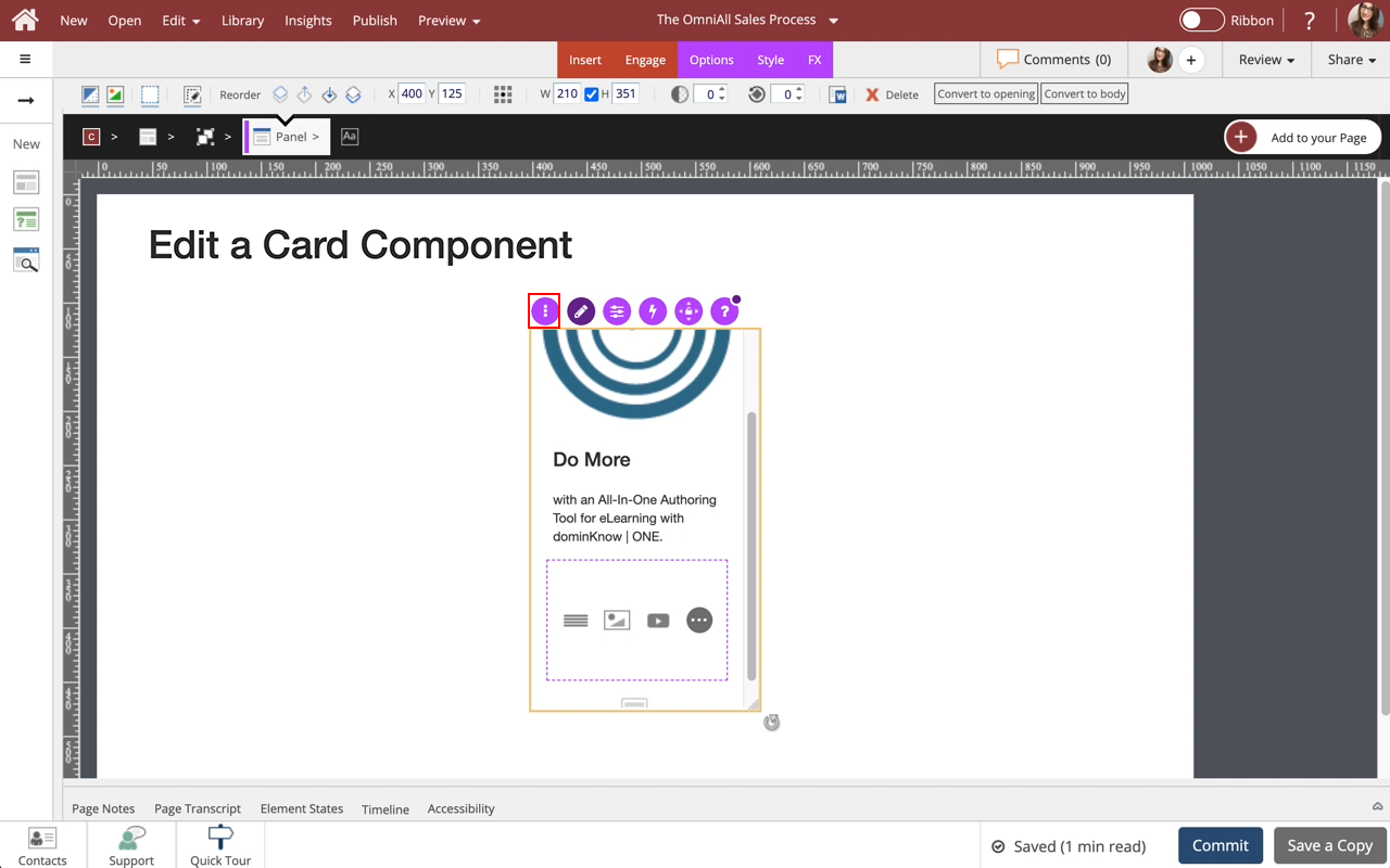
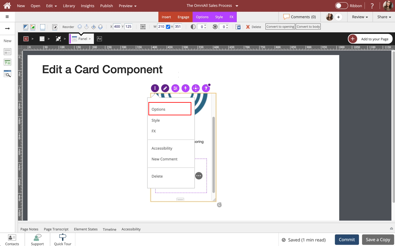
Select the three-dot menu in the Inline Toolbar. Have access to the Options, Styles and FX tabs, Accessibility panel, and add a New Comment, or Delete the component.
00:52 Select Options.
00:56 The Options and Style tabs have a number of control and design options for the Card component as a whole. You can change the look of the Panel to show a header, a footer, both or none, change the control settings if a header is added, add icons to the header panel, change the panel header color, add a border, add a background Fill color, and in Flow adjust the Size. Use the FX tab to add effects to the component. Note: Cards with a Button can be added using the Engage Tab.
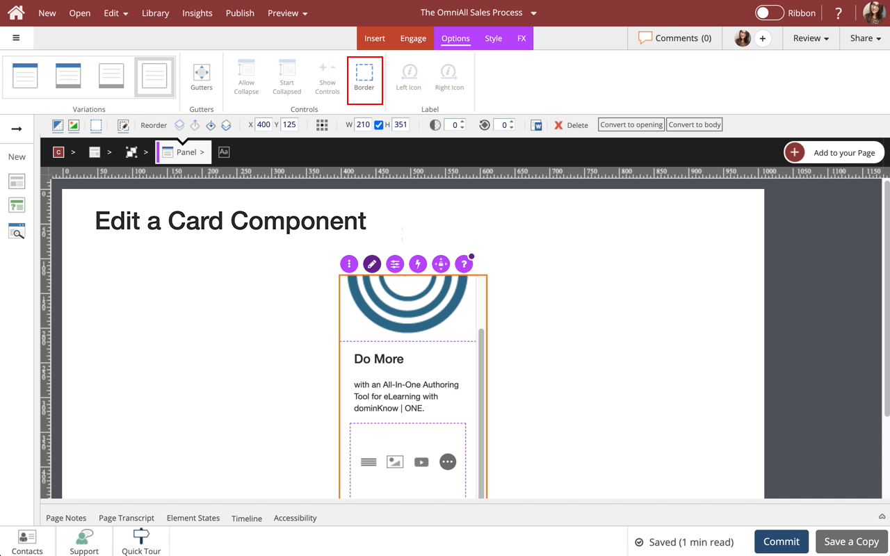
Select Border, in the Options Tab,
01:00 A Border is added to the Card.
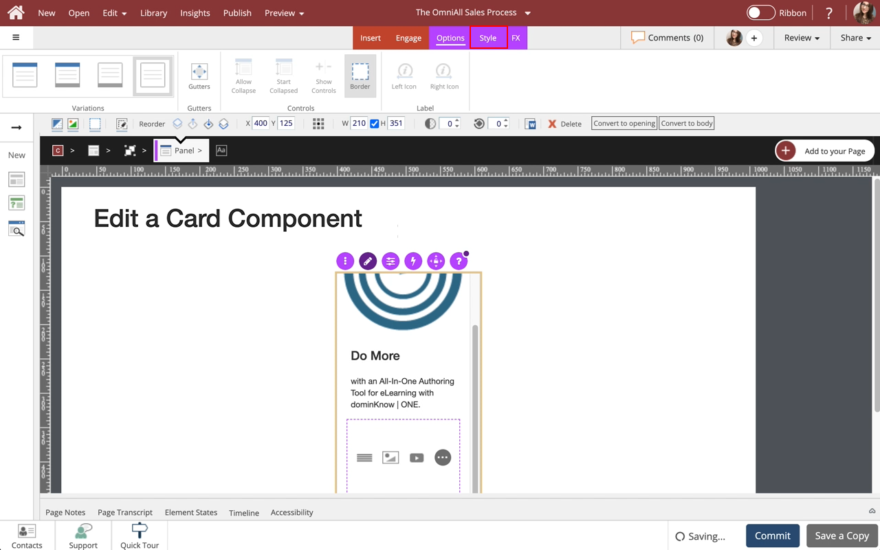
Select the Style tab.
01:04 Select Option 2 under Color (dark blue).
01:08 The border color of the Card has changed.
Select the Page to return to the Page content.
01:12 Preview the Current Page to see how the Callout will look and behave for your learners.



Comments ( 0 )
Sign in to join the discussion.