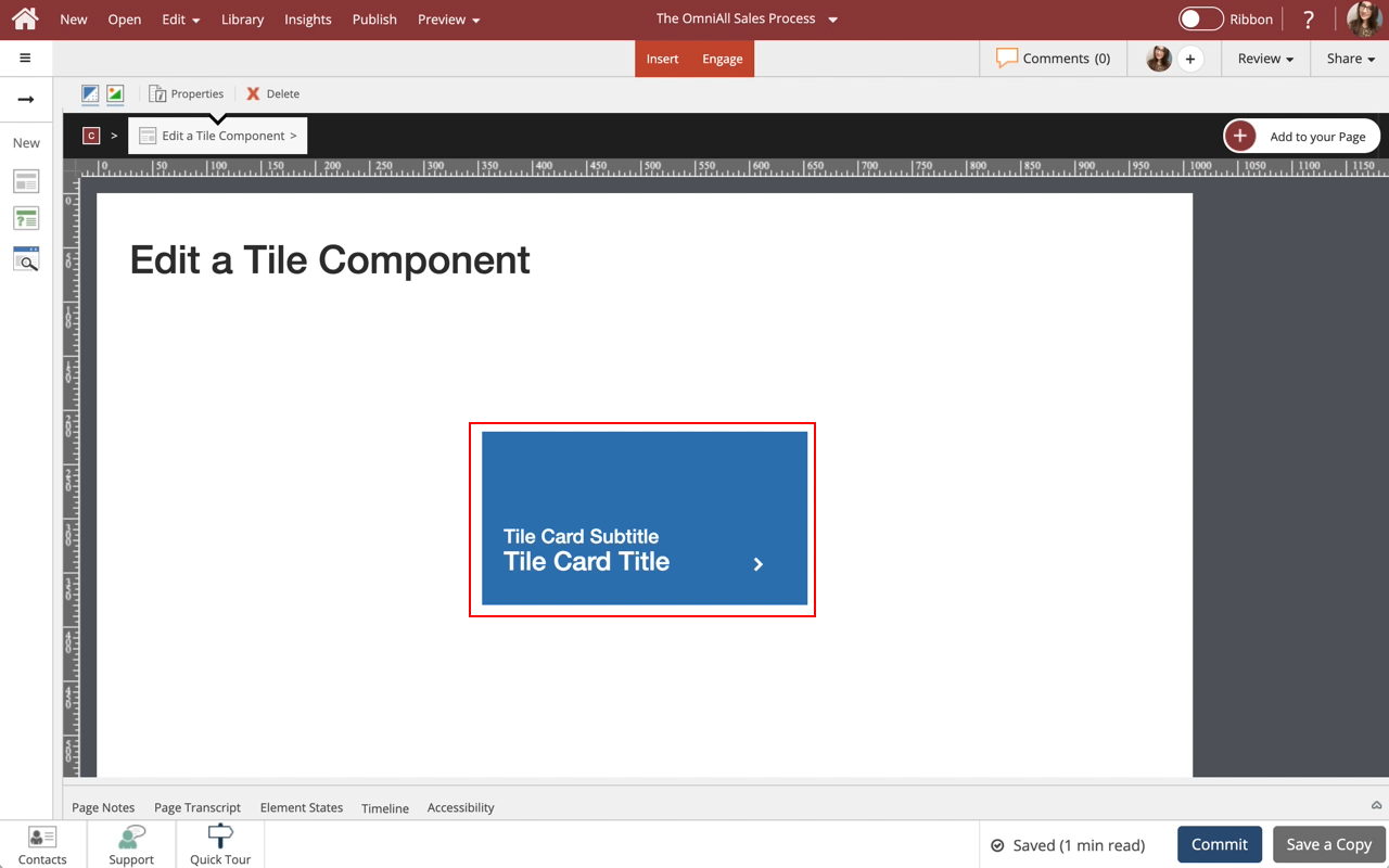
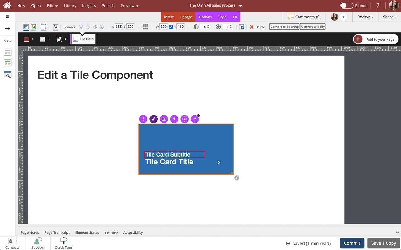
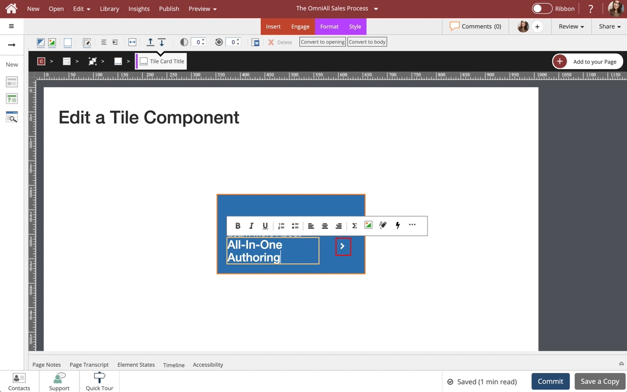
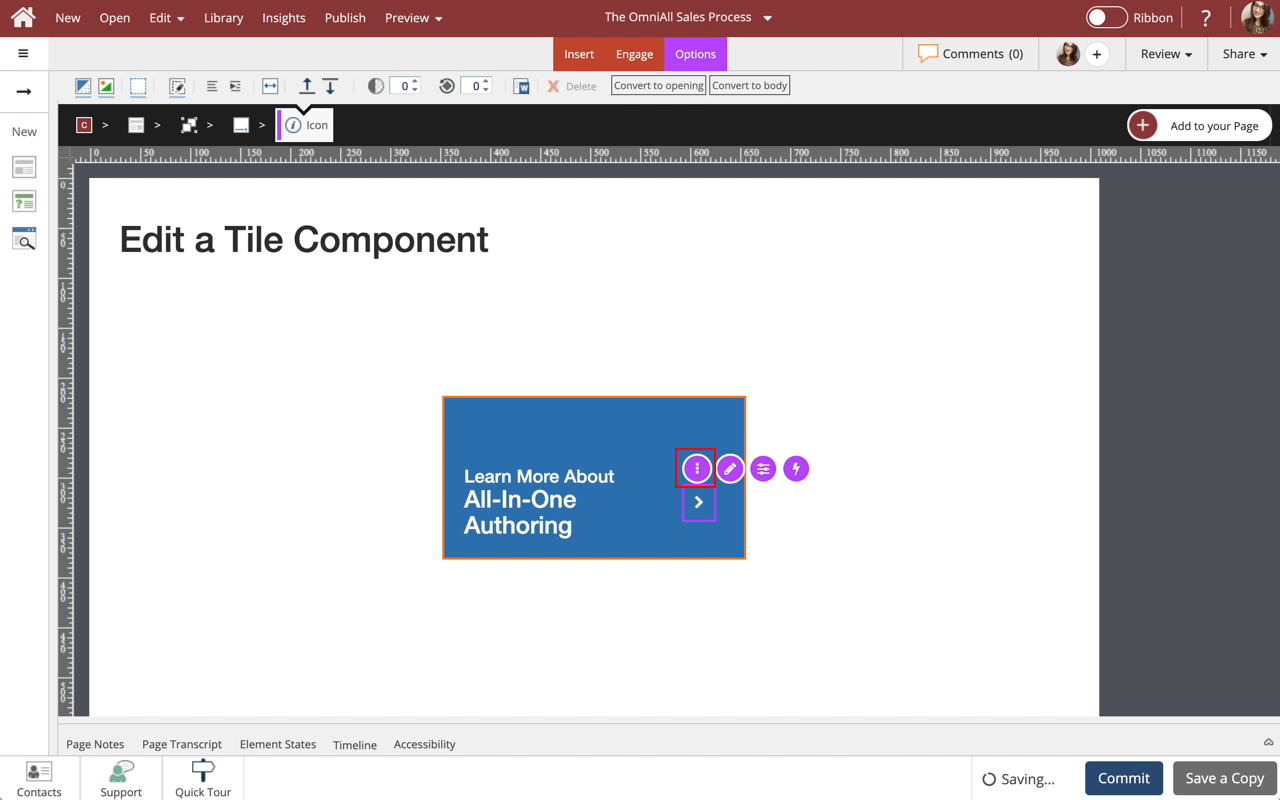
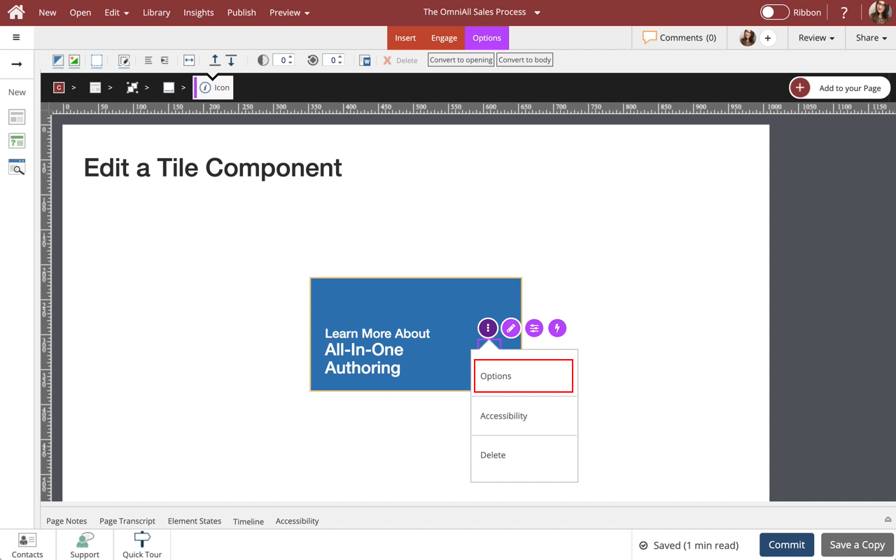
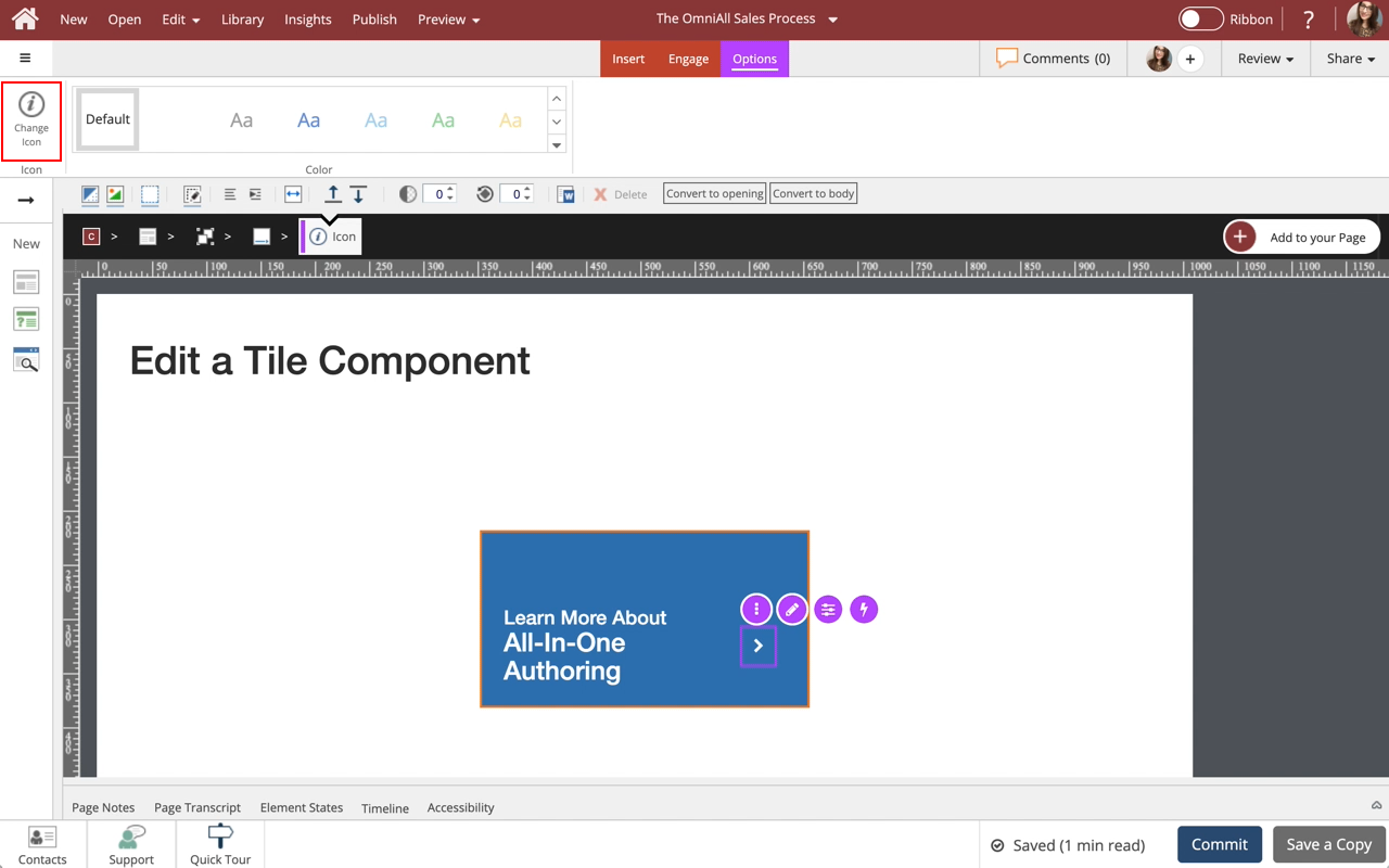
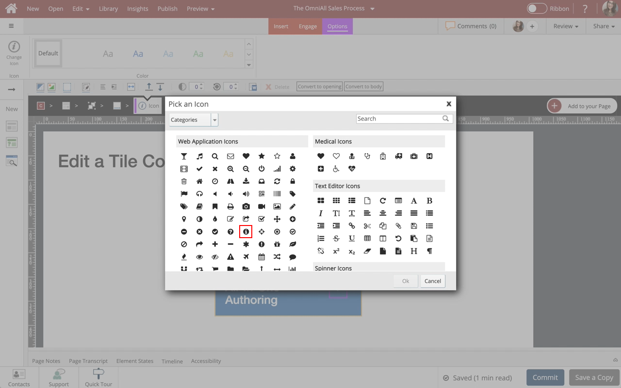
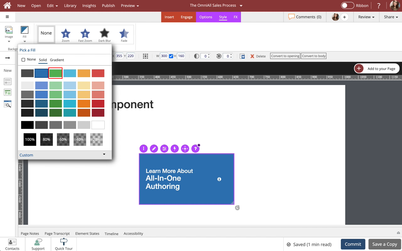
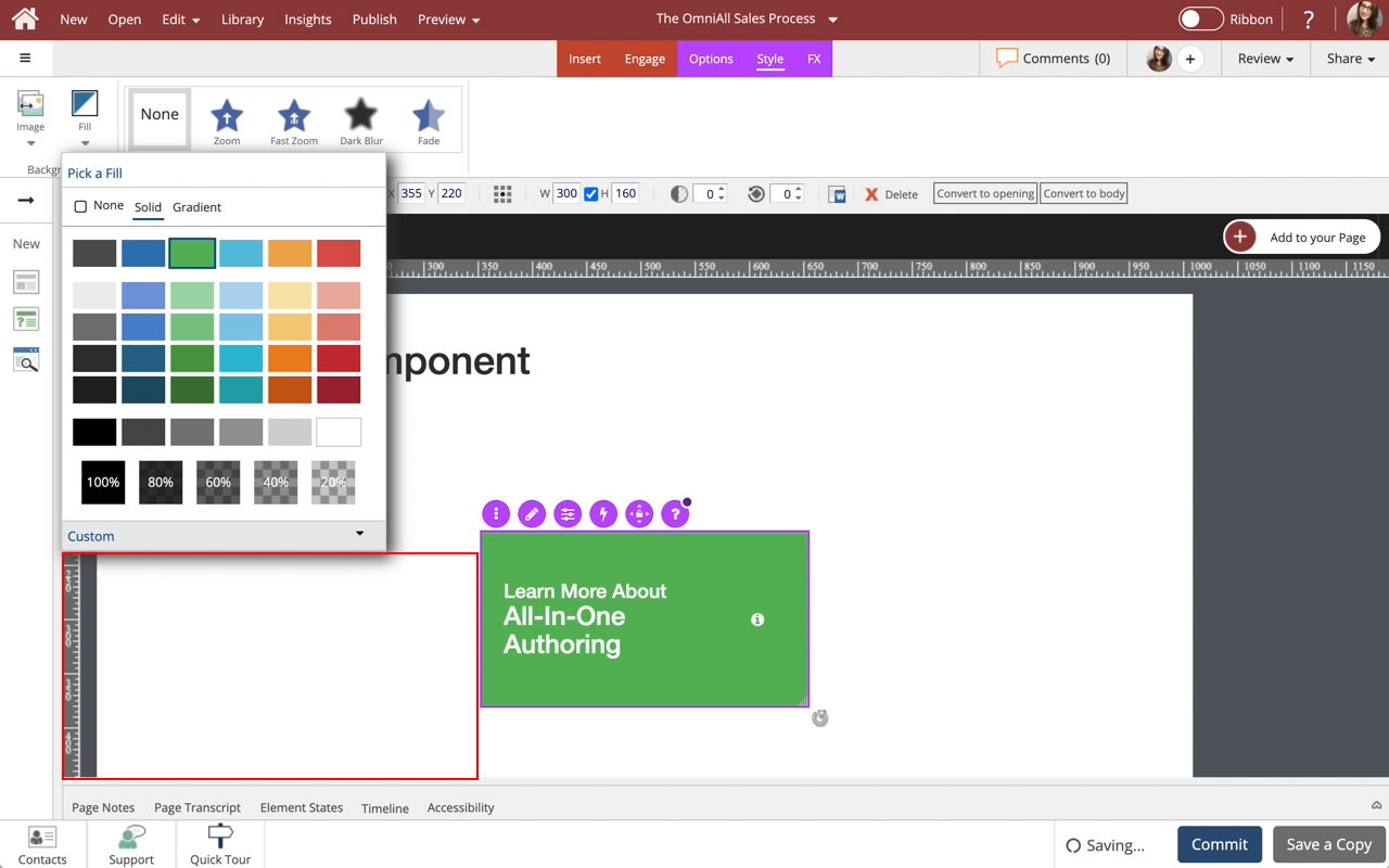
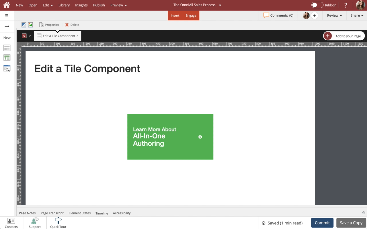
Edit a Tile Card Component
Steps to edit a Tile Card component.
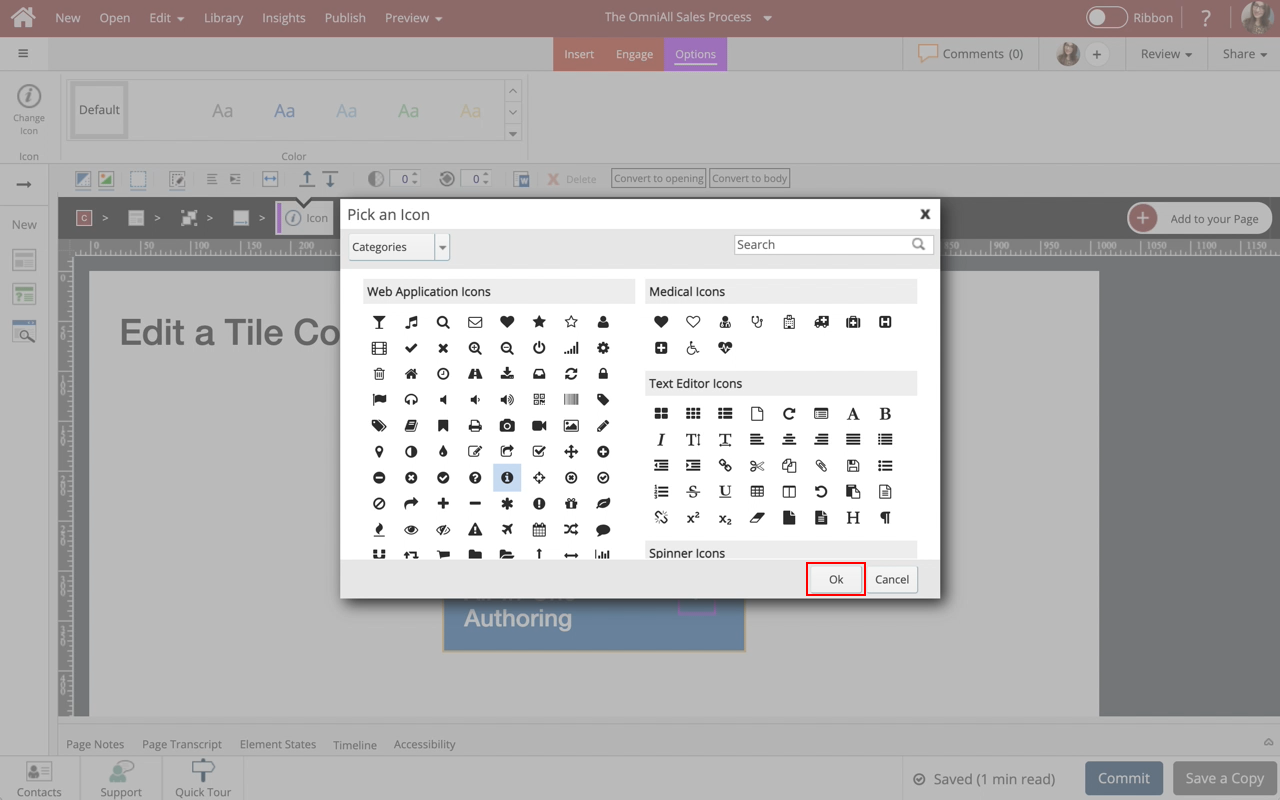
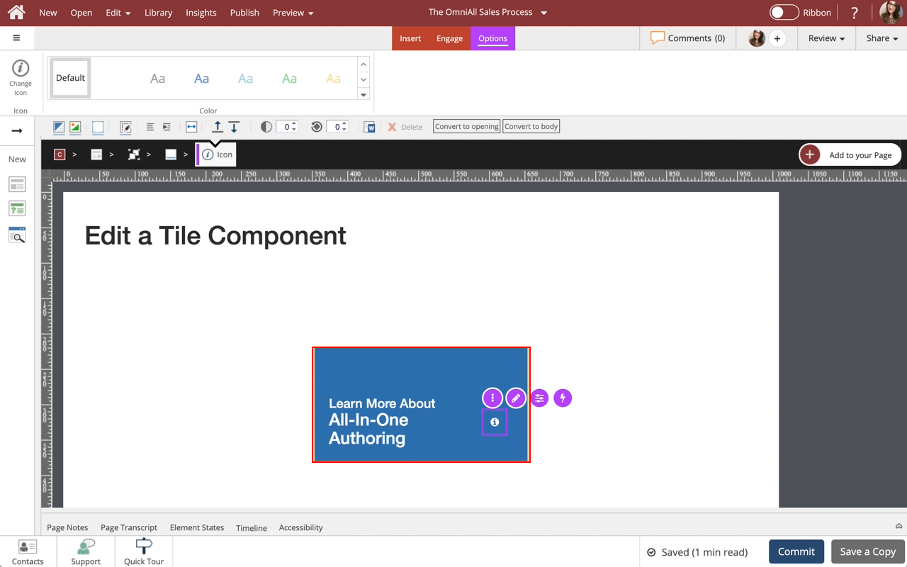
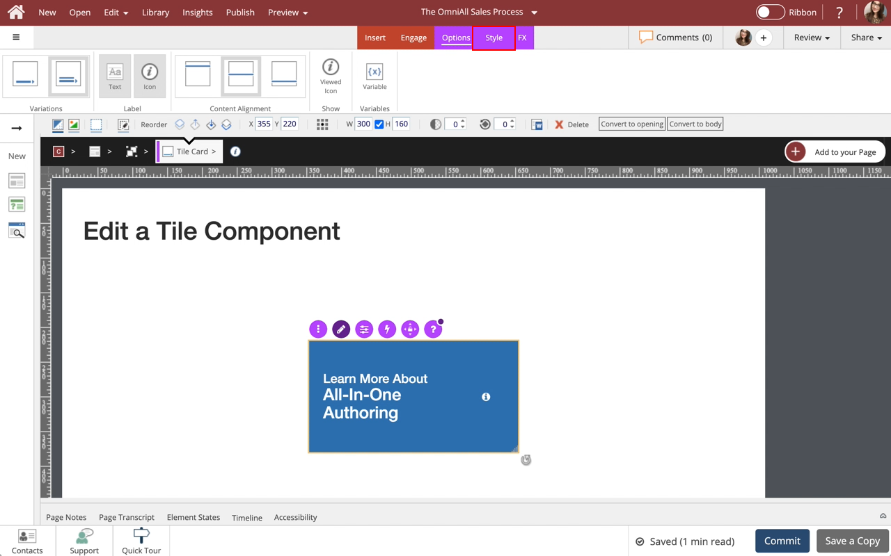
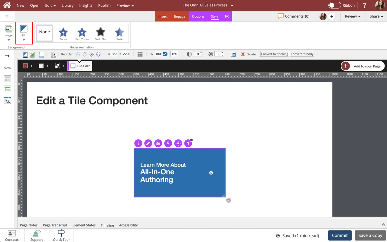
You can edit the text, change the icon on the Tile Card, as well as control the background display options.

Steps to edit a Tile Card component.
You can edit the text, change the icon on the Tile Card, as well as control the background display options.
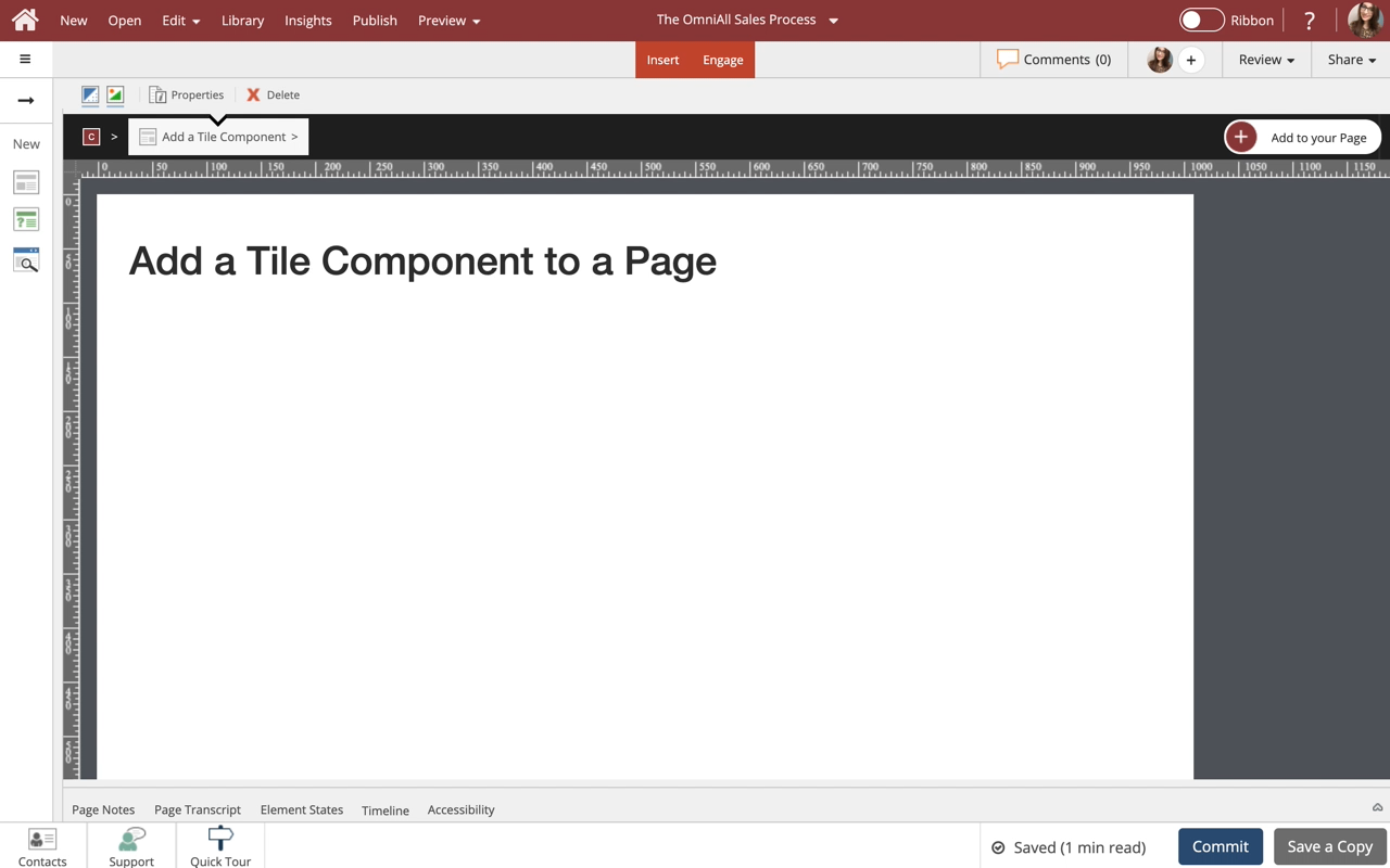
Steps to Add a Tile Card component to a Page.
Tile Cards are one of many components available on the Engage tab.
The learner can interact with the Tile Card when an action or trigger is applied to the card.
Use cards to set apart certain information, and assign headers, footers, borders and styles as you see fit. This lesson covers controlling the display properties of the Card component to suit your design needs.
Note: Cards are available in multiple styles with or without a Button. The buttons are easily set up just like any other button in dominKnow | One.
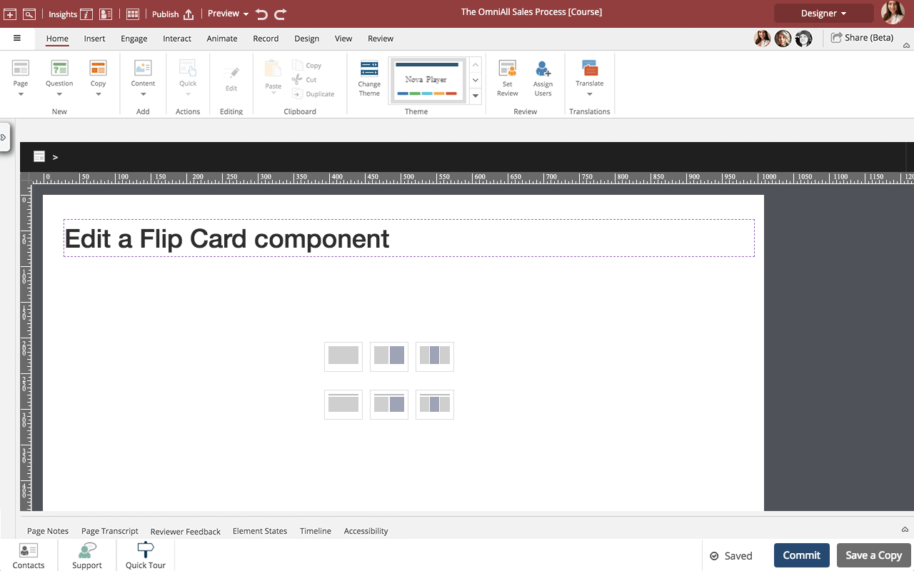
Steps to edit a Flip Card component.
You can add any content to the front and back of a Flip Card as well as control many display properties.
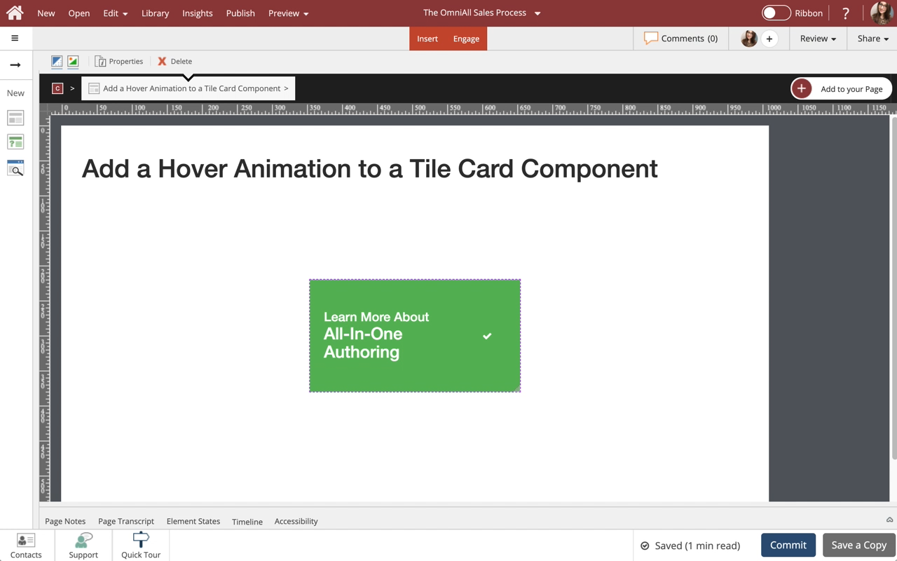
Steps to add a Hover Animation to a Tile Card component.
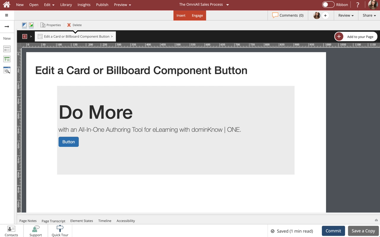
Steps to edit a Card or Billboard component button.
What is the purpose of the Tile Cards interactive component? I've searched the available resources, and I can't figure out what it's for. Is it just for navigation purposes, like "Click the icon to continue", or is it meant to display content that's initially hidden when the user clicks the icon? And if so, how does that work?
If it's only for navigation, I think it's a little confusing to have it grouped with content-based interactive elements like Tabs and Accordions.
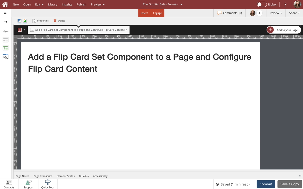
Steps to add and a Flip Card Set component to a page and configure the Flip Cards within the set.
Flip Card Sets are one of many components available on the Engage tab.
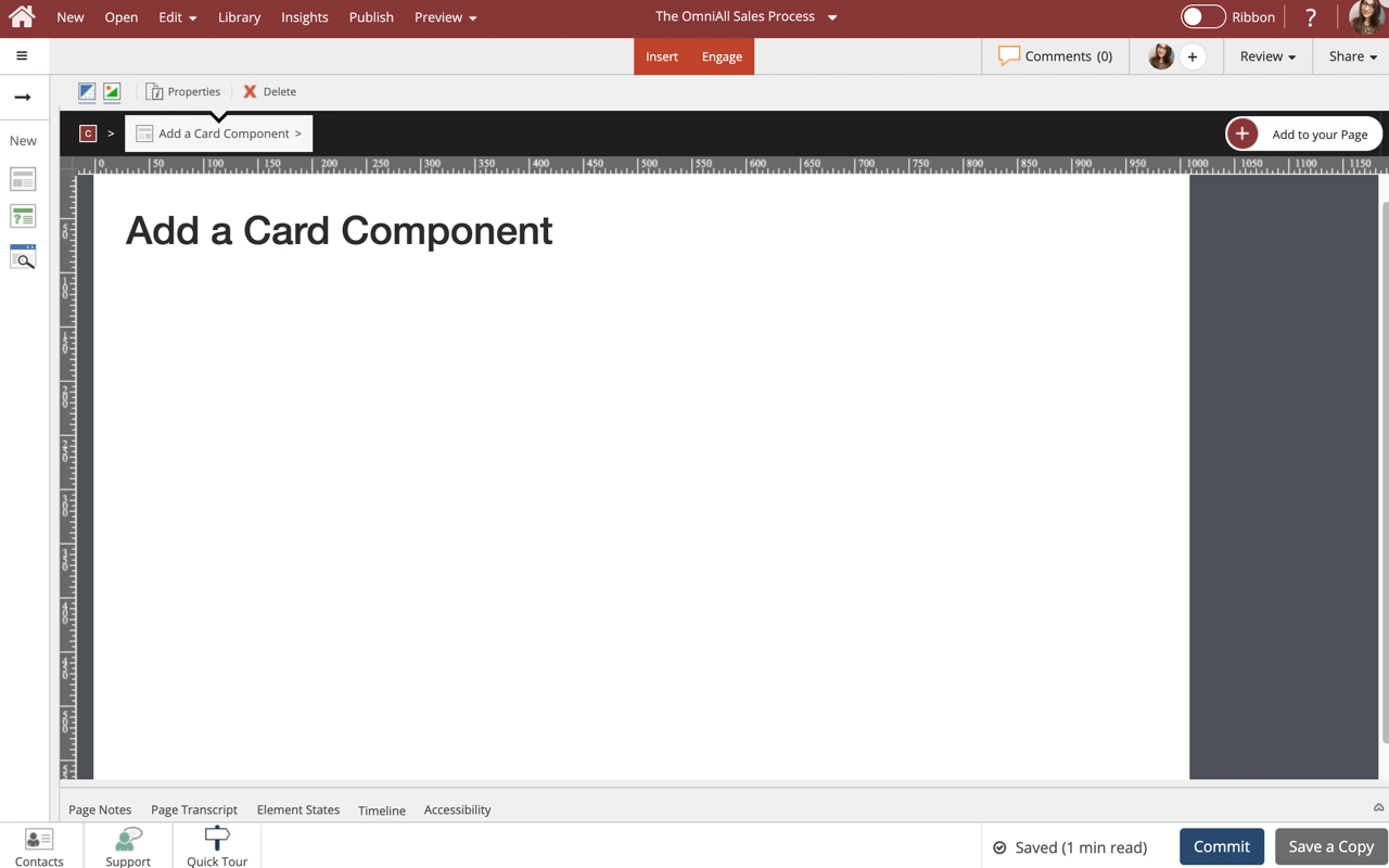
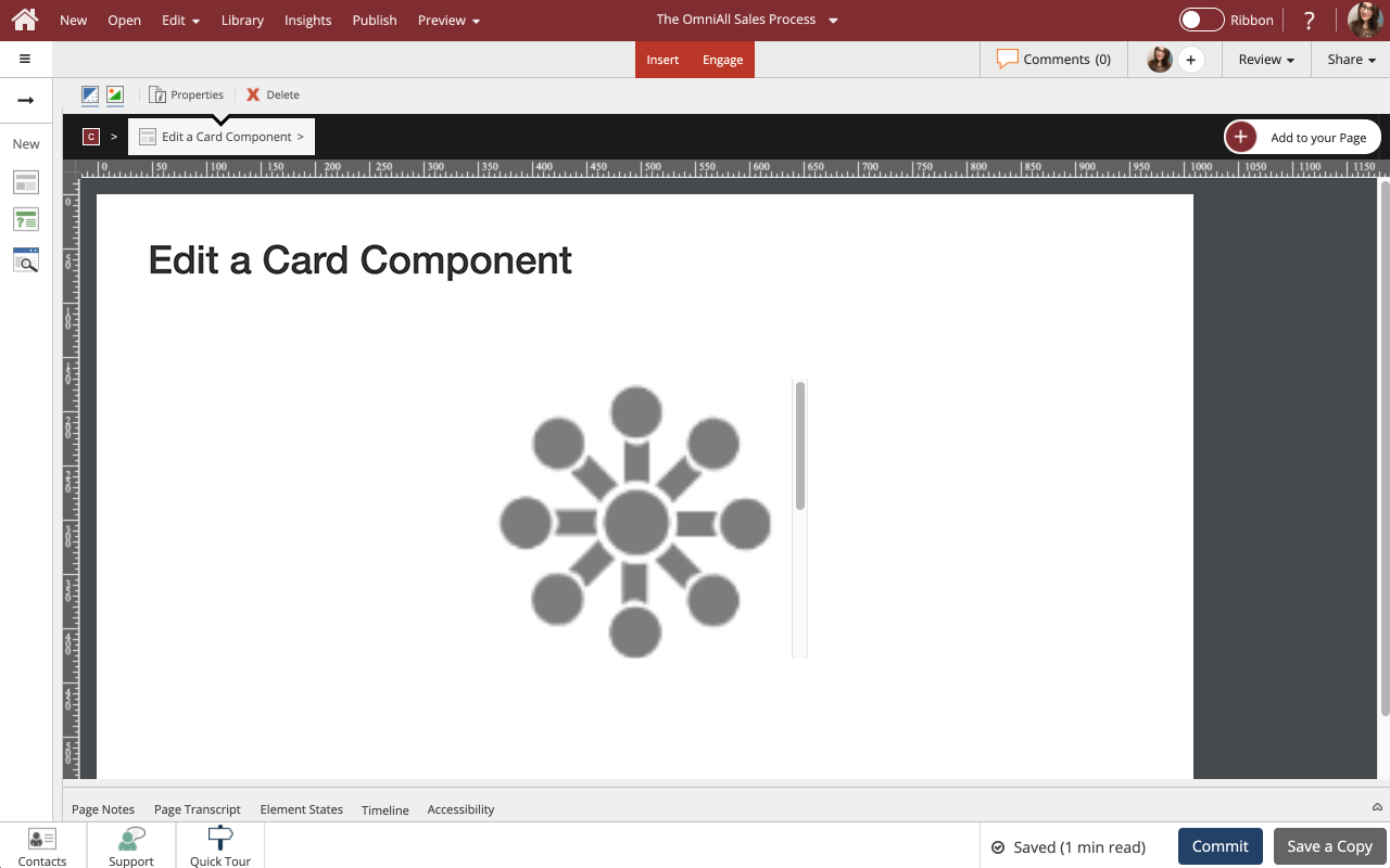
Steps to add a Card Component to a Page.
Cards are one of many components available in dominKnow.
The learner can interact with a Card by selecting the button within the card if applied.
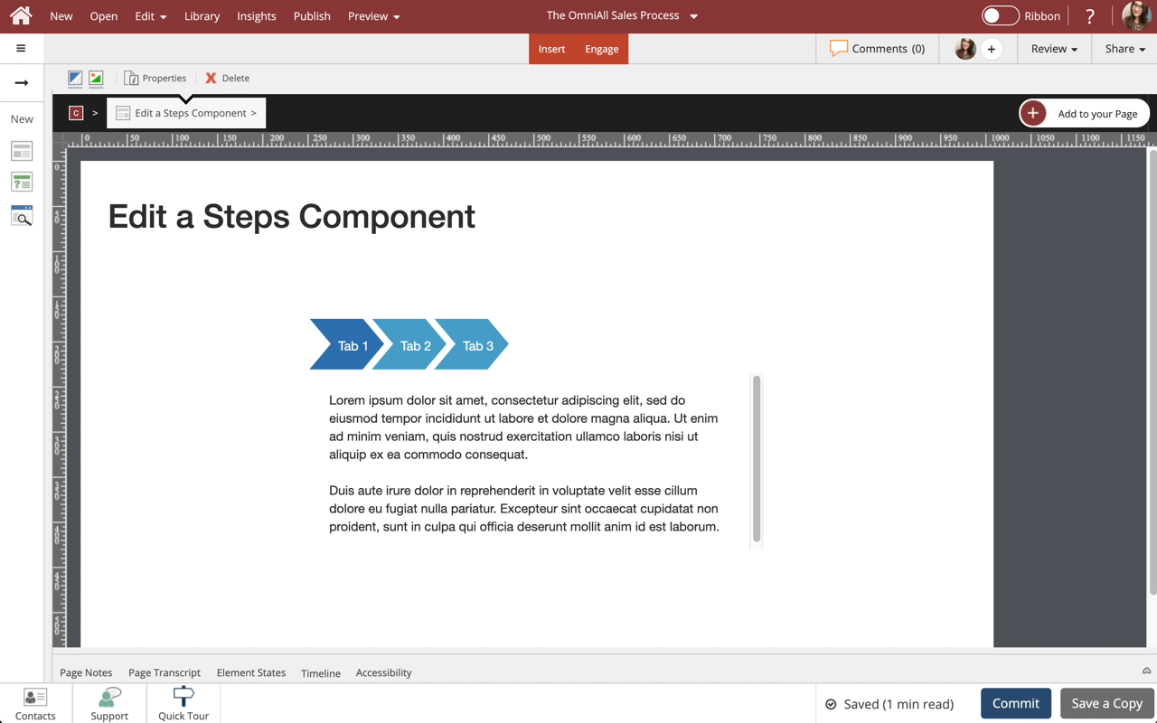
Steps to edit a Steps component.
Use Steps to display information in a tabbed layout. Steps are available in a variety of orientations for you to choose from. All types can be formatted and styled for numerous appearances and behaviors.
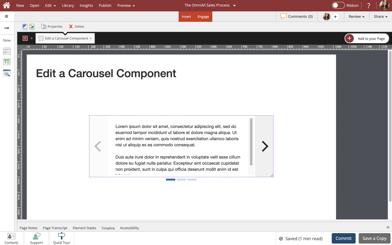
Steps to edit a Carousel component.
You can add any content to each slide within the Carousel, as well as control many display and play options.


Comments ( 0 )
Sign in to join the discussion.