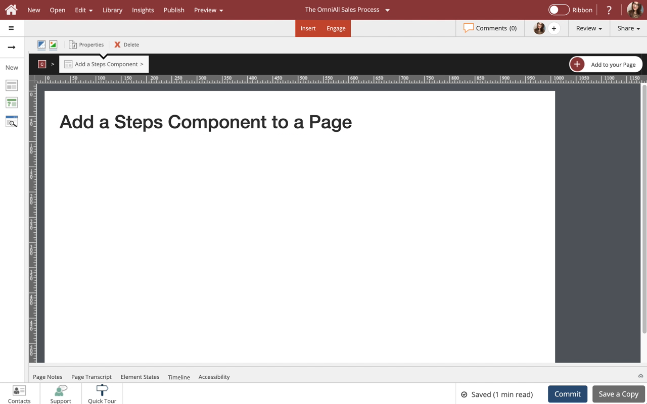
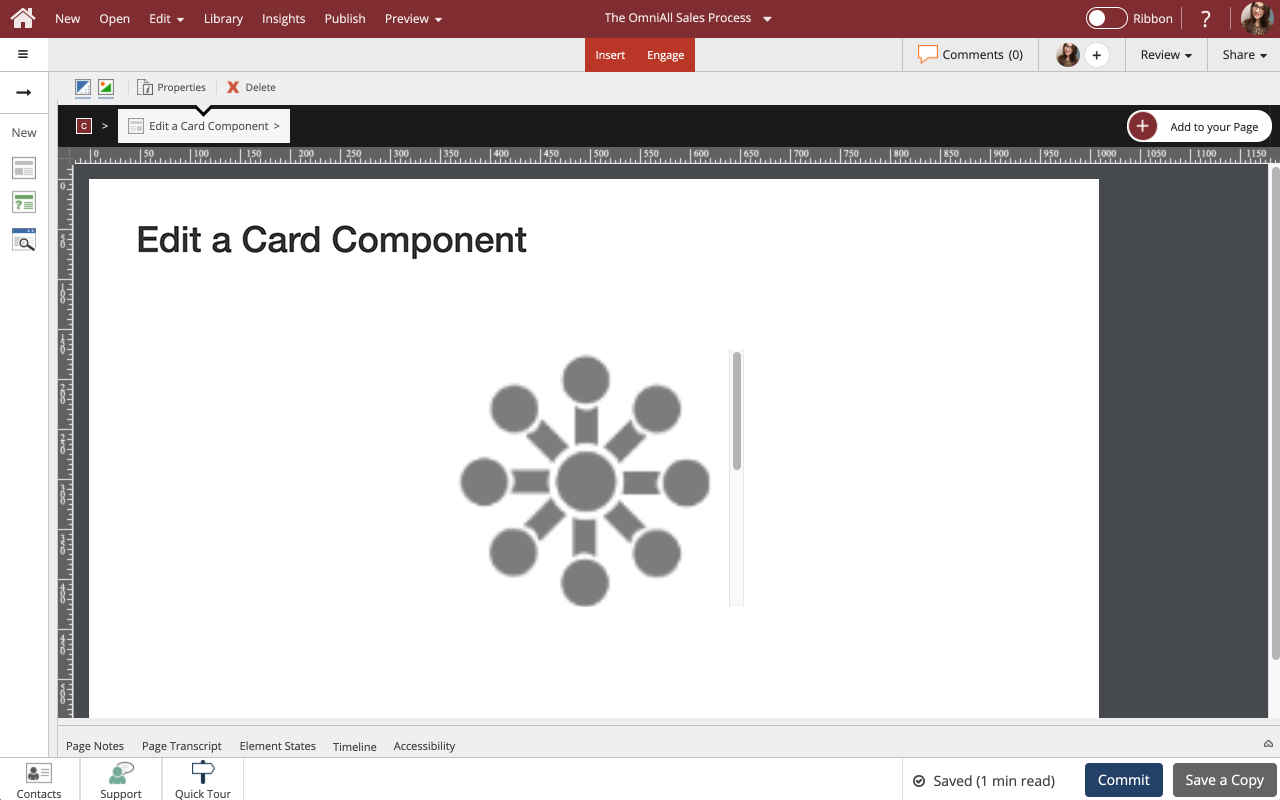
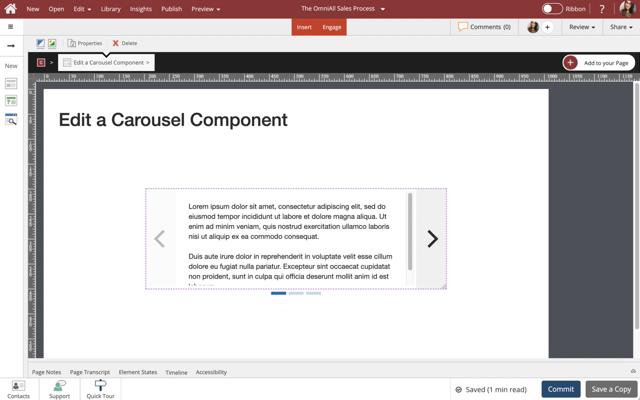
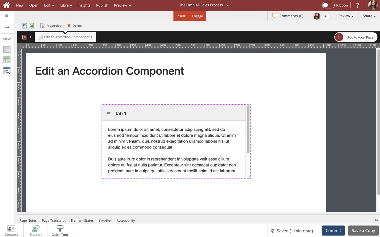
Edit a Steps Component
Steps to edit a Steps component.
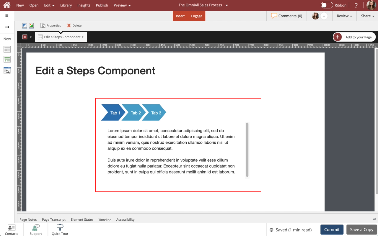
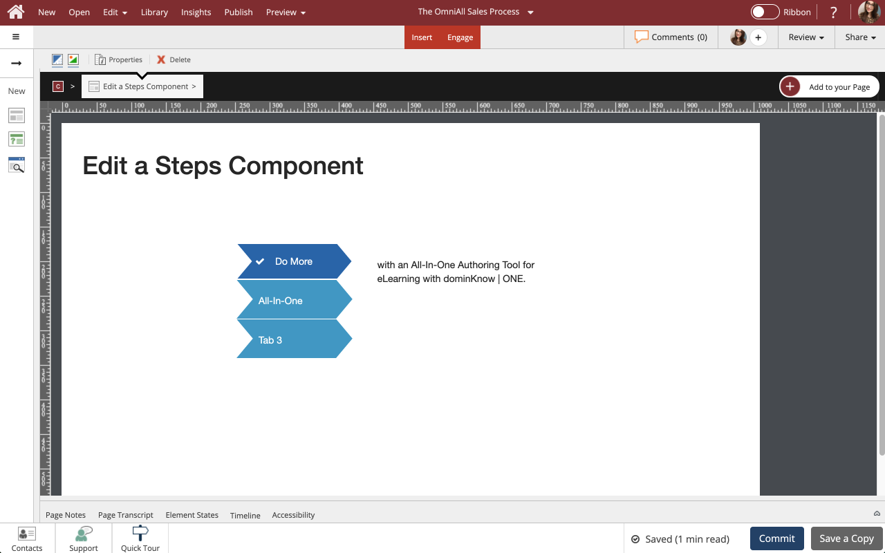
Use Steps to display information in a tabbed layout. Steps are available in a variety of orientations for you to choose from. All types can be formatted and styled for numerous appearances and behaviors.

Step 2
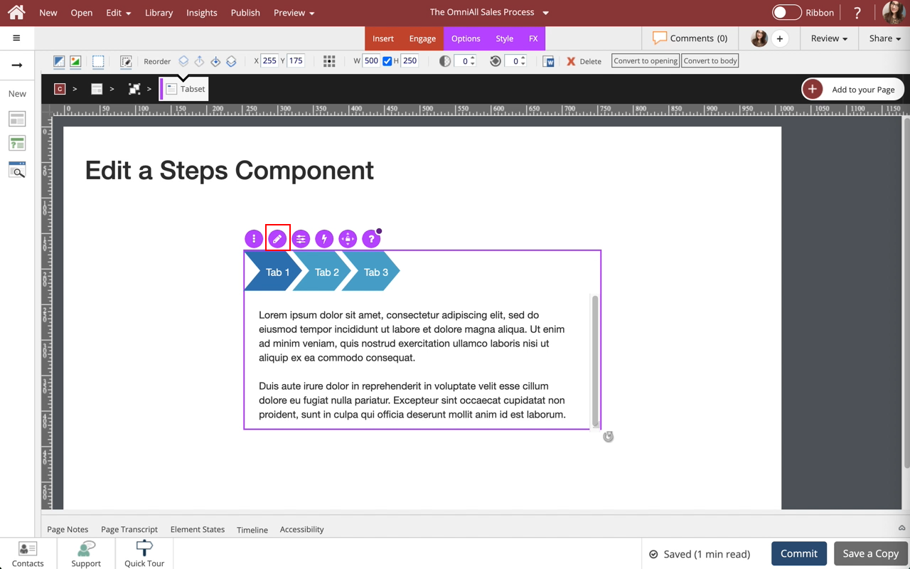
To edit the content within the Steps Component, select the Edit Icon in the Inline Toolbar, or double-click the Steps Component.
Step 4
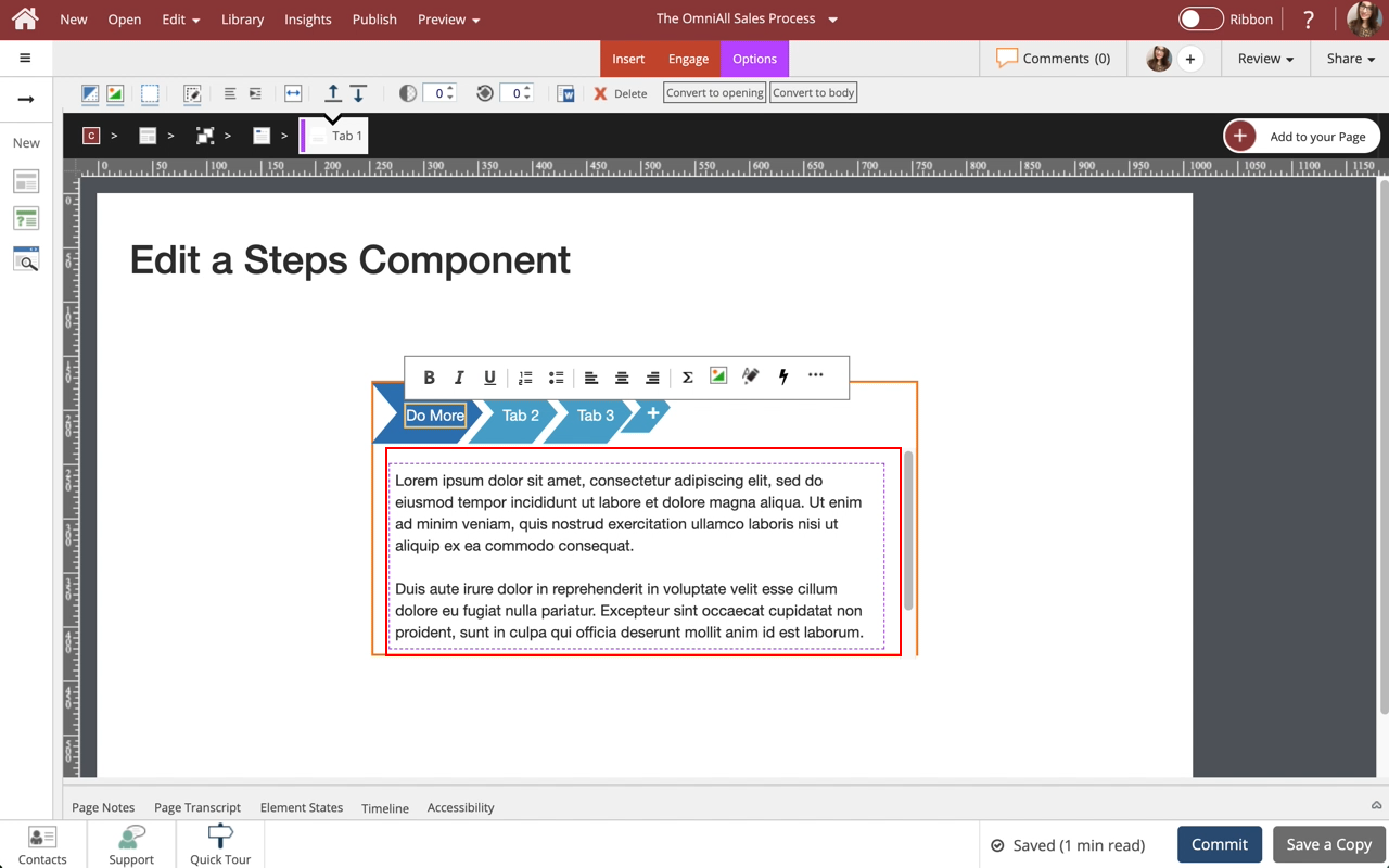
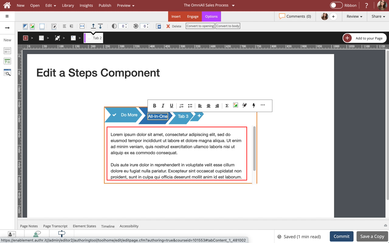
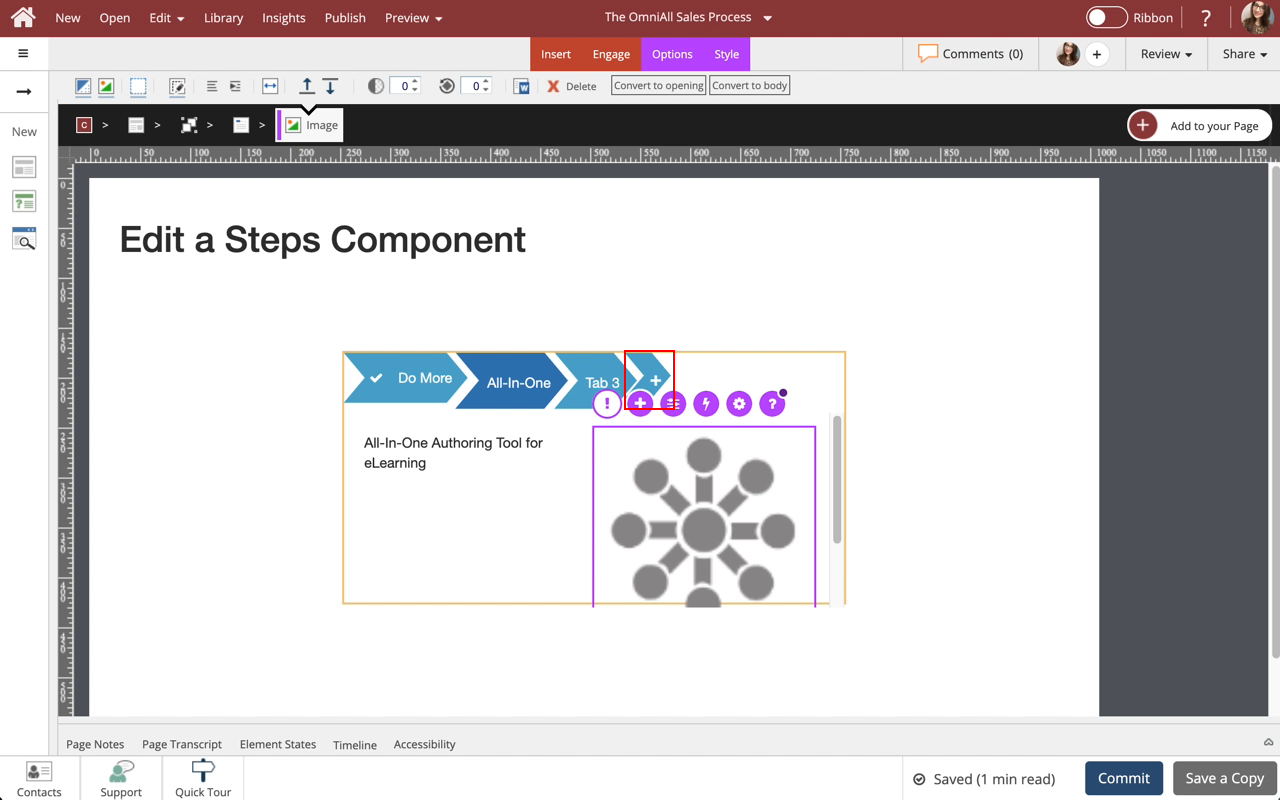
The new text is added.
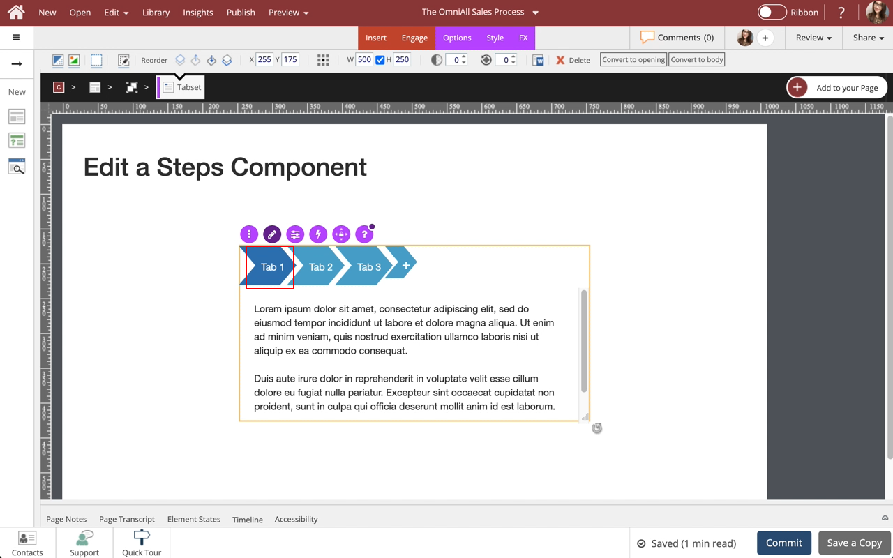
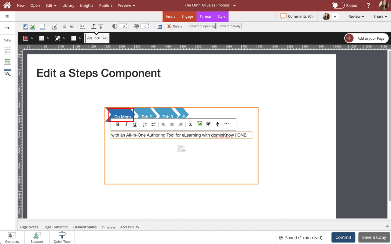
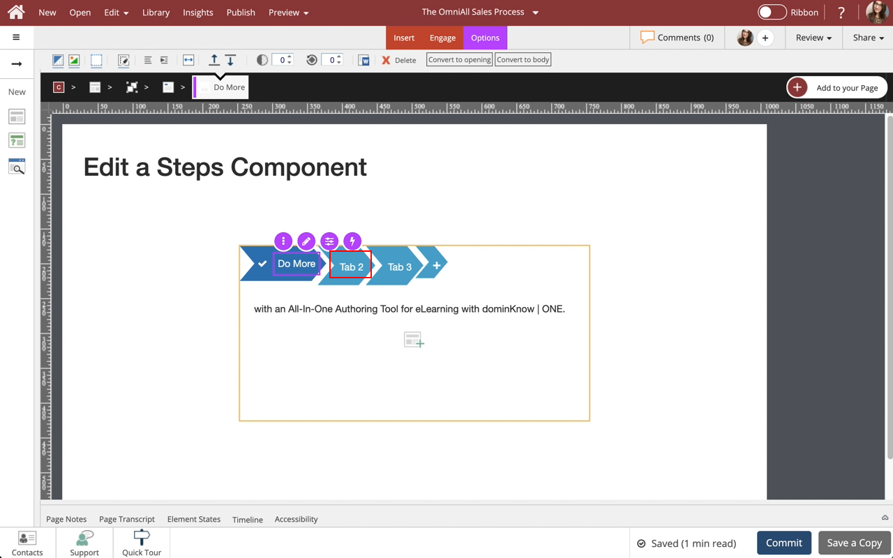
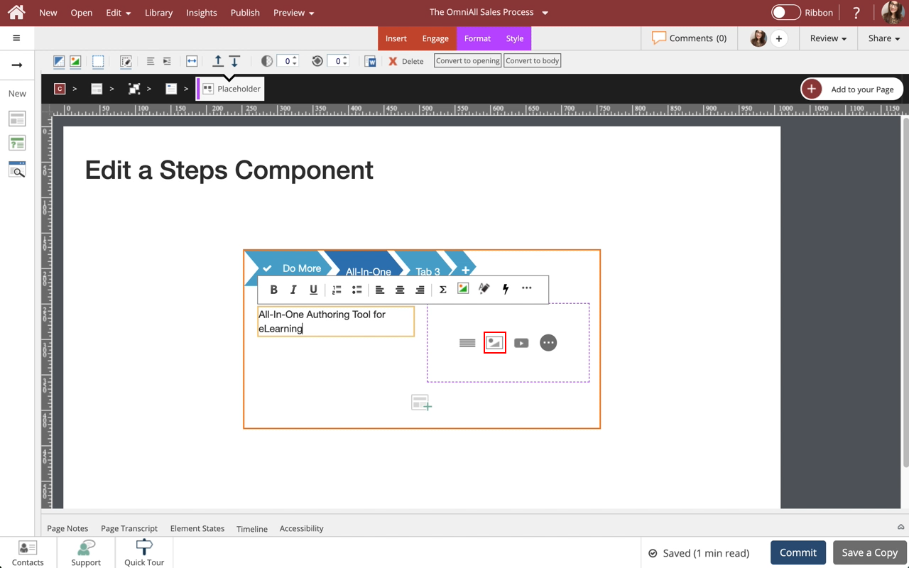
Select the Placeholder Text within the Tab 1 to edit it and we'll add text for you.


Step 25
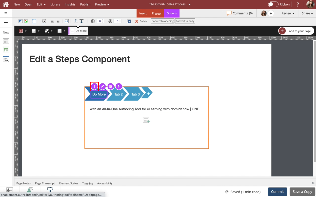
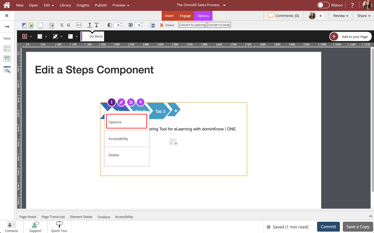
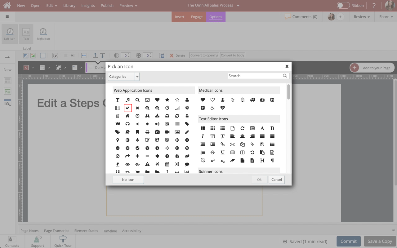
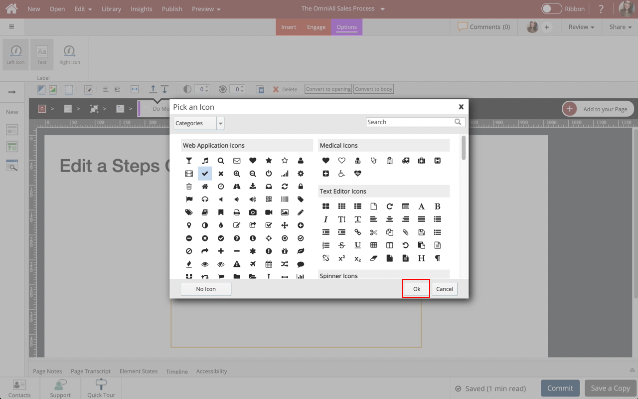
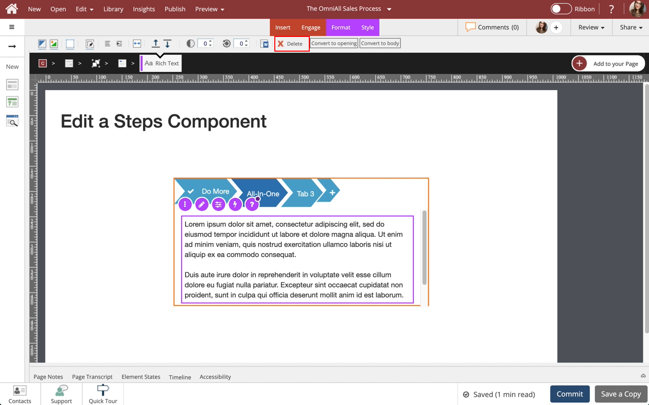
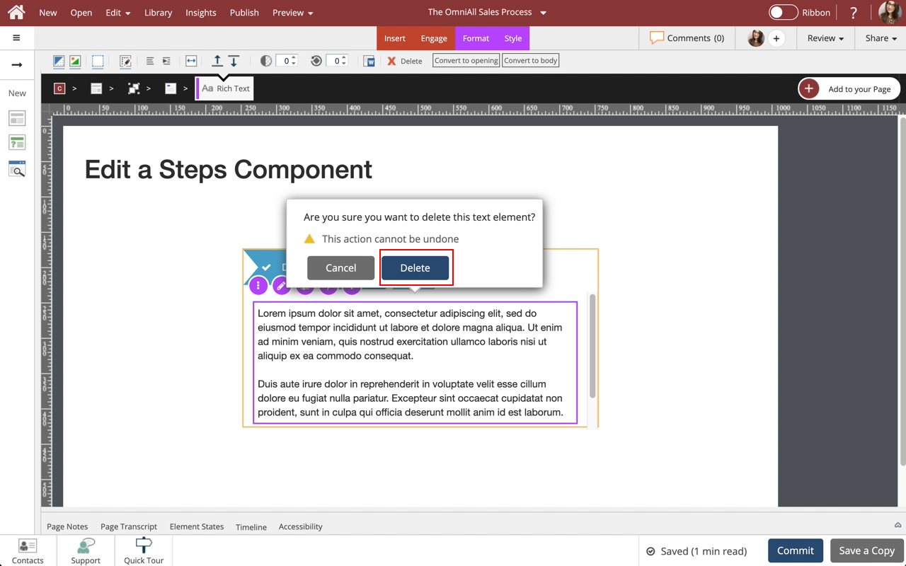
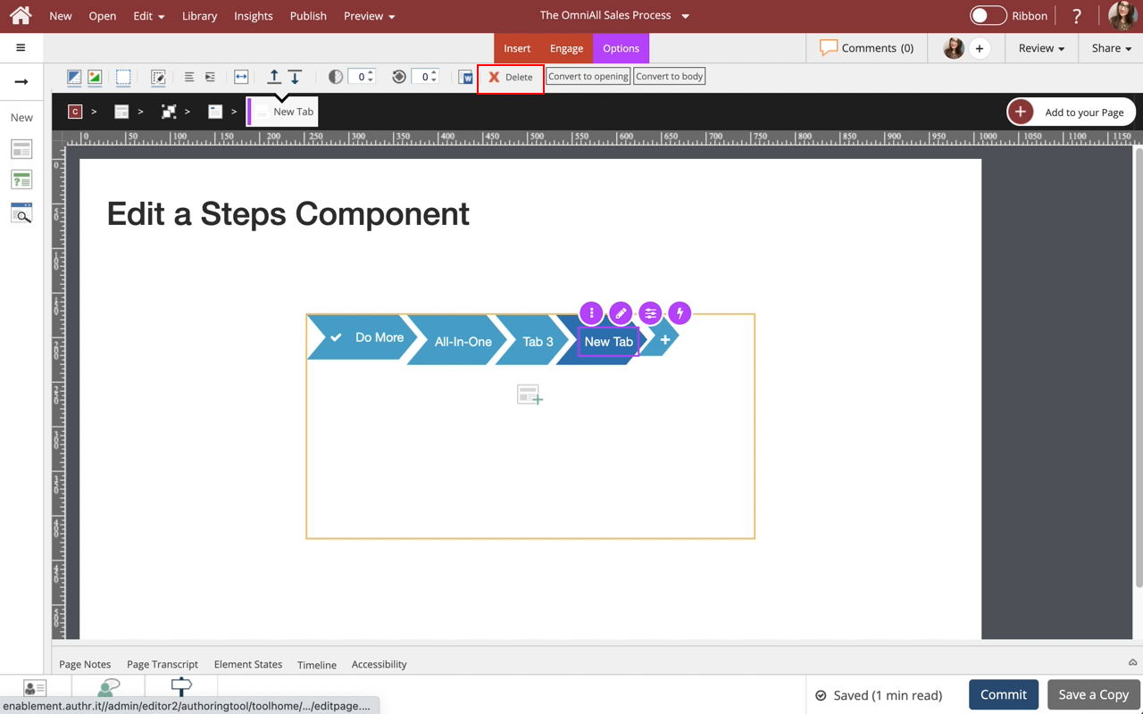
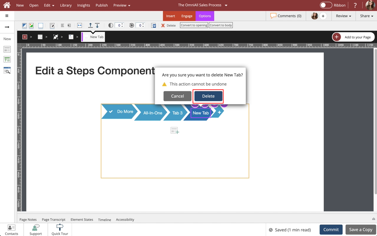
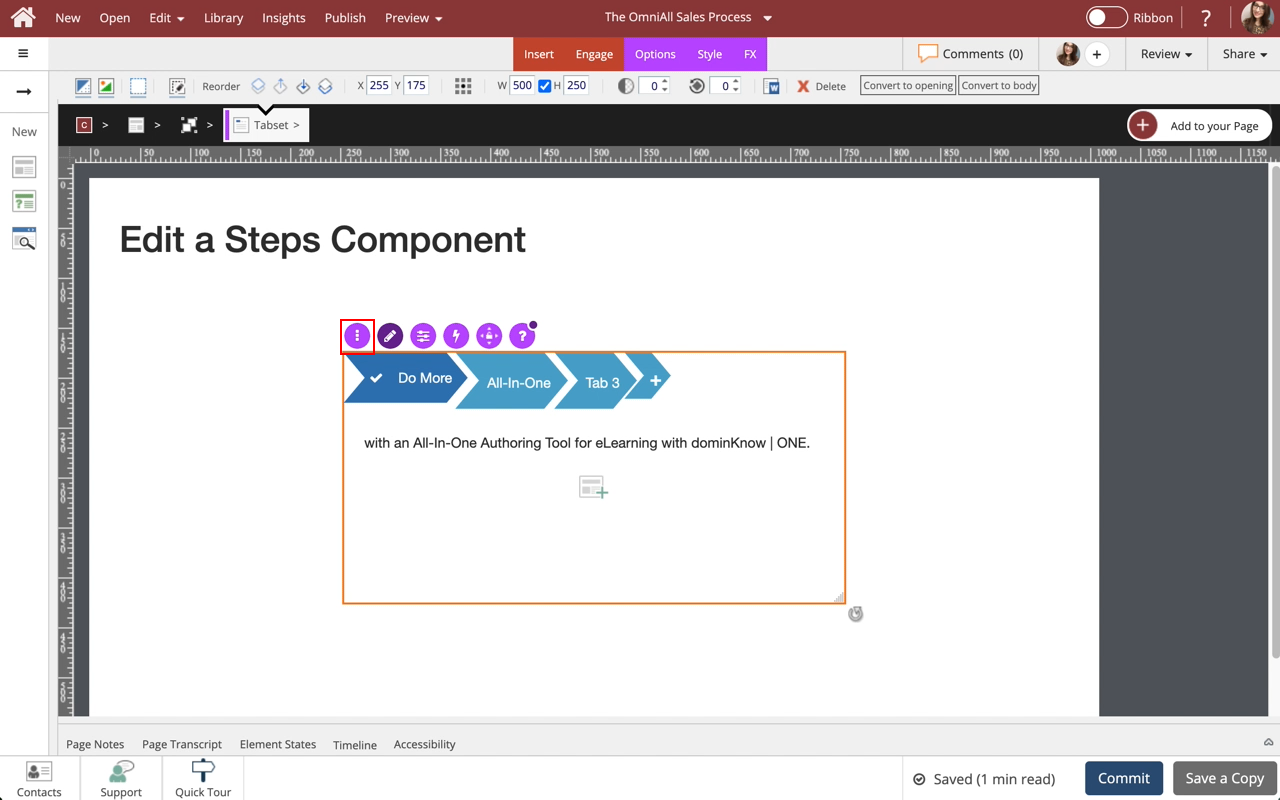
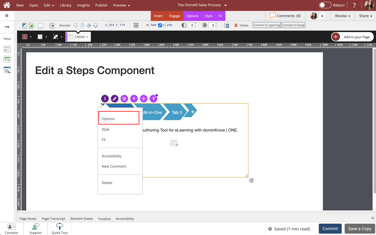
Select the three-dot menu in the Inline Toolbar. Have access to the Options, Styles and FX tabs, Accessibility panel, and add a New Comment, or Delete the component.
Step 27
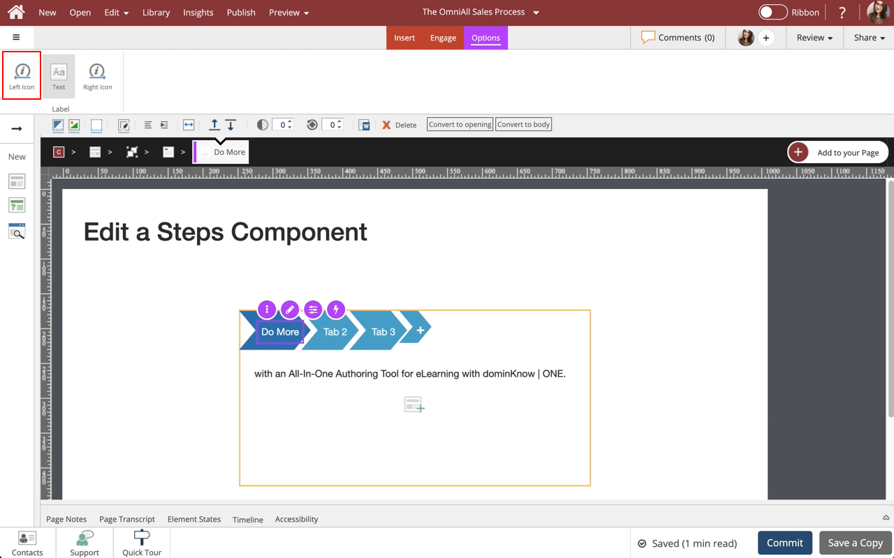
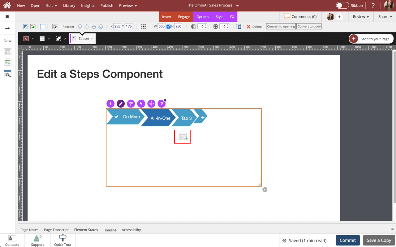
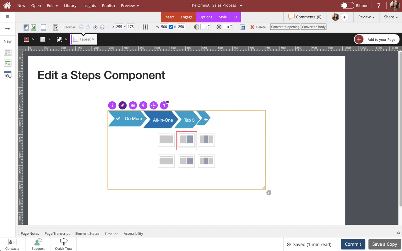
The Options and Style tabs have a number of control and design options for the Steps Component as a whole. You can change the Orientation, Respond at (in Flow), Enable/Disable Justified, Enable/Disable Sequential, Enable/Disable Start Unopened, Add Content, Enable/Disable Controls, Starting layout, Adjust the Shape of the tabs, Color, Opacity and Background Fill. Use the FX tab to add effects to the component.
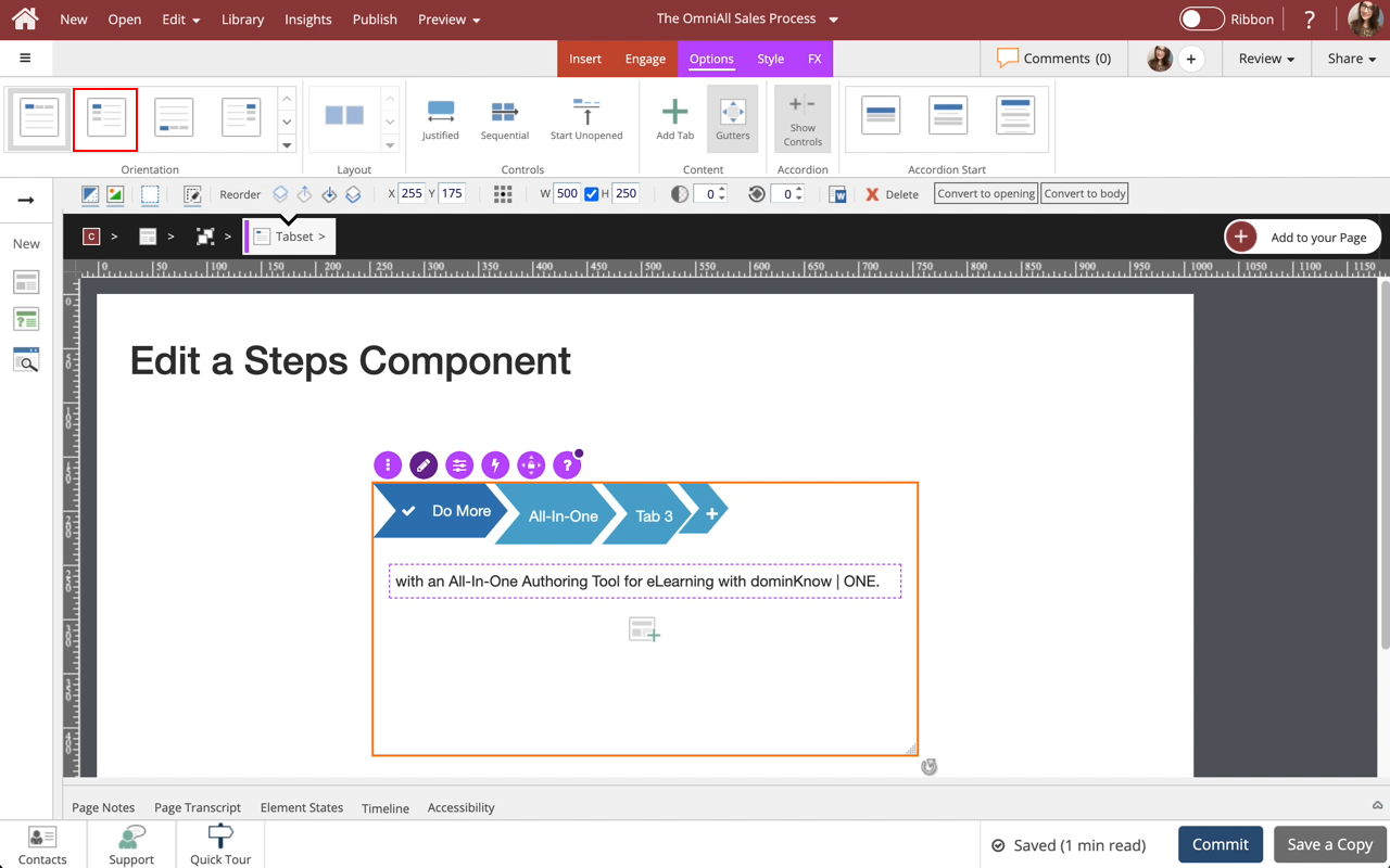
In the Options tab, under Orientation select Option 2.
Step 28
Notice the Tabs are displayed on the left side.
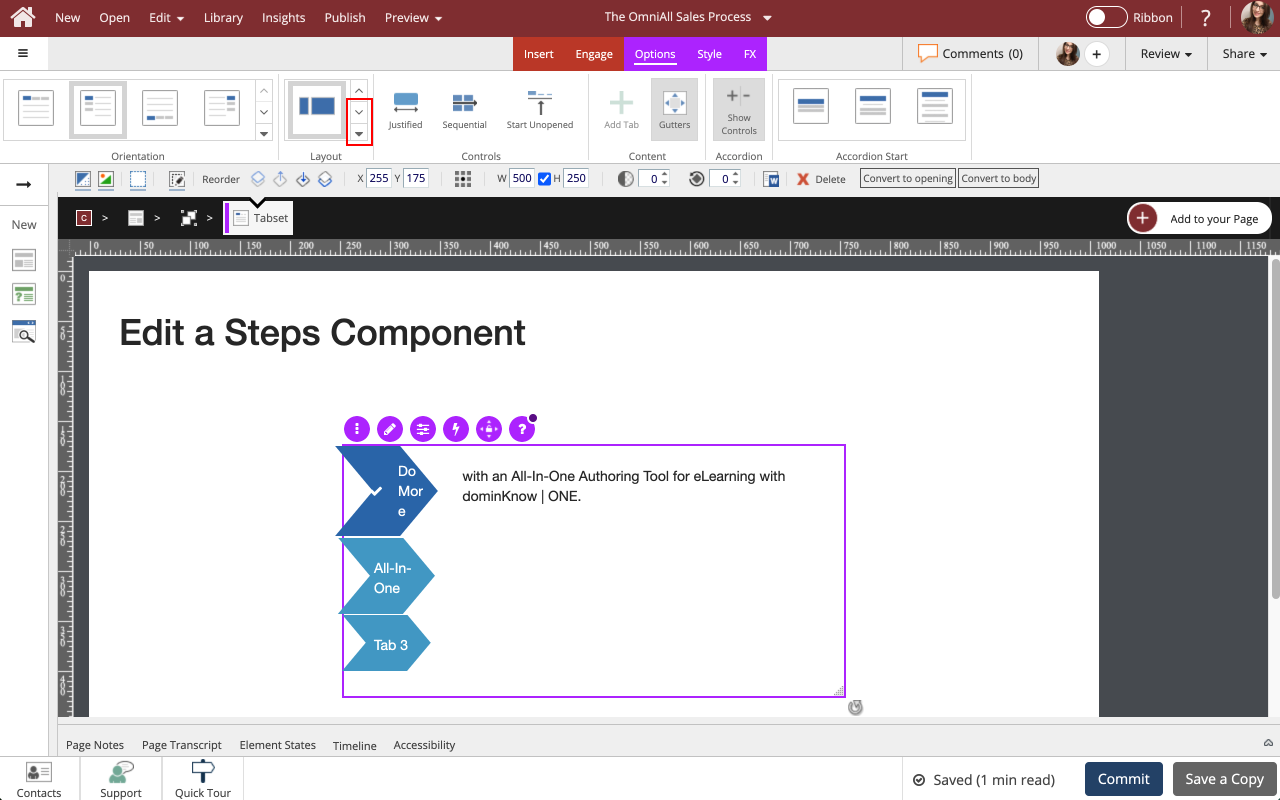
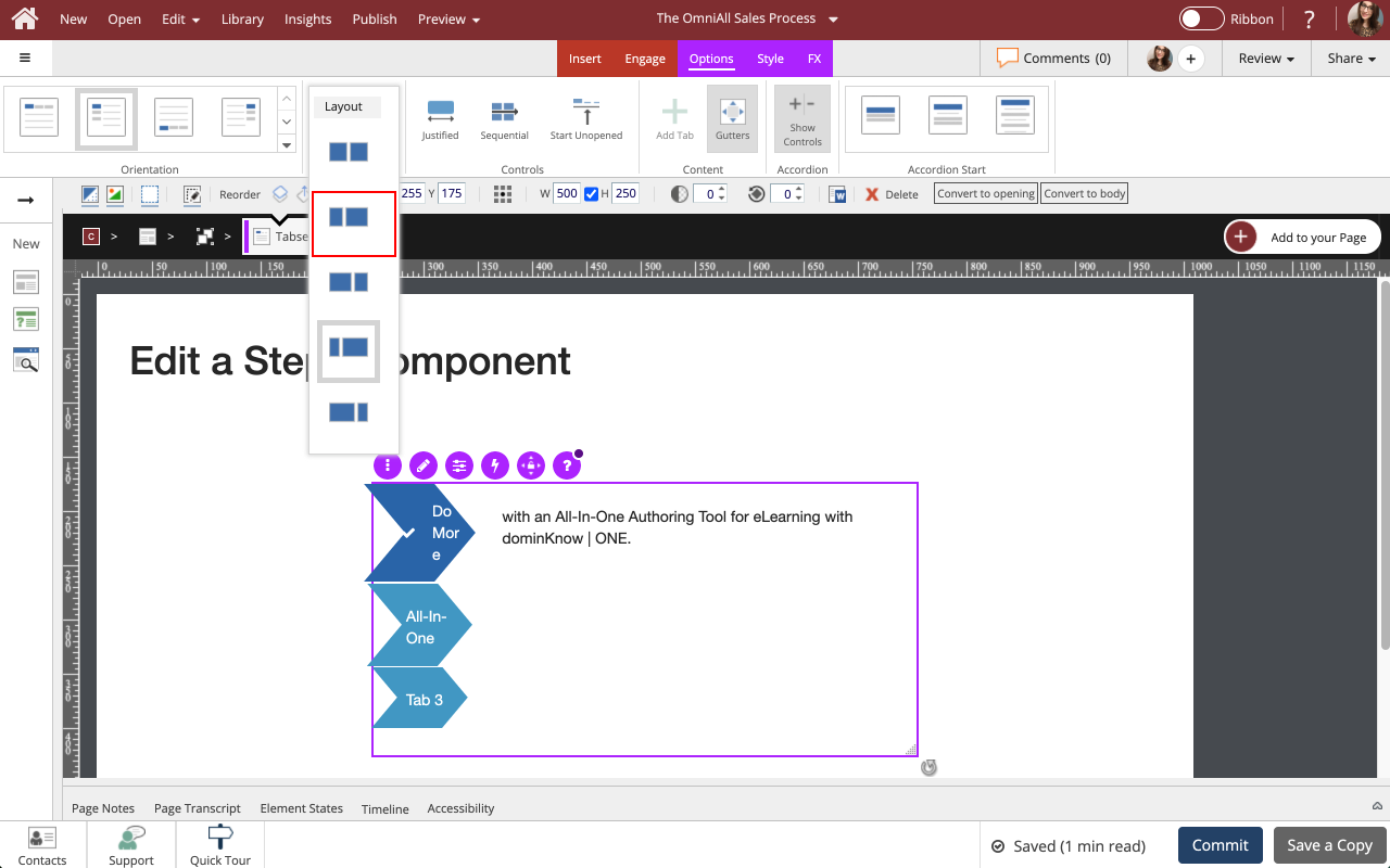
To adjust the Layout of the tabs, select the Down icon under Layout.
Step 30
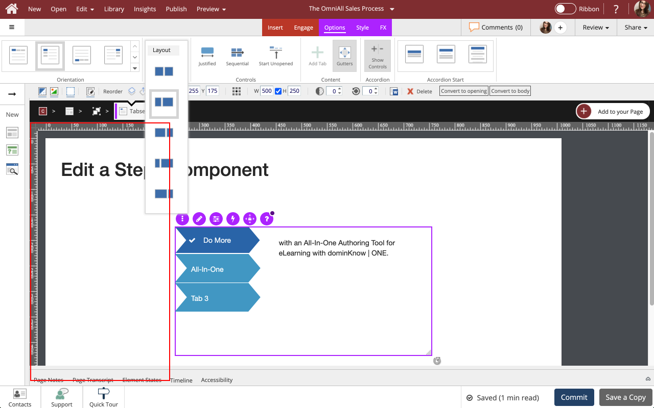
Notice the size of the Layout has been changed.
Select the left side of the Page to return to the Page content.
Step 31
Preview the Current Page to see how the Steps Component will look and behave for your learners.

Comments ( 0 )
Sign in to join the discussion.