Embed
Create a Collection
Update Collections
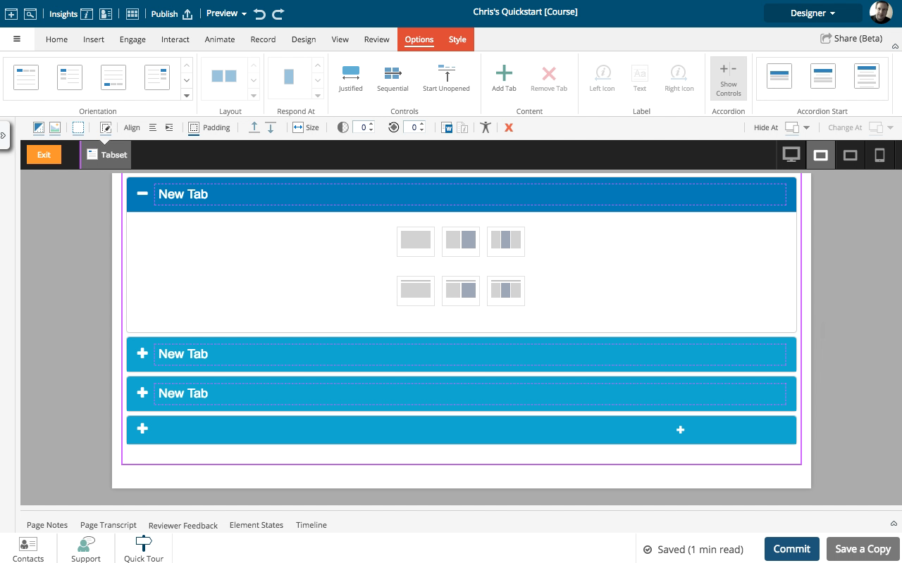
The components on the Engage tab allow you to add several different layouts to any tab or component.
These default layouts offer up to three columns, since these are the most typically-required types of layouts.
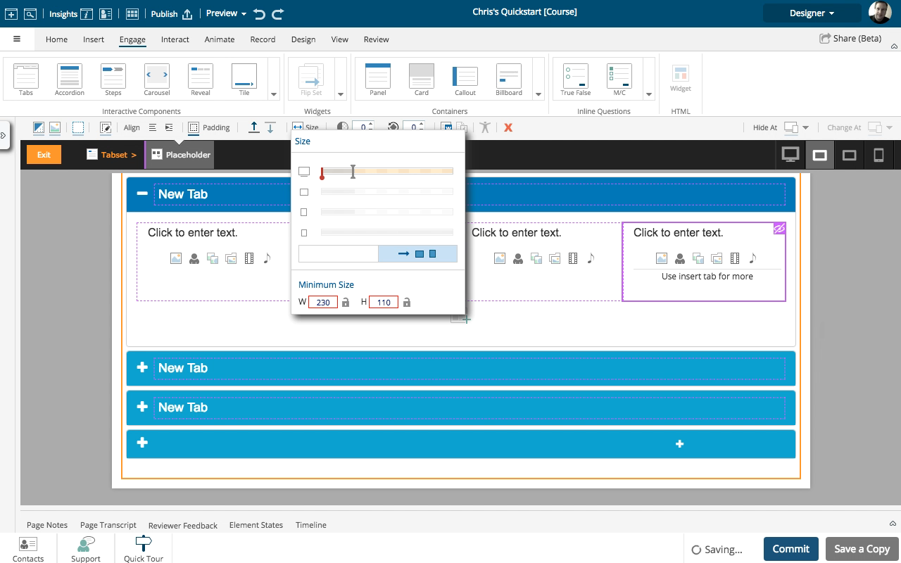
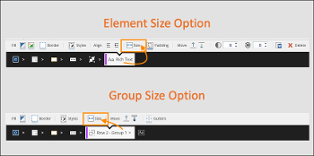
Need more columns? You can customize the sizing of the elements in a layout to allow more elements in the same horizontal row.
An important concept to understand is that responsive design measures width in 12ths.
Something full-width is 12/12ths wide, something half-width is 6/12ths wide, a third is 4/12ths, and a quarter is 3/12ths.
In this example we set four Placeholders to each be 3/12ths wide so they all fit together horizontally. You can also vary the widths for different layout designs, for example setting two placeholders as 2/12ths and two as 4/12ths.
NOTE: One thing the measurement in 12ths can't support is having five equal-width columns, since 5 can't be divided evenly into 12.
-
1
Click the continue button:
-
2
Click the continue button:
-
3
Click the continue button:
-
4
Click the continue button:
-
5
Click the continue button:
-
6
Click the continue button:
-
7
Click the continue button:
-
8
Click the continue button:
-
9
Click the continue button:
-
10
Click the continue button:
-
11
Click the continue button:
-
12
Click the continue button:
-
13
Click the continue button:
-
14
Click the continue button:
-
15
Click the continue button:
-
16
Click the continue button:
-
17
Click the continue button:
-
18
Click the continue button:
-
19
Click the continue button:
