Embed
Create a Collection
Update Collections
The components on the Engage tab allow you to add several different layouts to any tab or component.
These default layouts offer up to three columns, since these are the most typically-required types of layouts.
Need more columns? You can customize the sizing of the elements in a layout to allow more elements in the same horizontal row.
An important concept to understand is that responsive design measures width in 12ths.
Something full-width is 12/12ths wide, something half-width is 6/12ths wide, a third is 4/12ths, and a quarter is 3/12ths.
In this example we set four Placeholders to each be 3/12ths wide so they all fit together horizontally. You can also vary the widths for different layout designs, for example setting two placeholders as 2/12ths and two as 4/12ths.
NOTE: One thing the measurement in 12ths can't support is having five equal-width columns, since 5 can't be divided evenly into 12.
-
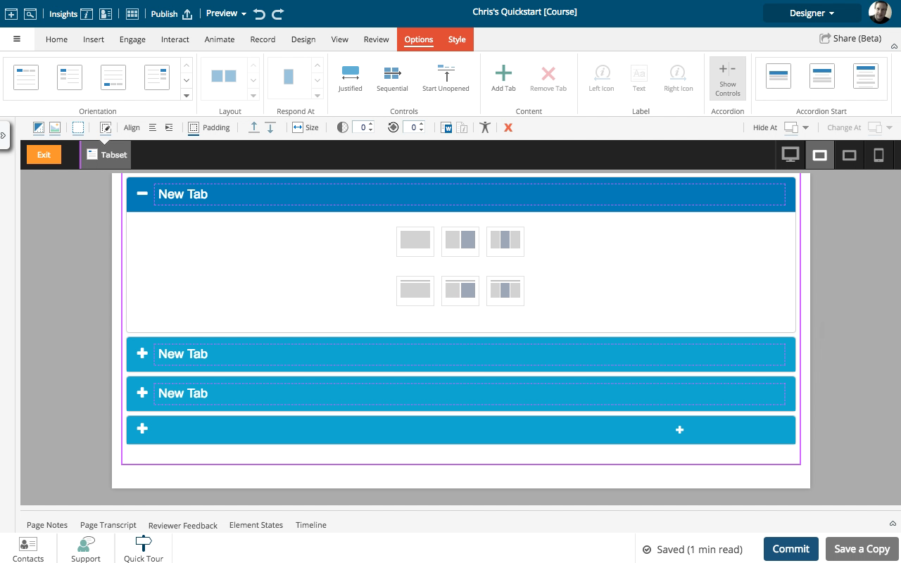
1To start, add a three-column layout to the tab.
Click the continue button:
-
2Select the bottom area of one of the Placeholders. We're don't want to add content yet so avoid the icons and the "Click to enter text".
Click the continue button:
-
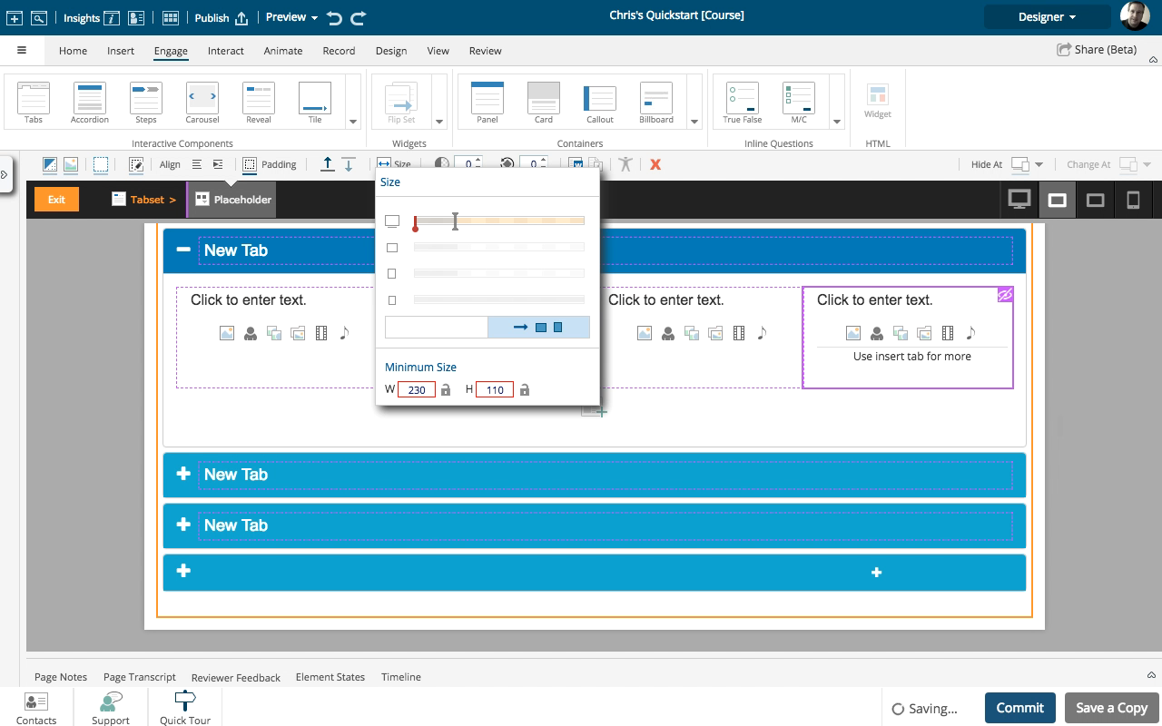
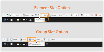
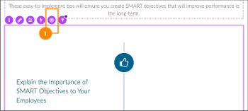
3In the Selection Control Bar above the Stage, select the Size icon.
Click the continue button:
-
4On the Size panel are four sizing bars, one for each breakpoint range. The bars are measured in 12ths (in other words, each bar has 12 segments). You can see the Placeholder is set to be 4/12s wide for the three widest breakpoint ranges. Each of the three Placeholders you've added has this same setting - they are each taking up 4/12ths of the available width, so altogether they are 12/12ths wide. We can adjust the settings on the Size panel to customize the layout on this tab so it has four columns instead of just three.
Click the continue button:
-
5To start, we'll add one more Placeholder. Select the + option below the three placeholders.
Click the continue button:
-
6Select the one-column layout.
Click the continue button:
-
7The new Placeholder is added to the Tab. Select the bottom area of the first Placeholder
Click the continue button:
-
8In the Selection Control Bar, select Size.
Click the continue button:
-
9You can select the drag handle on the top sizing bar and drag it one segment to the left to adjust the Placeholder's size from 4/12ths to 3/12ths. The sizing bars for next two breakpoints will adjust as well. The element will change its width on the Stage and the other two placeholders will move over to the left. For this exercise, simply click on the drag handle to go to the next step.
Click the continue button:
-
10Select the second Placeholder.
Click the continue button:
-
11Select Size.
Click the continue button:
-
12Adjust the setting on the top sizing bar to to be 3/12ths. For this exercise, simply click on the drag handle to go to the next step.
Click the continue button:
-
13Select the third Placeholder.
Click the continue button:
-
14Select Size.
Click the continue button:
-
15Adjust the setting on the top sizing bar to to be 3/12ths. For this exercise, simply click on the drag handle to go to the next step.
Click the continue button:
-
16Select the remaining Placeholder.
Click the continue button:
-
17Select Size.
Click the continue button:
-
18This Placeholder is set to be 12/12ths, or full width. Adjust the setting on the top sizing bar to to be 3/12ths. For this exercise, simply click on the drag handle to go to the next step.
Click the continue button:
-
19Once the Placeholder is set to 3/12ths, it will pop up into the available space beside the three original Placeholders. You now have a four-column layout on this tab.
Click the continue button:
