Navigating the interconnected pieces of how dominKnow | ONE uploads, stores and tracks media assets

Best Practice

Adding a Description and keyword Tags to media files improves Search results in the Media Library and helps other authors identify and understand the context of media files.

It’s an important and highly recommended best practice to always ensure that media files have this metadata added -- which is why we immediately make these fields available when you upload a file so you can quickly provide this information.

The Media Browser

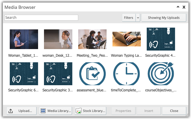
When you add an image or other media file to a page, you work through the Media Browser panel to upload it:


As you upload more media files, you’ll continue to see them added to the Media Browser panel.

The top bar of the Media Browser offers tools to help you find specific files quickly.

From left to right, these options are:

  • Search: You can use the Search field to find specific files. The Search feature searches file name, file Title, keyword Tags and Description.
  • Filters: The Filters button allows you to select the media types being displayed in the Media Browser. By default, the Media Browser is set to filter based on the type of media you start out inserting.
  • Browser Context Display button: The Media Browser can show the media files that you have uploaded across all projects or it can show the files anyone has uploaded to the current project you are working in. This button toggles between these two options. NOTE: Searches are done based on the context as set by this button.


The bottom bar of the Media Browser includes:

  • Upload: lets you browse to and upload a file to the dominKnow | ONE site.
  • Media Library: opens the full Media Library (and closes the Media Browser)
  • Stock Library: opens the dominKnow | ONE stock media collections. 
  • Properties: opens the selected media file in the Edit Asset panel
  • Insert: inserts the selected media file onto your current Page.
  • Close: closes the Media Browser Panel.

You can make the Media Browser larger or smaller by using the drag handle on the bottom right of the panel.


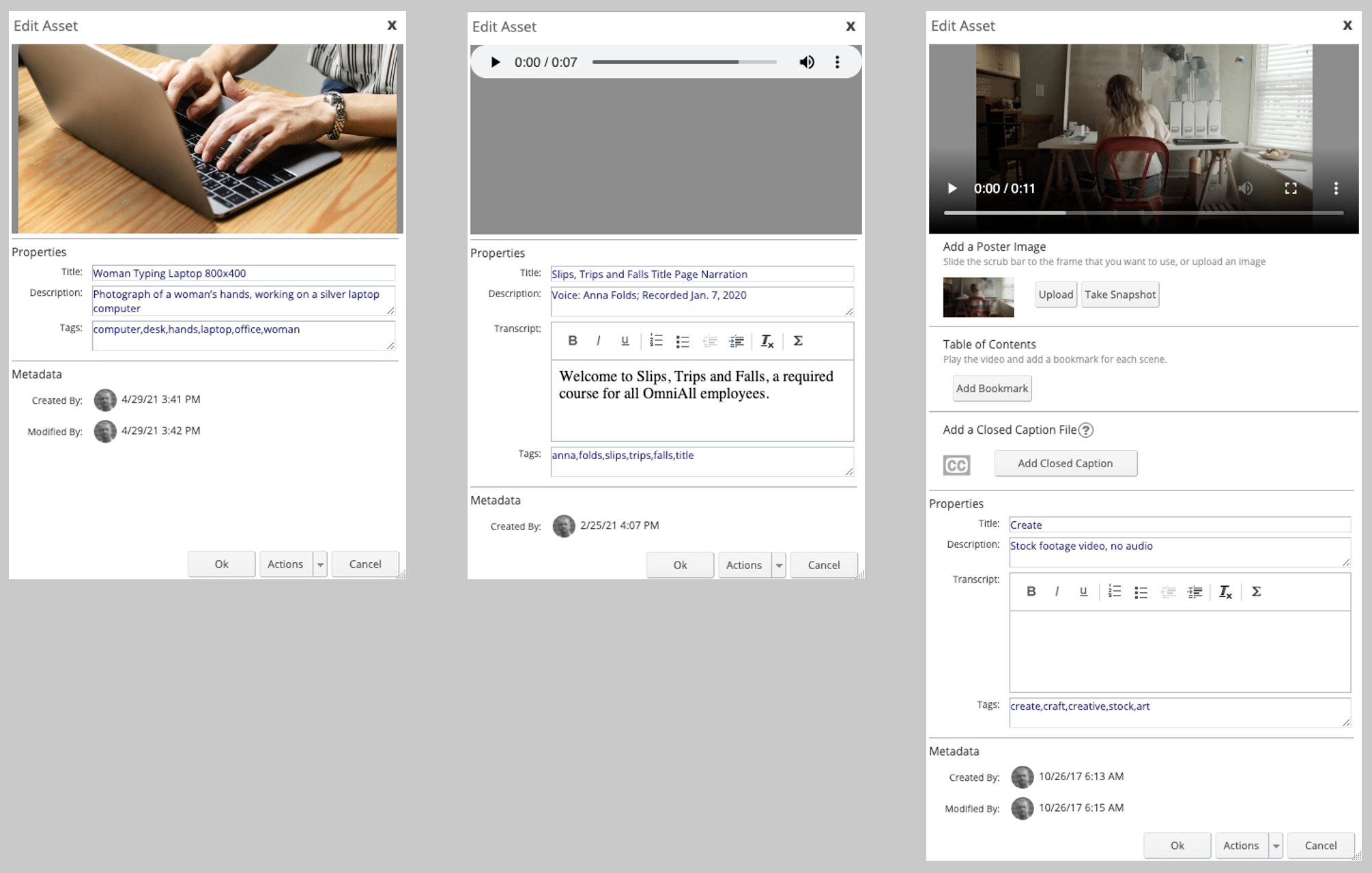
The Properties button opens the selected media file in the Edit Asset panel:


The Edit Asset panel is also presented when you first upload an asset.

The Edit Asset panel has different property options depending on the type of asset file being uploaded. 

For all asset types the panel includes Title, Description and Tags:

  • You can give the file a Title that is different from the file name.
  • The Description field is typically used to provide an explanation of the image to help other authors who might want to re-use it.
  • The Tags field is used to add keywords to help with searching for the image within the media library as well as in published content that uses a Theme that supports a Search Field, for example the Course and Knowledge Base players. 

The panel includes other settings for different asset types such as audio files or video. For example, for video files you can add a poster image and closed captioning files, among other differences.

To save any changes made, select Ok.

The Actions options include downloading the asset to your local computer.


The Media Library button in the bottom left of the Media Browser opens the Media Library panel.

The Media Library


As you add media files to your pages, they are also automatically stored in the Media Library.

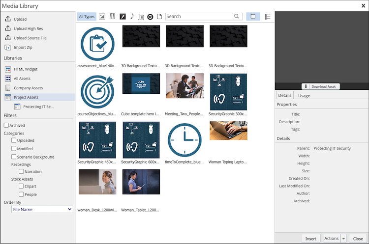
The Media Library Panel gives you access to all media files that you have permission to use.

On the left side of the panel are a number of different options.


Upload

From the top section you can Upload files directly to the Media Library.

This article has more details on the upload process:

Uploading Files to the Media Library >> 


Search and Filters

The rest of the left-side panel focuses on helping you find the files you need.

At the top is a Search field.

Next, you can filter based on file Type:

  • Images
  • Video
  • Audio 
  • Documents
  • Captures
  • Source Files
  • HTML Widgets

You can select these individually or in combination.

You can also use the default Filters or create your own Custom filters to narrow down your search results.


File Display

The centre panel of the Media Library interface displays the media files. These can be displayed as thumbnails or a list. You can order the display by Title, Date Modified or File Type.

You can select multiple files by using CTRL+Select on Windows or COMMAND+Select on Mac.


Details and Usage

The right-side section of the Media Library panel displays information about the selected media file (or the last file selected, if none is currently selected).

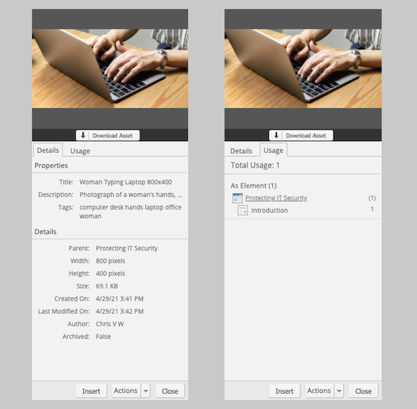
When the image file is initially selected, the panel on the right displays the Details for the file:
 

You’ll see that the Description and Tags added previously are displayed. You’ll also see that the Library also automatically tracks other details about the asset, such as the Project it was uploaded to, size data, date it was first uploaded (Created On) and when the last edits were made to its details such as the Description or Tags (Last Modified On), who the uploading author was and whether or not it has been Archived.

The Usage tab displays the Projects and Pages where the file has been used.

From the bottom of the right-side area you can Insert the selected file onto the current page or you can Close the Media Library panel.

There is also an Actions dropdown button which has three options available:

  • Edit: Allows you to edit the data (Description, Tags) for the file
  • Archive: Removes the file from being found in searches or being used in future projects. The file continues to be available in Projects where it has already been used.
  • Unarchive: Reverses the Archived status of a file.
  • Add Tags: Allows you to add Tags a file or multiple files.
  • Replace: Allows you to upload a replacement for the file in the Media Library. This will update ALL uses of the file with the replaced file across all courses.
  • Delete: Allows you to Delete the file from the Media Library. You cannot delete a file if it is used in a Project.


The Download Asset button below the preview area allows you to download the file from the dominKnow | ONE site, if you have permission. 

Accessing the Asset Properties when authoring

If you are authoring in Designer mode you can access much of the information available about a media file in the Media Library when authoring without having to open the Media Library. (This is not available to authors in the Essentials or Essentials Plus modes.) 

Selecting a Media file on a Page adds an Options tab.

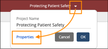
On the Options tab is a Properties button. It opens a Properties panel to the right of the Stage.


The Properties button opens the Media Properties panel to the right of the Stage:


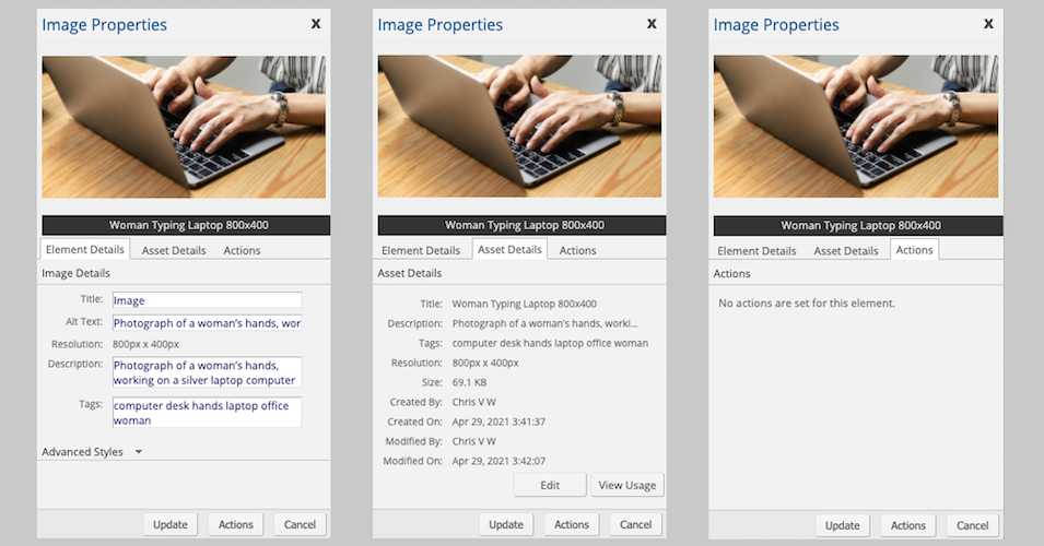
The first tab, Element Details, displays the details for the element as it is used on your page. These details are unique to this contextual use only:

  • The Title field shows the name of the element on the Stage. You can change this here on the panel or in the breadcrumb above the Stage.
  • The Alt Text field uses the asset's description by default, but you can edit this if needed. Editing it here only changes the Alt Text for this use of the image in this element on this page. It does not alter the Description nor any Alt Text set for this image when used in any other elements on this page or any other pages.
  • If you are working in a Claro page you will see Resolution information that reflects the size the asset is being displayed at on the page, which may be different than the asset's actual size. 
  • The Description and Tags fields are also automatically populated with the same fields from the asset details, but you can choose to edit these as well.

The Advanced Styles opens a text entry field where you can add custom CSS properties to apply to the image. (NOTE: you need to know CSS to use this feature.)

The second tab is the Asset Details tab. This tab displays data and information about the image stored in the Media Library. You can use the Edit button to edit the Description and keyword Tags. You can use the View Usage button to see all courses where the image has been used.

The third tab is the Actions tab. This tab displays information about any actions that have been set using this element as a trigger on the page.


At the bottom of the Image Properties panel are three buttons which are available no matter which tab is selected:

  • The Update button will apply any changes you make on the Image Properties panel.
  • The Actions button allows you to set Actions if you want to use the media file as a button (in the case of images) or as a trigger to control the timing or display of other on-page content (in the case of an audio or video file).
  • The Cancel button closes the Properties Panel.
  0     0

Similar Projects

Questions  ( 1 )

  • 0
     Asked one year ago    fernandor      0   |   1  
    Unanswered How to bulk removal of media (not used)?